

Showing posts with label elements of art. Show all posts
Showing posts with label elements of art. Show all posts
Sunday, November 9, 2014


Thursday, November 29, 2012
When Artists Unify

Diptych
Forest Deep 1 and 2
12" x 7" each
Pastel
Casey Klahn
Unity is the spirit of the elements in your art working together. When you choose to unify the elements, you are providing greater power, impact and emotional strength in your work. Unity is achieved when every part of the picture agrees with every other part of the picture. In a perfectly unified picture, nothing would be out of place, and everything would make sense of everything else. A well unified image reveals a clear concept and all the parts testify to this.
Unity can be defined in negative terms, which is to say that when a picture lacks unity, some part or parts seem out of place. This can happen when the colors do not agree or make sense together. Also disunity exists where the marks are of such different character that they clash. Further, your picture will appear as if it ought to be reduced by being split into parts.
A common pitfall is to divide the picture plane, either horizontally or vertically, with two completely disparate ideas, such as a very light blue sky and dark, dull brown land form. I was working on an image this week in the studio which portrays a darkish boulder field tumbling down on the right hand, and a watercourse splitting the image by dividing off the left side. I decided to kill the waterfall idea altogether, as the boulders were rendered with a fine, shadowy mood, and I felt that the narrative of a waterfall was in opposition to the moody image already there on the rocks.
What to do
Using colored ground is a fine start if you want to unify the middle values and supporting hue in a painting. A neutral value and hue, such as Sienna brown, is a warm and fairly unobtrusive beginning from which to build upon. It helps by establishing a singularity of color "all-over" the image. Using pure hues as a supporting underpainting is a strong start, and provides some of the same advantages as neutral undertones, but will also limit your responses.
If you wish to begin on white or black ground, then you will have to establish a pattern of hues and values that carry the image and do not contradict one another.

Here is a pastel on white paper which is unified by keeping the main hues analogous, or close to one another on the color wheel: blues, violets and pinks. A few yellows keep it active, and grays used judiciously adopt their neighboring colors and extend the illusion of local sameness. Open marks, paper texture and the white color showing through, and the use of counterchange to harmonize, help to keep this composition together.

Here I have used almost the same colors on both brown and white supports. The brown piece is easy to keep unified as respects color, but on the white I have to use the pink-violet throughout the whole image, and it helps that these warm hues are close on the color wheel. The supporting neutral hue, which is a gold ochre, stays in the warm temperature range, and yet creates a conversation with the violets that makes sense: it is pushing the foreground forward, and feels complimentary to the violet, since it has a slight yellow bias.

Consider this image which uses pink and green on white laid paper. There is a violet-pink hue under everything. That touch of green at the place where the midground meets the sky, together with the same green in, behind, and under the tree makes the color story of "pink compliments green" work throughout the picture. Imagine this image with the green only in the tree, and nowhere else, and the resulting picture would lack unity.
Establish unity by telling a coherent story with all of your lines and also the marks or brush strokes. Repeating shapes and establishing a pattern, as well as textural continuity and rhythm provide threads of unity throughout your picture.
More Thoughts on Unity
Now I have a question for you. Is harmony a requirement of unity in a painting? If so, what about the very successful image, The Scream, by Edvard Munch? I look at The Scream and feel panic, not harmonious and good thoughts! Also, don't you feel a little off balance when you view At the Moulin Rouge, by French artist Henri de Toulouse-Lautrec? These iconic images do evoke the fundamental unity of the ideas held within them, as a result of elemental (formal) unity. They are masterpieces of the power of art to express emotional disquiet and therefore they reveal some of the deeper things of humanity. Unity in the use of the elements of art is one of the tools used in creating these strong works.
We accept that disharmony is an aspect of some paintings, just as asymmetry is the opposite of harmony within the element of balance. Unity is something different than harmony; harmony being consonant parts and unity a gathering of the whole.
Unity is having great elemental bones in your painting, and portraying your idea with clarity.

Giorgio Morandi
Still Life
Morandi was a master of the concise still life. Here he shows one near-black or dark cobalt bottle next to an essentially white bottle, setting up a very severe formal insult to an otherwise sedate grouping. But, imagine what it would look like without that indigo box behind and near the left side of the assemblage. The box harmonizes with the black bottle, and establishes a dialogue of the parts. They are saying: l'unità di qualità formali e l'unità delle idee.
Tuesday, May 8, 2012
Visual Pathways
Visual pathways are a function of lines, shapes, movement and space. Are you offering your viewer a clear path into your picture, or a fence to block him out? What about within the space? You'll want to organize your space to create movement and suggest pathways.

Now consider how each line of the mid ground and back ground leave the frame. They are either straight, or, if they are trying to dive down, I turn them straight at the last. Note this on the upper left and right, where the mountain would otherwise want to naturally flow downward. If the red arrows obscure this, look at the image posted above. Like a used car salesman, I am keeping you by the collar, and persuading you to stay in the picture.


This deceptively simple landscape has multiple pathways into and around the picture. It avoids triangles in the corners, which I call bilges. The lavender swath that enters the bottom of the space, which also splits the lower left corner, begs you in and draws your eye to the trees that are the focal point of the image. The trees connect directly to the far hills, and so unify the parts of the space.
One artist described visual pathways as linking values, not just lines, to organize a visual pattern. I recommend George James' video here.
One artist described visual pathways as linking values, not just lines, to organize a visual pattern. I recommend George James' video here.
One of the tricks we learn from the graphics world is to insure that our entry or exit lines on each side do not point downward. This is a greased rail out of the picture plane, and a rude invitation to the door. Make the lines enter and exit at an upward angle. How can one possibly achieve this? If you must draw a line downward, surround it with more upward lines, and the gaffe may be forgiven.
Consider the red lines I have added in the pastel below. Three offer access to the picture from the bottom left, which is the "school solution" for the attention of the western mind - we read from left to right. None come exactly from the corner. There is an ancillary line at the right side of the tree, which points upward - if it pointed down, that would be an unkind invitation to leave the scene.
Now consider how each line of the mid ground and back ground leave the frame. They are either straight, or, if they are trying to dive down, I turn them straight at the last. Note this on the upper left and right, where the mountain would otherwise want to naturally flow downward. If the red arrows obscure this, look at the image posted above. Like a used car salesman, I am keeping you by the collar, and persuading you to stay in the picture.

The corners at the bottom of a painting seem like attractive places to drop triangles for the beginner. The awful result is what I call the "bilge" area of the painting space. It is the place where we discard irresolute thoughts and actions.
Bilge in the corner - makes it a clunker.

Bilge in the corner makes it a clunker.
Monday, April 9, 2012
Asymmetry
If it is in motion, it is asymmetric. Time. Space. Number. Pattern. Balance is the element of art often described as symmetry, and the lack thereof is described as asymmetry. This unbalance is what sets things in motion, and is a fundamental tool the artist uses to bring two dimensional pictures to life.
Pleasing your artistic sense when creating an unbalanced composition is not a very straightforward skill. What may please you is open to interpretation. It is a test of your own ability to observe your compositions, and to be self-critical.

Ghost Riders
6.75" x 9.75"
Pastel
Casey Klahn
One example of asymmetric choices is the radical imbalance in Ghost Riders, seen above, caused by placing the two trees fully in the left half of the visual space. I reconciled this asymmetric "insult" to my senses by creating a heavy preponderance of balances. The colors are orange, violet, and green, which are an even tripod of secondaries. Add blue to even the number of dominant hues.
The number of trees is two, which is an even number. The "z" pattern of foreground shapes makes use of the mirror-image that results from cutting a "z" down the vertical axis. The trees are each as wide as the intermediate space between them. See how unrelenting balance can harmonize the heavy imbalance caused by the trees being to one side?
Asymmetry is closely related to the element of space. In the post on space I discuss asymmetry in other ways, such as an imbalance in the size of space versus negative space.
Asymmetry is indicative of organic shapes and objects, and will be your most frequent choice for compositional arrangements. Learn to understand what pleases you when organizing your picture space, and your viewers will be pleased, too.
Asymmetry is indicative of organic shapes and objects, and will be your most frequent choice for compositional arrangements. Learn to understand what pleases you when organizing your picture space, and your viewers will be pleased, too.
Trivia:
An impressive example of information asymmetry occurred when a buyer, Mr. Zack Bodish, acquired a signed artist's proof by Picasso for $14 from a thrift store. He knew the value, and the seller did not!
Tuesday, April 3, 2012
Choosing Symmetry

Colossians 2:9
For in him the whole fullness of deity dwells bodily,
You are free to choose symmetry in organizing your compositions, although it is unusual to do so today. We discussed in the last post, Symmetry Versus Asymmetry - Make Your Choice, how contemporary audiences are visually trained to enjoy some irony in their art, and that bilateral sameness is not readily accepted. But, this was not always the case in art, and the first examples that come to mind are the early icons of Jesus Christ.
Symmetry is found in the 6th. century Christ Pantocrator icon of Saint Catherine's Monastery of Mount Sinai, shown above. The figure of Christ is generally centered in the image. When centered in the halo, the inside edge of Christ's left eye is on the center line. In iconography, centering the image of Christ is a hieratic statement, and signifies the primacy of God and holiness. Adherence to standard formats also signified orthodoxy, and the center line of the image is key. Balance continued to be an important tool in western art through the Renaissance.
Symmetry is found in the 6th. century Christ Pantocrator icon of Saint Catherine's Monastery of Mount Sinai, shown above. The figure of Christ is generally centered in the image. When centered in the halo, the inside edge of Christ's left eye is on the center line. In iconography, centering the image of Christ is a hieratic statement, and signifies the primacy of God and holiness. Adherence to standard formats also signified orthodoxy, and the center line of the image is key. Balance continued to be an important tool in western art through the Renaissance.
However, it is interesting to see the exceptions to visual balance in this Pantocrator image. The eyes are asymmetric, as well as the margin of the halo, which is the same thickness to our right and top, but narrower on the left. This is the big secret to creating interest within symmetry: make the two halves unmatched, or asymmetric in nature. The main subject may split the division line, but comparing the halves will result in balanced, but not mirrored, compositions. One may include visually balanced masses, yet they could adopt different shapes, such as the triangular tree vs. the higher, irregular tree mass in Wolf Kahn's tree painting in my previous post.
In sacred art, the dual nature of Christ, who is fully God and fully man, is almost invariably illustrated by this compositional trick of overemphasizing the bilateral disparity of the face, and especially of the eyes, which are the mirror of the soul. See also da Vinci's Salvator Mundi.

Fast-forward to Edgar Degas' portrait: The Painter Enrique Melida Y Alinari (1838-1892). By the time of the Impressionists, realist portraiture involved not historical and sacred subjects, but daily life and contemporaneous subjects.
.jpg)
In sacred art, the dual nature of Christ, who is fully God and fully man, is almost invariably illustrated by this compositional trick of overemphasizing the bilateral disparity of the face, and especially of the eyes, which are the mirror of the soul. See also da Vinci's Salvator Mundi.
Although Christ's face splits the centerline, there are multiple ways da Vinci has satisfied our need to thwart balance, including by varying the spacing and height of the objects and hands. They provide a visual pathway through the painting.
Fast-forward to Edgar Degas' portrait: The Painter Enrique Melida Y Alinari (1838-1892). By the time of the Impressionists, realist portraiture involved not historical and sacred subjects, but daily life and contemporaneous subjects.
.jpg)
Degas' portrait, which looks much like himself, nevertheless is of another painter. Simplicity here demands more balance than in the far older images of Christ! The halves of this image, left and right, are uniquely similar as regards shapes, and the two color composition reflects a bilateral unity on a formal level. The main relief we get from symmetry is the shaded left side of Alinari's face. More relief is offered by the division of objects top and bottom (head vs. shoulders and suit) and by the slight right turn of the head.
Thursday, March 29, 2012
Symmetry Versus Asymmetry - Make Your Choice
Contemporary western audiences are very used to seeing asymmetry, or unbalance, in fine art. But, that isn't always the case, and artworks may succeed with either balance or the lack of balance. I was delighted to see a Wolf Kahn oil recently, that illustrates balance and resolve.

This series of posts will consider the subjects of balance and unbalance, also known as symmetry and asymmetry. Split your image into two along the horizontal and the vertical axis. You should have quarters, or halves of each aspect, if you will. Now, consider every element of art by its distribution from side to side.
Next Post: Choose Symmetry.
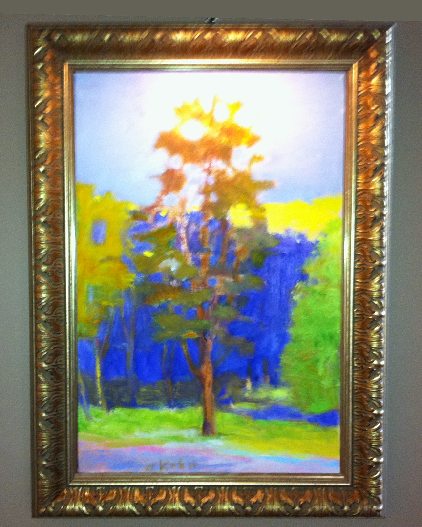
Wolf Kahn put the tree right in the middle of the picture! How does he resolve this visual "problem?"
This series of posts will consider the subjects of balance and unbalance, also known as symmetry and asymmetry. Split your image into two along the horizontal and the vertical axis. You should have quarters, or halves of each aspect, if you will. Now, consider every element of art by its distribution from side to side.
There is also the overall distribution of elements. Ask yourself if you have an equal balance of color temperature. What about equivalent textural effects? I like to think of the three primary colors, or even the three secondaries, as creating a sense of balance when they are all three present in a painting. Evaluate your overall painting to determine if you have achieved your goals.
Contemporary artists usually gravitate towards asymmetry to portray tension, interest and "edginess" in their images. However, symmetry can be used to establish hierarchical patterns and greater meanings, such as in sacred art.
Next Post: Choose Symmetry.
Monday, March 12, 2012
Movement
 A basic visual symbol for movement is a diagonal line, and it is the prime mover in most figurative works. At the right, in Renoir's Study for Dance in the Country, the master artist establishes energetic movement both in the upward diagonal hatching, and by the diagonal lines suggested by Suzanne's head and upper arm. Every angle and tilt of the two figures evokes a movement of the dance, to include twisting and stepping and spinning.
Other aspects of the line create movement, such as elliptical lines and arcs. Remember that western eyes read from left to right. Do not cause unintentional visual blocks to movement, such as a right angle line or a tangential line or mass.
Look at graphic art and the work of illustrators to understand motion and visual pathways in art. These artists are expert at flagging where they want your eyes to move, stop, and circle around within the image. It is slick salesmanship, and the master artists also used these techniques to their advantage.

Henry Toulous-Lautrec places this figure's left elbow against the left edge of the picture plane. This creates an almost mechanical support and we feel the static nature of this, supporting the action of her hand turning her hair braid. The twist in the braid, and the almost right angle of the braid to her head suggests action. The triangular form of both arms held up leads our eyes in the all-important upward and rightward motion. Her nightgown directs us up and into the picture, and establishes multiple directional and diagonal lines. Arcing lines create the sweep of turning motions: note the black hair around the wrist and the right edge of the nightgown at the lower right.
By the way, do not miss my upcoming post on visual pathways, because I have some great lessons to share with you on that subject. I think everyone will learn something new.
Images:
Pierre-Auguste Renoir. Pencil study for Dance in the Country (Aline Charigot and Paul Lhote). 1883.
Henri Toulouse-Lautrec (1864-1901) Combing. 1891 Medium not specified/ looks like other oil paintings by the artist.
Friday, March 9, 2012
Massing Values

Massing all of the darks at the bottom left solidifies the impression of water and weighs this area down. The gray promenade at the right foreground is close in value to the shadow side of the hotel, optically tying these two elements together into a bigger space. The slightly darker, battleship gray sky asserts a downward pressure also creating a gravity to this building scene. The big yellow facade covers the same amount of area, generally, as the other divisions of space just mentioned, and the turquoise roof matches the facade's value, effectively massing the two parts as one. Big masses, defined by their values, make for a simply rendered scene.
John F. Carlson said, "I don't believe a painting ever failed for being too simple."
Mass drawing is used to create an object in space, but here I want to address the massing of values. Massing values is a method for keeping your value scheme both simple and unified. I know I need to write about unity, but we'll save that subject for later.
To put "massing values" in negative terms, it means not breaking up a mass, or shape or group of shapes by organizing too many values within it. This is done by putting darks, mid tones, or lights each in a generalized area. Each value group may either create a separate mass, or they may perhaps be touching or at least relating to one another visually.
Again, the idea is to create large shapes in order to simplify. Massing values is a way to adjoin shapes, to make many objects appear as one on first glance.
Deborah Secor teaches about massing values:
Look for the shapes defined by masses of similar values. Squint your eyes to lose the details, stand across the room or look into a mirror to see how all of the dark places form one big interlocking piece, as do the lights and the mediums. Rearrange these shapes to achieve a pleasing pattern of values, massed together into a composition.
Be in control of your value masses to clarify, simplify and unify your art.
Wednesday, March 7, 2012
Compositional Troubles

Going downtown, looking for trouble!
The elements we have been blogging about have all been presented in a positive manner: what to do to succeed with your compositions. Take a break from that, and apply a critical eye to see what may be causing you compositional troubles. Loriann Signori makes us aware of the following post by Robert Genn: Six compositional boo-boos.
Go read Genn's thoughtful list of 6 common pitfalls that trip up artists whose technical abilities are otherwise squared away. They are:
- Weak Foreground (poorly constructed, blah!)
- Homeostatic Conditions (unintended patterns, tree growing out of a head)
- Amorphous Design (no design or composition, lack of intention)
- Lack of Flow (no pathway into and within the picture)
- Too Much Going On (opposite of simplicity)
- Defeated By Size (big, but not organized or composed)
May I add the following observations about common pratfalls?
Negative space with no intention. Too big and/or unwarranted negative space.
Weak areas - places within the picture plane that are poorly executed or forgotten.
Lack of unity. Will the viewer ask how many people painted your picture? Color is a prime way to create this mistake: is one part composed of colors not comprehended by other parts of your picture? Another way is to have directional marks that don't comport with the flow of your picture.
I don't want you to approach your art without confidence. Be aware of the dangers, but go forth with courage!
Friday, March 2, 2012
Color - Intensity, The Forgotten Axis

3-D models of color are designed around three axes: hue, value and intensity.
The Turquoise Axis
4.9" x 7"
Pastel
Casey Klahn
iPhone informal photo
The three properties of color are well known by the artist: hue, value and intensity. But, how much attention do we pay to intensity? It is a critical element of contemporary color, given the broad availability of colors now. You may not wish to "push" high intensity colors in your artwork, but ignorance of this key property is also a disadvantage to you. Above, my pastel, The Turquoise Axis, is focused on color intensity as a subject.
Read more below the fold (takes you to the full post at The Colorist).
Read more below the fold (takes you to the full post at The Colorist).
Saturday, February 25, 2012
Texture

You can feel the skull, smooth here and rough there. The antlers are heavy, with the age-worn bases, but smooth beams.

A marbled sky appears smooth, while the knotty upland pine appears rough.
Texture is a portrayal of how objects might feel and it adds an imaginary tactile dimension to a painting. The illusion can be created using all of the methods at the artist's disposal: line, pattern, style of applying the medium, etc. Scumbling and glazing are methods that the pastelist uses to make the surface of a painting more lively, and perhaps rough. I also enjoy blending with my fingers to create smooth areas.
See Richard McKinley's Pastel Pointers on these basic techniques.
With the advent of Modernism, artists began to introduce textural qualities to the surface of paintings. A new dimension! Of course artwork had surface texture before, but there now became an interest in focusing on the two dimensional plane for its own sake.
With the advent of Modernism, artists began to introduce textural qualities to the surface of paintings. A new dimension! Of course artwork had surface texture before, but there now became an interest in focusing on the two dimensional plane for its own sake.
Thursday, February 23, 2012
Wednesday, February 22, 2012
Value Scale

The value scale is best thought of as a gray scale and can be
directly related to color value.
The value scale, as illustrated below, is often shown as an eleven point scale, with black at the zero point and white at the ten. But, I want you to consider selecting only a few to compose your values in a picture. For instance, you may choose a three or a five value set to keep your painting simple.

As an example, you may want five values only, and perhaps they would be numbers 3,4.5, 7, and 8. Notice that you may skip numbers in the sequence, because this creates depth and interest. You may choose 3, 4 and 6 instead for an even simpler composition.
Another way I keep it simple is to assume the polar values that will be in my painting. Have only 3 values in your range. Say 2 is darkest and assumed, or put out of mind, and the lightest value assumed is 7. Then, I am free to work with any three values within those parameters. 3, 5 and 6, for instance. You get the idea - it is a mental trick I use to focus on fewer details and provides for me a very basic composition.
See the video in the sidebar that covers this topic.

Five values, represented as gray, may be used
to compose a unified painting.
Tuesday, February 21, 2012
Space

By now you have caught on to the dual nature of particular
elements of art. Space can mean the 3-dimensional illusion in a picture,
and it can mean the division of areas within the 2-dimensional format.
Space - the illusion of dimension. Ask yourself if you feel like you can move around inside the painting. Also, space can describe the division of the area into parts, such as the positive and negative space in a picture.
I use space as a compositional tool by dividing the paper into threes or fives. This asymmetric division of space, by number, creates tension and interest. It also prevents the space from becoming too complicated, as with 7 or 10 areas.
Let's keep space and form properly understood, since they are both dimensional by definition. Remember with form, we had three dimensional shapes and also the deeper formal aspects. The unified nature of all the elements of art is the form. With space, we have divisible areas within the picture, and a sense of the interior area within the painting.
"The air one sees in the paintings of the masters is not the air one breathes," Edgar Degas.
The best use of negative space in recent memory can be found in Andrew Wyeth's Christina's World.

There may be less negative space, by proportion, in an Andrew Wyeth painting than you might first think. The figure takes up one third of the horizontal space in the foreground, or field.
While it is common for artists to add larger areas of negative space to format their pictures, it is also a common pitfall among contemporary artists to use so much negative space that they seem to forget that proportions matter.
Look again at Christina's World. Draw verticals at her feet and head, and see that she takes up one third of the horizontal area in the foreground, or field. Now draw horizontal lines and she takes up about a quarter of the space considered on the vertical axis. As a consideration of mass, how many Christinas would fit in this picture? Maybe ten.
My observation is that many contemporary artists will overdo the negative area of space, and this without any consideration for what they are trying to say.
Space is the area provided for a particular purpose. Space includes the background, foreground and middle ground. Space refers to the distances or areas around, between or within components of a piece. There are two types of space: positive and negative space. Positive space refers to the space of a shape representing the subject matter. Negative space refers to the space around and between the subject matter. Space is also defined as the distance between identifiable points or planes in a work of art. Wikipedia.
<><><>
Saturday, February 18, 2012
Color - A Thematic Essay


Pink & Green. Sometimes more meaning can be portrayed visually than verbally. Consider this my entry on Color for our elements of art series.
Monday, February 13, 2012
Pattern

Big, horizontal elliptic shapes, like pear quarters or lips, create a repeatable pattern in this landscape. The rounded shapes in this picture's land-forms are also mirrored by the rounded shapes of trees and bushes.
Pattern is the way you would compose your picture if it were a quilt top. Lay it out in some discernible motif. Often, patterns in art can be repeated shapes, and may involve the comparison of shapes, lines and colors. Think of the word: counterpoise. One shape predicts another.
The Golden Ratio is also a pattern found in nature.
 The first artist I think of when I think of pattern is Henri Matisse. Born and raised in a textile producing region in northern France, he constantly described patterns on wall paper, dresses, and carpets. Then, he would create an elaborate design, weaving the whole picture into a pattern.
Let's review the elements of art so far..
Consider the image posted at the top of this post, Upland Fields. The elements we have covered so far in our posts are pattern, line, shape, and form.

Long, horizontal lines are obvious, and the shapes are long pears or lips, which are very organic. They are repeated to create a pattern. As respects form, there are five horizontal shapes from bottom to top, and three masses of trees or bushes. The asymmetric, or odd numbered, quantity work to suggest the randomness of nature and the aerial feeling of faded colors, encroaching over the ridge in places, establishes a feeling of upland atmosphere.
Friday, February 10, 2012
Form

Color temperature is a good way to suggest form. Warm plays next to cool to create vibration and separation. Cool can recede and warm proceed towards you, except where other drawing tricks overcome these "rules." Note how the color temperatures, along with shading, create form on the trees in this pastel.
But wait, there's more! Form relates to the formal aspects of painting, which is our broader topic in these lessons. The form of an artwork is the piece in its rudimentary state: unified, visual, and independent of the meaning or context. Take away Norman Rockwell's narrative of a family at Thanksgiving (pregnant with meaning) and observe the way his objects work together to make a fine painting. These are the formal aspects, and the holiday sentiment is the informal aspect of this iconic painting.

Thursday, February 9, 2012
Shape

Shapes: organic or non-organic and geometric shapes are
lines with identities.
lines with identities.
Shape is a 2-dimensional outline of your subject, sometimes described as the contour. To be more specific, a line drawing of a shape may include both the interior and boundary lines of a subject.
Shape is the line become something identifiable. It is an important genesis for making representational art. However, Modernists focused on shapes as a way to organize the flat plane of a picture. As with all the elements of art, in these definitions there are deeper meanings than what is evident on the surface of things.
Pay attention to the shapes created on your surface, and use them to harness the dynamics of your picture plane.
When we add dimension, then form begins to emerge. That we will save for the next post.
Wednesday, February 8, 2012
Line
Pastel Workshop will be posting some basic art elements for the benefit of workshop and art students. Today, we look at the basic line.

Fluid Corner, Pastel, Casey Klahn.
The line in art directs your attention and expresses movement, perspective and compositional elements. Along with the point, or dot, it is a basic component in art.
"A line is a dot that went for a walk."
Paul Klee.
The line in art is a construct of the basic thing: the point or the dot. Lines do not occur in nature, we are told, yet artists still make much of them. Is this an abstract thought? Yes, I think so.
We use lines to suggest and stand in for other things, and we use them to be expressive. Other dynamics in art that fall from the line are gesture and linear perspective.
Lines restrict and bind. Just ask Johnny Cash.
Further reading:
Monday, February 6, 2012
Subscribe to:
Posts (Atom)



 Posts
Posts


