Friday, August 29, 2008

Draw Five

Olive Trees & Paint
May 2008
Pigment Wash, Charcoal & Pastel
On Diane Townsend Paper
21.5" x 14"
Casey Klahn


Drawing has absorbed much of my attention lately. Many of my recent artworks are drawing-based, as opposed to images that I begin with pastel sticks in large masses of color. I'm using charcoal and pencils again.

At The Colorist, my drawings are gathered under one label here. See the My Drawings label here at Pastel.

Let's explore drawing theories in this Five for Friday post.
  1. I don't seek so much to draw things as I do to make a drawing.
  2. Gather a collection of your own drawings that are framed or cropped somehow. How much negative space did you use?
  3. My best advice for laying out a drawing is to just begin it, and work outward. For this, you need a big sheet of paper.
  4. Don't erase anything, unless it's to add to the drawing.
  5. Proportions are for draftsmen. You are an artist. Think: "will following the rules of proportion enhance my drawing, or sidetrack me instead?"

Tuesday, August 26, 2008

Color Studies


This is the promised color study part of our Abandoned Barn Series workshop. We looked at black and white thumbs already.

These images were scanned, printed and then noted with pastels.

Several color thoughts have been presented here. So far, I am favoring the last one, and I want to massage it some more.

Friday, August 22, 2008

Compositions Advanced


The Abandoned Barn Study has been a goldmine for me in the analysis of composition. I thank Brian McGurgan for giving me that opportunity. The study has led us to look at things like lines that lead us around, into and out of our picture plane, the weight of masses, and the plastic element called "push-pull" by Modernists. See Hans Hoffman.

Hoffman declared the reign of "one point" perspective (linear composition) to be over. He proposed color, light and shape as elements that not only lead into a picture, but also push back out of the plane. Ready for some interactive fun? Go here for a color puzzle illustrating Hoffman's Push-Pull Spatial Theories.

Add Hoffman's theory to your linear perspective rules. Now, understand the application of lines, intervals, colors, values and other elements in the picture plane to lead the viewer's eye where you want it to go. If the sky is "heavy" with darker values, the eye will feel it's "weight" pushing the picture elements down.

Let's have a look at some examples from my own drawings. Do you think in color when you draw with pencil or charcoal? If you are a painter, you should. It will effect the outcome of your gray scale drawing. Maybe this will become evident as you look at this combination of both colored and black & white drawings. Again, we're using a definition of a drawing as a picture leaving some ground/paper showing.


Forest Study, 6" x 5", Charcoal
Casey Klahn


Bell Tower, 4.75" x 4.5", Original Pastel
Casey Klahn


Behind the Garage, 7" x 8.5", Graphite on Sketch Paper
Casey Klahn


After Wolf Kahn#1, @ 8" x 6, Pastel on Sketch Paper
Casey Klahn


Lead Climber, 11" x 6.75", Graphite on Paper
Casey Klahn
The Portal, 4.75" x 4.5", Graphite
Casey Klahn

Now, look at my analysis of how sometimes linear, and sometimes values or colors push the viewer's eye around the picture plane.


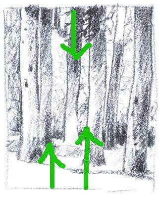
Dark foliage pushes down; light foreground pushes up.


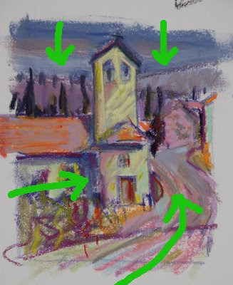
Dark value sky colors push down; light foreground pushes up and various lines lead in.
Blue (cool) recedes; pinks, yellows, oranges and violets are warm and proceed to the front.


It was tempting to make the winter sky dark, and the shingle roof dark as well. Instead, I remebered the push-pull theory and helped the eye heavenward with lines, mass weights and open, light values in the sky. Part of the roof was left light. Diagonal lines lead in from the left, and various vertical and spiraling lines disrupt and stop you inside the picture plane. They help to lead your eye upward. Notice that the interval of sky need not be large, because so much help is offered by the push-pull methods - this allowed me to keep the garage big and prominent.


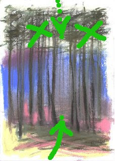
This was directly copied from Wolf Kahn when I did a study of the contemporary master. Interestingly, the light foreground, with open lines lead in, and the hatched tangle in the upper area serve to catch the eye - partly stopping and only pushing down gently.


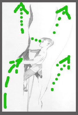
The environment of vertical rock is hard for the flat lander to visually process, so understand that here we have a lead climber on a vertical cliff that begins to overhang above him. He is intently focused on the rock before him, scrutinizing his next options. Don't get dizzy!
Our climber has more interval overhead than below, and yet he still gives the impression of being high off the ground. The lines opening up, and the simplicity and lack of detail help this effect.


Here is the most complex drawing shown as far as perspective is concerned. Obvious lines lead one into the picture and downhill along the path, then through the portal in the tangle, and then across the void, or canyon, and up the rock cliff. Important roof lines also bring the eye in from the left.
The "bending" viewpoint is a curvilinear perspective. In this drawing, I have offered a type of curvilinear perspective. My brain hurts, now. Reference here.
There is an interesting story that goes with this image, referenced here.

Wednesday, August 20, 2008

Brian's Barn

Conté pierre noire pencil on Cartiera Magnani Velata paper (cream tone, 8″ x 8″ ), August 2008.

Here is the second crit of Brian's thumbnail sketches, and after this we'll move on to color compositions. I have to say that I really admire Brian's enthusiasm in all of his pastel work. For this particular project, he has even gone so far as to buy a couple of new books to support this study. Way to go!

Brian's post, More Abandoned Barn Sketches, follows my Thumbnail Critique of his first sketches, and this project is referenced here in a past post at Pastel
(pastelsblog.blogspot).

My Comments:

I like the square format, and your complete elliptical circle around the barn is a good tool for attaching the building to the terrain. Don't make it too perfect, though.
In our minds, we want our landscapes to be irregular .

Pay serious attention to the intervals of space given to each element in the overall image. Try this experiment. Put away the photos, and also your prior sketches. Now, draw the scene from memory. Weight the elements for compositional reasons, not descriptive reasons.

You said, "With Casey’s comments on Wolf Kahn and Hans Hoffman I’ve gone back and done some more reading and will continue to explore the “push-pull” aspects of this piece - the visual weight of the sky versus the land masses and also the dynamic that warmer and cooler colors will have within the piece once I get that far along."

You have four bands of terrain, which I like. Several ways to handle that. One is to keep the four, but camouflage two by making them analogous colors and the same value. An important one will be to not make the bottom two bands be equal height (or depth, if you will).

Kahn does a lot with sky colors to either push the eye down upon his buildings, or conversely to allow them to breath and float up. But, what do we do with linear composition to accomplish this?

Here is a sketch I did in Photoshop to arrange the same elements you are using, but giving different weights to each element. The major lines refer to one another, which unifies the scene, and keeps the eye inside the picture plane, and on the barn. A cunning aspect is that the fore and mid (behind or above the barn) ground are roughly the same size like in your sketch, but the balance has shifted to the fore and barn elements because these two elements are drawn a little larger, and the angles are now offset rather than being parallel.


When I used to get crits from the Famous Artist School, the artist would offer these re-drawn sketches. I hope that's O.K. for you, Brian. Sometimes a drawing speaks better than words, huh?

Tuesday, August 12, 2008

Thumbnail Critique

Conté pierre noire pencil on Cartiera Magnani Velata paper (cream tone, 3″ x 4″, 3″ x 5″, and 6″ x 3″), August 2008.
Brian McGurgan


I won't be doing crits, except by request, and then gladly. Brian McGurgan, of Brian McGurgan's Drawings and Paintings, has asked for one as he follows along with my Abandoned Barn Workshop. What I do hope to do with this series is to post about the Abandoned Barn Project every week at least once a week. Since Friday is Tips, I'll choose another day of the week.

We'll be doing color sketches after the B&W thumbnails, and eventually I'll post my artist's demo as we finish this work in my studio. I started the painting on site, with all of the flavor of plein air work, but I'll be completing it in the studio for ease of teaching from a blog. This whole thing is an experiment for me in teaching, blogging and demonstrating a Work in Progress (WIP).

Brian:

There is no doubt you get the feel of the site, with its lonely and abandoned barn. Maybe you'll have to get me doing some NYC buildings, next, from photos and while I'm in my western studio. I hope to show some of these to the farmers who own the property some time. They'll be thrilled, I know. That distant mountain shows up in many of my own artworks, and I like to tell people it is "almost in Canada" .

You have a great understanding of your aspects, and how they effect the outcomes. I would do several sketches of each (or one) aspect, because the one-each system is too confusing.

I'm glad you're thinking in color at this stage, already. A true sign of a painter! Be willing to change your color ideas as you ruminate on the image over time. I like the brown and neutral idea, but it will dictate certain things down the road, and we'll need to figure that out along the way.

The lower left image makes the barn the star of the show, but the negative space remaining is ambiguous - there is too much of it. And, be careful about getting the barn in the center of the drawing.

The upper left one is an interesting study of what happens when looking at photos (you don't get my advantage of being here to see it in reality). The photo (I call them "evil") flattens perspectives. I have to constantly be aware of this, and
stretch the vertical view on my paper to counter this. So, when you lower the horizon line intentionally to include some sky, you fall into the photo-become-drawing trap of flattening the view too much. I have addressed the same issues in my Charcoal Thumbs, but I have kept the hill mass above the barn "fat" to avoid the evil camera perspective effect.

Also, my sky inclusions are for pictorial (linear) purposes, and not for color purposes. I am keeping these two aspects in compartments: first the linear composition, then the color composition. Don't let the color needs screw up the linear composition or failure lurks near.

On the subject of drawings from photo reference, see my post here.

The vertical format is nice
because it keeps the loneliness of the barn intact, and yet crowds nothing. A bunch of issues develop here, though. Remember our friend, Wolf Kahn? He is all about Hans Hoffman's "Push-Pull" theories, and Kahn's drawings are a virtuoso performance in allowing lines to push the sky down (or up!) as the composition needs. Same story with his foregrounds.

So, in looking at your third drawing, I wonder which element will dominate. The sky, mid and foregrounds share thirds equally. My eye needs to be told which element to favor. In fact, you risk having four elements equally weighted, if I think of foreground, barn, mid ground and sky. I do like the "fat" field mass above the barn, though. I think #3 is my favorite over all (vertical).

Finally, I want to get into your drawing a bit. The barn drawing works great for it's value scale, and has perfect "weight" and is anchored well to the ground. It's a great drawing! I
want you to analyze the perspective as a 3 point perspective, though. It looks like you have a 2 point perspective going, with almost a slight third point (the vanishing point below the dirt would wish for the vertical wall lines to be more acute). Does that make sense? My thumb#3 illustrates a 3 point perspective of this barn, where the viewer is slightly above and looking down on it. The vanishing point for the vertical lines is below the ground level.


Anyone else willing to follow along? I'll be out-of-pocket through Monday, and then we'll be resolving my compositions and moving on to the demo.

Monday, August 11, 2008

Charcoal Thumbs

Abandoned Barn Thumb #1


Abandoned Barn Thumbs #2 & 3


Thumbnail sketches, in charcoal, of the abandoned barn image. Remember that buildings seen from above suggest 3 point perspective. I'll remand you to the search engines to look up drawing perspective. Note, the query "3 point perspective" works better than a query like "drawing perspective".

I find that after you learn drawing skills, it's effective to NOT think too hard about the technical aspects of perspective. Just trust yourself to draw it and the quicker the better - your result will be fresher and more lively. That's right, I said "lively" in describing a building!

Then, after the fact, if something doesn't look right, review your drawing's perspective.


The 3 thumbs above represent a closely cropped version of the abandoned barn scene. And, each crop is a little different, and the results are very different in my eye. I find this image to be simple enough that I won't distinguish between a line sketch and a value sketch.

Going back to this perspective issue, I want to mention that the barn exists in a 3 point perspective space, but the landscape exists in a zero point perspective. The land in much of the American West is rolling hills with mountains in the distance. The artist must organize his lines for the overall graphic needs of his painting, rather than point style perspective. My own bias is to make the lines lead the eye into the painting, and hardly ever out! Upward directed lines at the edge, diagonals and "Z" shapes are helpful here. I also noticed several triangular patterns where grass patches abut the fields and crop lines. They provide interest and direction.

As far as the barn is concerned, my thoughts are to keep it anchored to the earth. Just like figure drawing, ask yourself how the interface of the feet to the ground of a standing subject appear. Believable
? Or floating strangely in space?

Next: Color Studies.

Saturday, August 9, 2008

Knot Tie Down - Field Easel Follies

Get Wind Load Protection with This Bomb Proof Tie Down System for Your Field Easel

Get in an Anchor and Snug it Tight

The Secret Formula - A Triple Equalized Bowline Knot Keeps All Three Legs On the Ground

In getting ready for your outdoor trips, one of the fiddly things is sun protection and wind defense. The umbrella, which I have bungee corded to my Mabef Field Easel, may defend me from the sun, but it also makes the wind load worse. Also, when I add the pastel box and drawing board, I'll have other surfaces that catch the wind. I don't want to have to pick my expensive set of sticks out of the nicely plowed dirt, do I?

Who says those days of rock climbing were wasted? The fancy rope tricks I learned apply to various of life's problems, such as tying down your field easel.

Here is the break down of my system. Buy a section of perlon (nylon) cord) - this one is a 7mm cord bought at REI. I reckon it's about 18 feet long. The carabiners (REI) are attached to the three legs with mini bungee cords (Home Depot). Tie a Triple Bowline to equalize the load (Video Instruction Shown Below - Sorry About the Ads) and attach to the carabiners.

Hammer in a tent stake and attach your rope. I used a Trucker's Hitch, but I fancied it up by using a directional bight. Hey, I'm not giving up all of my secrets, here!


How to Tie a Triple Bowline Knot -- powered by ExpertVillage.com

Thanks, Dan!

Reality check: I did have to do a gentle one hand grab of my kit when a 4 MPH gust of wind threatened a topple. I made a note to myself to directionalize this set-up with a cord going out to the windward side as an additional measure. Vented umbrellas are available for artists, too. I would still use some kind of wind proofing even with that type of umbrella, as your drawing board and pastel box are wind catchers, too.

Friday, August 8, 2008

Abandoned Barn Photomerge Panorama

Abandoned Barn Panorama - Click On To Enlarge


Shall we share an artistic adventure? Select and view the panorama photo posted above, and bust out your pastel set.


Here we are in panoramic Eastern Washington, about 3 - 4 miles from my house. The subject in this kind of vast and open landscape is, to say the least, a challenge to arrive at in a focused manner. Luckily, the abandoned barn stands out, and it fits into my typical subject-set of buildings and trees.

Follow along with me here at pastelsblog.blogspot as I develop this scene into a finished painting. It may take a while, as I'd like to present it to you as a mini workshop.

And, be my guest at utilizing my photos to work along on your own landscape. Stay tuned as we work on the "Abandoned Barn Project".


Reference #1, Abandoned Barn


Reference #2, Abandoned Barn


Reference #3, Abandoned Barn

Consider this your Five for Friday tips, which is my weekly instructional offering. The tips will dovetail with this long term "Abandoned Barn" project.
  1. Feel free to begin any time making thumbnail sketches, preparing your ground (paper) for a studio work based on these photographic images, and let me know if you are participating.
  2. I will be starting with Wallis paper. You may do the same, or use what you prefer instead.
  3. I want you to have in mind an artist that you will be emulating, or following "in the style of" while you are doing this work. Hint: mine is Albert Handell.
  4. If you wish to see my own building images, they are here.
  5. I will be posting periodic updates of this work-along WIP. If you link them to me, I would like to post yours, too. Maker sure the photos are reasonably good. I will be posting instruction on basic pastel and plein air as well as studio practices, so you may participate as a beginner or an intermediate pastelist!


Wednesday, August 6, 2008

Teacher's Demo

Teacher's Demo
7 (63%)
Teacher's Critique
1 (9%)
Peer Critique
1 (9%)
Lecture
0 (0%)
History
0 (0%)
On Site Work
2 (18%)


The big winner of the polling results for my workshop inquiry is the category "Teacher's Demo". A distant second is on site, or plein air, work.

Now, I want to refine this demo idea. What format should this take? Besides the traditional stand-in-front-of-a-class kind of demo, there are new and more convenient ways to do these things today. I looked on Wet Canvas for demo posts where I see photo series' with Works In Progress, and that also led me to You Tube demos.

What I didn't like about the You Tube vids was the sped up or truncated briefness of them. I valued more the ones where you see the artist and the ground, rather than a time lapse of the WIP.


Angela Fehr said,

I'd love to learn pastel - I've done a couple of portrait drawings with pastel but I'd love to learn a more painterly approach.

When I teach a watercolor class I always lean strongest toward teaching technique. My first watercolor workshop was weak on technique and focused on looseness and creativity and as a new artist, what I needed to was to learn what watercolors were capable of and what my options were to gain the effect I wanted. It totally depends too upon your students' skill levels.

Thanks for visiting my blog BTW - I love meeting other artists online!

August 5, 2008 2:17 PM


I am looking for this type of input, with specifics for what you like in a workshop. Any whiz bang suggestions for getting a complete artist's demo on the Internet? Thanks ahead of time!

Tuesday, August 5, 2008

Under Your Image

In researching my own workshop instruction methods, I have found some You Tube Vids that I like. Here is Kitty Wallis, of Wallis paper fame, and she is explaining the properties of not only her unique ground, but the usage of liquid pigment and its benefits. I use this method to either wash a tone on my ground, or to actually get down an underpainting with some detail. I am planning one for a barn image now, where the overwhelming presence of the Earth's color is going to be too much for the painting. If I underpaint a good color, though, I'll be free to continue without worry.


Monday, August 4, 2008

Bald Ridge Road Trees

Bald Ridge Road Trees
Graphite in Sketchpad
@9" x 9"
Casey Klahn


Enjoying some plein air sketching.

Saturday, August 2, 2008

Live Blogging McKinley Workshop


Very great thanks to Miki Willa, who is live blogging the Richard McKinley workshop in Oregon. McKinley is a popular pastel master who has a feature blog at The Pastel Journal Blog, called Pastel Pointers. You'll notice that his teaching style is compelling, and our own Miki will probably be getting seven years of experience in one week from this.

It appears that Miki is embarking on a seven week plein air trip. Woo Hooo! Dream vacation, anyone? It reminds me of Eden Compton, who is on permanent plein air vacation as a permanent sailboat resident.