Thursday, December 29, 2011

March 17th & 18th in Morristown.


I'll be teaching at the studio of artist Julie Friedman, in Morristown, NJ.  March 17th. & 18th., 2012.  More info to follow.

Wednesday, December 28, 2011

Progress


Detail
Charcoal, Conte and White Chalk
@ 8" x 12"
Casey Klahn


Okay.  I fixed the eye placement and the lip.  It is fascinating how once good abilities can evade me after too many years out of practice.  Figures and heads require lots of practice, and then there's the art part, too.

This is done on newsprint.


Monday, December 26, 2011

Detail of a Head

Detail
Charcoal, Conte and White Chalk
@ 8" x 12"
Casey Klahn


This drawing was a failed start.  But, this detail is nice.  I'll try it again tomorrow.

Friday, December 23, 2011

Subjects - A "How To"

This is the second installment on subjects.  Originally published a year ago.


Hoquiam River Bright 
10" x 14.75"
Pastel & Charcoal
Casey Klahn


Cindy Michaud asked me to follow up on the previous post about what to leave in, and what to leave out.  In that post, I wrote about finding your subjects, and gave my examples of the river and the prairie.  But, how to find them is the core question.


Would it be obtuse of me to say that your subjects may find you?  Here's what I mean.  Decide what your best recent works are.  Perhaps you have 6 or 10 of them framed that you really feel represent your best work.  What are the subjects?  You find when painting these given things, such as botanicals or wildlife or city streets, that you do your best work.  These are the subjects that sing for you.


Concentrate on these few things that you've identified.  Spend your next several studio sessions just painting these things.  Right now, for me, it is a river in the forest.  Specifically, the Little Hoquiam River, on the coast in Washington state.


Studio Hoquiam River Scenes


Thursday, December 22, 2011

Your Subjects

This post was first published a year ago.  It is in two parts, starting with What To Leave In, What To Leave Out.


[Waning+Light+72.jpg]


[somtimesweather+72.jpg]


It was interesting to see a great pastel artist list his focus on a narrow range of subjects in a book I read recently. The book is a dated one by Albert Handell: Pastel Painting Workshop. He likes the Southwestern landscape with arroyos and pueblo-style structures. He does trees, rock boulders and waterways. In his figurative work, he likes vignettes and portraits.

Why be narrow in subject matter?


It is good to be aware of what your subject matter is before you go off to the field to paint on site. Why be narrow in subject matter? My own feelings are that you may delve into a subject as deeply as you wish, and may never run out of inspiration. If your goal is to "draw things", then you may wish to pursue every possible subject one after the other. But, if you are wanting to produce paintings with depth and with good technique, then limiting yourself to a handful of subjects will provide you a greater opportunity for depth.

Limiting your subject matter will put you in good company.

Limiting your subject matter will put you in good company. Van Gogh stayed with agricultural landscapes in France that revolved around trees, waterways, fields, buildings and bridges. He did portraits and still lifes, but he stayed with common themes. Degas stayed with interior and theatrical figures, such as orchestras, singers and ballerinas. He did nudes at the bath. He also liked the horse track, and some industrial interiors. Daniel Greene stays with the portrait, but in his figurative work he focuses on painting his wife, artist Wende Caporale, in the New York subway with tile mosaic backgrounds. Of course, he does other works, but his series work is a method of staying focused. Harvey Dinnerstein does self portraits where he is painting bare chested, and Andrew Wyeth stayed on the Helga series for a number of years. His Helga series kept true to his own ouevre of rural interiors and moods.

Limiting my subject matter helps tremendously in finding compositions.

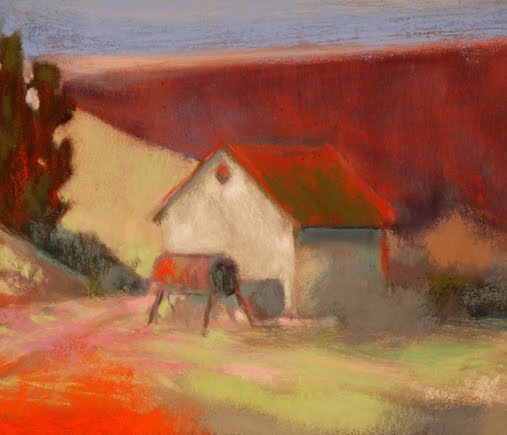
My own oeuvre features trees, forests, rivers and the prairie.  Sometimes rural buildings are featured, and rarely do I bring in the sky, horizons or light.  It's interesting to think of what I purposefully omit.  The horizon is too much landscape - too boilerplate.  Light is not much of a part of my environment, especially where I grew up on the Washington coast.  The sky is better left alone, unless to add a pushing or pulling event, or to set the color concord. 


Some of the content of this post was brought forward from a previous tips post, and updated with new material.

Monday, December 19, 2011

Color Rules, as in, "The Roost."

RYB


This article was published at The Colorist, and I want to develop these color ideas here, too.  Enjoy:


There has been some call for me to reveal my opinions on the use of color.  When I demonstrate in person, students invariably wants to know why I pick each color as I work.  This series of posts will be my attempt to draw back the curtain on my ideas about color.  


After perhaps six, or maybe ten, of these posts, there will be some organization to what I am saying. For now, I'll just write things down as they occur to me.


<><><>


  Color choice is a very personal thing.  I mean that in both intention and in talent.  You have your own color sense, and it is up to you to let it reveal itself.  Choose the color you want.  WANT!


  Kandinsky got it wrong when he assigned meanings to color.  That is, I think that the artist's job is to make the patron see his, meaning the artist's, own meanings. One should not pander to perceived ideas of what colors may mean to the viewer.


...umber comes from the earth already umber.


  I use the RYB color theory.  Red, yellow, and blue.  The reason I do is that I am not submitting my artwork to the printing press or the camera, at least not at the conceptual stage.  I will become involved in color mixing, and the RYB color space works well for this.


  In thinking about color theory, and in spite of the fact that I use the "old school" RYB method, I do think in terms of modern, or contemporary, color.  That is to say, we have the fattest color array available today.  Raphael would have given his left arm to work with this many colors.


  I begin with the hue.  More on this later, when I lay out for you my own theories on what is most important in approaching color.  By the way, I hope you are arguing with me about these things.


  A Color Solid is a fun and useful tool, also.  I have seen it used with the Munsell theory, so I just make adjustments in my head to see it my way.  Someday I will construct a Color Solid as I see it.


  Just because you know that color theory has evolved over time, does not make you "right" in your opinions about color theory.  It does reveal that opinions are subjective.  I need to focus on what works, and my tools are laid out before me.  It is important for the artist to know how to mix a brown he likes, but please also realize that umber comes from the earth already umber.


Homework:


Robert Gamblin has a great video about his Color Space theories.  I differ in that I think of each hue as a two-part system named by its color, but not by its temperature.  More on that later.  I say, "blue-red" and "yellow-red," not cool or warm red.


Friday, December 16, 2011

Wednesday, December 14, 2011

The Hans Hofmann School of Fine Arts


This was posted in the sidebar at The Colorist, but I favor it so much it needs air at Pastel Workshop.

Thursday, December 8, 2011

Artistic Authenticity


The elusive state of artistic authenticity is what I want to discuss.  Here is an excerpt from the article I am writing about Authenticity In Your Art:


"Ignore Everybody,"
 Hugh MacLeod.


Technical skill is not critical to being authentic, although it may help to more easily say what you mean with your artwork. More importantly, I value being comfortable with line, composition and color. The formal elements of all artworks can be a huge distraction when a painter doesn't use them with intention and ease.


One obsolete meaning for the word, "authentic," is "authoritative." This is where my focus lies. Having the merit of authority – unimpeachable work. I once lunched with Donald J. Wiseman, the man who excavated ancient Babylon. Here before me was a living textbook footnote, for he was certainly the authority in his field.

Wiseman.

Hugh MacLeod.

More to come.

Wednesday, December 7, 2011

New Blog Name: Pastel Workshop


Pastel will now be Pastel Workshop.

Since there is a demand for me to teach workshops, and because I have been doing just that this past year,  I have decided to recruit this blog as an information center to provide lessons and data about upcoming workshops. For those who have followed Pastel over the years, I thank you and want you to know that I will still be offering the same content as before, along with improved access to instruction and to my artworks posted here and at The Colorist blog.

Requests for future workshops have been made for Portland, Oregon, Berlin, Germany, Morristown, New Jersey (not far from New York City) and also for eastern Canada.  No calendar is yet published, but if you are interested in any of these, please leave a comment here, and I will put you on my mailing list for workshops.   

Tuesday, December 6, 2011

The Winter Studio

 Sort through old supplies...

 Winter backlight, or, It looks like my head is Photoshopped on...

Gray days ahead, but that's what I like!

I was motivated by Maggie Latham's post, Ten Clutter Busting Ideas, to clean up my own act in the studio.  First:  my desks!  They are the worst clutter keepers offending me right now.


If I have any tips for you, I will pass them along next time.

Saturday, December 3, 2011

Riva del Garda

Hotel of the Sun, Garda
@5" x 4"
Pastel
Casey Klahn

I posted this somewhere before, but here is the formal photo.

Wednesday, November 23, 2011

Shadow River

@@@
Shadow River
11" x 19"
Pastel & Charcoal
Casey Klahn


Available.  Please inquire.

Happy Thanksgiving to the readers of pastelsblog!

Tuesday, November 22, 2011

Pre-Sale at The Colorist

There is a Pre-Sale going on at The Colorist, before my exhibit at the Arbor Crest Winery Tasting Room in December.  You may participate by bid or on a  "buy now" basis.  Happy Thanksgiving!

Field at Dusk.  Available Soon.


More images will follow soon - I hope on a daily schedule.

Sunday, November 20, 2011

Unified Sky


Unified Sky
@ 4" x 5.5"
Pastel
Casey Klahn


Many new and small works will be posted quickly over the next few days.  I am trying to organize a pre-sale of works before they go to exhibit in Spokane in December.  Please stay tuned.

Wednesday, November 16, 2011

Framed Print via Imagekind


Imagekind Framed Print:  Red Barn with Ramp by Casey Klahn.


As Shown, framed, for under $120.  Add tax and shipping.

Tuesday, November 1, 2011

Neutrals In The Field


Neutral Corner
@5x 6"
Pastel
Casey Klahn

This is one of those endless variations done from one seed image.

Wednesday, October 19, 2011

Belvedere - Work in Progress


Belvedere - WIP
@ 3.5" x 3.5"
Pastel
Casey Klahn

This was a demonstration work in Bellevue a couple of weeks ago.  It had some technical roughness, and so I am planning to do it over.  At Daniel Smith, in Bellevue, I used my demo earnings to buy an LED LightPod, and have already gotten a couple of follow-on images from this one.  This scene was taken from a photo I took in Italy in 2006.

Sunday, August 28, 2011

Friday, August 19, 2011

Top Tips


Top Tips for Travelling Artists is Katherine Tyrrell's series of reports on what works well for taking your studio with you and going over the horizon.  She has plenty of links in her series, and I recommend you read and bookmark her posts for that day when you will be scratching your head over what to pack.


Because I have written for many years about my take on pastels, some of my own hints are linked.  Thank you for that, Katherine.  Much has been made about my choice to paint on sight with only 6 Unisons.  I got that idea from a San Francisco artist, whose name I have unfortunately forgotten and whose URL I can't find anymore.  All that to say I didn't invent the idea.


Two layers in a cigar box.  Insert is a Fome Core DIY box lifted with a ribbon.  Six values of any hue is the organizational principle in this kit.


Maybe out of guilt over the attention I get for this, I have been trying harder to get outside and use the 6 U's kit.  I'm glad to report that some paintings have been started, and yet I have to admit I am not much of an outdoorist.  I did get a really nice painting started at the beach with charcoal and the 6 Us, and then I used my mid-sized box of pastels, pictured above, which I re-fitted right before my trip with a better selection of sticks.  It worked great, and yet when I went to the studio to do the "resolve" of the painting, I struggled and struggled.  So much the better.  Learning happens.


Happily, I have two great painting ideas from my summer's efforts, and they started as the 6 Us in the field.  That is what makes the whole thing worth while, isn't it?


Here are "The Six."  I added my one extra stick, the Grey-18, to extend my value range to the lighter side.  


Making a Mark
Top Tips - Pastels

Thursday, August 4, 2011

Beach Rocks

 A Rare Plein Air Effort.

WIP (Work in Progress)


At The Beach
Photo: Lorie Klahn


Wednesday, July 13, 2011

Carriera, Copley, Chardin, Oh My!


Young Lady of the Le Blond Family
13.4"  x 10.6"
Rosalba Carriera [Public domain], via Wikimedia Commons.


This looks good. For those interested in pastel's historical development.


Pastel Portraits: Images of 18th-Century Europe
May 17, 2011–August 14, 2011


Brightly hued, highly finished, and relatively large in scale, pastels in the 18th century were regarded as a type of painting and displayed like oils. The powdery, vibrant crayons are particularly suited to capturing the skin tones and evanescent expressions...

Monday, July 11, 2011

Head Games

Sketch, Head
Copied from a book
@ 9" x 7"
Charcoal and Chalk
Casey Klahn


This image was one of four 10-minute sketches of heads that I did the other evening to celebrate cleaning my studio. I was reading Drawing magazine, which is one of my guilty pleasures.  The idea here was the head as a cube in perspective.  I am also guilty of taking this from Ned Mueller, as I saw his great drawing in one of my coffee table art books.  Consequently, it will never be for sale.

Thursday, June 30, 2011

Pastels, Yellow Ideas, The iPhone Camera, Six Unisons Only & PA Sketches.


New Colors - Hand Made Pastels

Canola Crop - Making Me Think of Yellows


Scenery On The Butte


Six Unisons Only - Well, Maybe I Added a Gray or Two
.
Flowers On The Butte


Sketches