Showing posts with label Wolf Kahn. Show all posts

Thursday, March 29, 2012

Symmetry Versus Asymmetry - Make Your Choice

Contemporary western audiences are very used to seeing asymmetry, or unbalance, in fine art.  But, that isn't always the case, and artworks may succeed with either balance or the lack of balance.  I was delighted to see a Wolf Kahn oil recently, that illustrates balance and resolve.

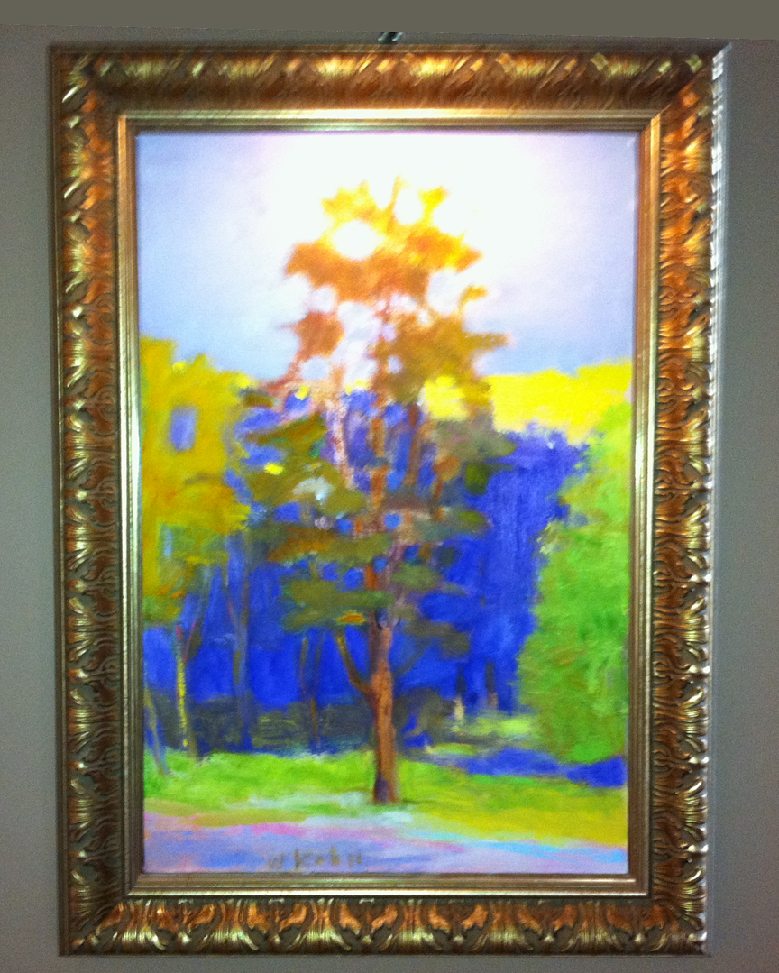
Wolf Kahn put the tree right in the middle of the picture!  How does he resolve this visual "problem?"


This series of posts will consider the subjects of balance and unbalance, also known as symmetry and asymmetrySplit your image into two along the horizontal and the vertical axis. You should have quarters, or halves of each aspect, if you will. Now, consider every element of art by its distribution from side to side.  

There is also the overall distribution of elements. Ask yourself if you have an equal balance of color temperature. What about equivalent textural effects? I like to think of the three primary colors, or even the three secondaries, as creating a sense of balance when they are all three present in a painting.  Evaluate your  overall painting to determine if you have achieved your goals.

Contemporary artists usually gravitate towards asymmetry to portray tension, interest and "edginess" in their images.  However, symmetry can be used to establish hierarchical patterns and greater meanings, such as in sacred art.


Next Post:  Choose Symmetry.


Monday, January 10, 2011

Large Format Pastels Book


I posted one image from a WK catalog I have the other day.  You may enjoy seeing more of these pictures.  This is a commemorative from an exhibit at the Ameringer McEnery Yohe gallery in NYC in 2006.

Monday, January 3, 2011

Wolf Kahn Post


Image from a Wolf Kahn exhibition catalog

Artist Larry Groff, who blogs at Painting Perceptions, has offered up a thorough report on Wolf Kahn.  

You know how much we love WK here.


Tuesday, June 3, 2008

Germany!


It gives me great pleasure to post about German pastel art. With the world's softest (and one of my favorite) pastel brand, Schmincke, manufactured there, and as the historic bed of the pastel medium, Germany is an important art hub. German painter Johann Alexander Thiele (1685-1752) is credited with the essential invention of modern pastels.

Expressionism is a key art movement originating from Germany.

Wall Panel, 1914
o/c
Kandinsky

Wassily Kandinsky (1866-1944) was a Russian artist whose growth and style was solidified during his long residencies in Germany. He was the first abstractionist.

Astrid Volquardsen is a contemporary pastelist in Germany. Link.


German information center, US German Embassy.
Some of my favorite pastellists either originate from or frequent German soil:
Wolf Kahn, born in Stuttgart.
Gesa Helms, frequents Germany and posts landscapes from there.
Casey Klahn, second generation German-American.

Petra Voegtle
Not a pastel artist, but very prolific and an indispensable gateway for English language blogging from Germany.

Sunday, February 10, 2008

Paper Choice

Bell Tower
4.75" x 4.5"
Original Pastel on Sketch Paper
Casey Klahn

Readers are asking which paper Wolf Kahn uses, and especially since he has spoken against sanded papers. I doubt that WK would want to be known for proscribing any art materials or for any "rules" in art making. He tends towards the creative expression and loose side of the house, I think. My feeling is that he expresses his own methods and that's that.

Far be it from me to tell anything more than what I have seen or read about the master's materials. I did buy Diane Townsend's Wolf Kahn Terrages, which as far as I know is the only product he's ever endorsed. I did find the following vague reference to WK's paper choice.

This is the pastel that I worked on with Wolf Kahn because he is particularly fond of the gritty formula. He likes to break open the surface of a paper like Lana paper and work the color directly into the fibers of the paper.


Diane Townsend, reference.

You might recognize the Raffine product name, which derives from Lana, in France.
Raffine at Jerry's.

The pastels of Kahn's that I saw in NYC were wonderful. His very loose (scribbled) style is a foreshadowing of his layered approach to oils. Then, he finishes with electric colors that pop as only intense pastel sticks can do. Imagine a thatching of burnt umber, then a heavy line of Sennelier Ultramarine over the top. The paper that is made in the cold pressed manner (think: rough, versus hot pressed, which is like an ironed flat pair of pants) is appropriate to this style. You simply can't scribble into sanded paper very effectively.


In Process, One Gets an Idea of the Paper Hand

Here are some non-sanded papers that I like to use:

Rives BFK (offered in a heavy weight; sized)
Arches Cold Pressed

Monday, November 26, 2007

Bits @ Kahn

http://www.union.edu/Gallery/Archives/kahn_mason.html
The link above will take you to an interview titled: Separate/Together, Wolf Kahn and Emily Mason. I haven't read or seen enough about EM, or Cecily Kahn for that matter. In this interview, Kahn reveals some insight on the second generation of Abstract Expressionism and intuitive process, and about having an inherent color sense.

Read Lin Wang's blog post, The Dust on Butterflies' Wings-Wolf Kahn in Pastels. It is about the occasion of Kahn's installation at The Hoyt Institute of Fine Art. BTW, this is an interesting blog to read in general.

Tuesday, October 23, 2007

Wolf Kahn Exhibition Catalog


When I had the pleasure of visiting the Ameringer-Yohe Fine Art Gallery in New York City a little over a year ago, I also got my hands on this beautiful catalog printed on the occasion of the artist's installation: Large Format Pastels, 10 November 2005 - 7 January 2006. I missed the exhibition by a long shot, but the gallery staff were cordial and allowed me to view about 7 of Kahn's small pastel works.

One can find these rare books on e-bay, for sale. Kind of like selling a gift, don't you think? The gallery presents these freely to patrons who show an interest in the artist's work and who would enjoy having this compliment.

Here is an example of a more current WK catalog from the A-Y Gallery.

Friday, September 28, 2007

Nexus Too Soon?


Is it too soon in the life of my new blog to have a cross-post from The Colorist? Will Technorati gig me for blatant self-linking behavior and take away some of my "authority" score? We'll just have to see. But, here we have an obvious nexus where, at my process blog I have planned a drawing book review for the month of October, and yet that book, Wolf Kahn Pastels, is fully about the subject matter of this blog.

Be sure to read my review of the great contemporary artist's process book, and stay tuned here for the second post where I share another of his pastel books with you.