Thursday, February 28, 2008

Gray Tips

1. Use a set of gray, harder pastels organized like this: five values of warm gray and five values of cool gray. Lay in your drawing with vine charcoal, or some other dark tool, and then create the whole painting in just gray. Register the grays on a separate piece of the same paper you are using. Now, add in your colors, but be sure to match the values against your gray scale register.

2. I do keep my grays separated in many ways, as I touched on last week. My hard gray sticks are in their own section among the hard pastel sets. Then, I take my truest grays and keep them in a separate storage box, but divided into sections by temperature, and from dark to light in each section. Of course, you'll want to organize your black and white sticks somehow. I suggest you separate them from the grays to give yourself an organized and easy way to reach for the grays!

3. Further, I keep my colored grays in with the big palette tray - most notably the almost white tinted grays. Many manufacturers are offering sets of grays, now. I highly recommend these if you are building your palette, but don't forget to buy some true grays and not just the tinted ones.
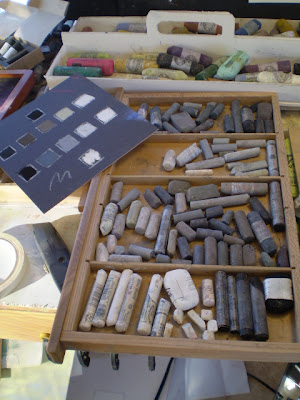


Re-organizing My Grays So They Are Not Double Stacked. Hard Pastel Grays Are Organized Elsewhere


Near Section - Blacks and Whites; Next - Warm Grays, by Value; Lastly - Cool Grays in Two Sections, by Value


4. Consider two types of thumbnail sketches in starting a work. One is just values, done in black and white. I often use a big, dull woodless graphite pencil for this on white sketch paper. The other is a color composition, where I try to work out most of the color ideas before hand. If I am being experimental, I may do a large sketch for colors, and just let myself go.

5. Do a gradient sky sometime using ultramarine, but actually mix the dark side with black! Try it with the black over the blue, just the opposite of the typical rules. You may be excited at the depth of sky you achieve.

Monday, February 25, 2008

Daily Pastel Bloggers

Barn, Still Under Snow


The number of bloggers who post daily pastels, or mostly so, has increased. I am not one of those, but I admire the movement and often wonder what makes these artists tick.

When time allows, I will expand these entries, with the artist's names, hometowns, shoe sizes, etc.

Friday, February 22, 2008

Five for Friday

Contaminate!

Poly Vinyl Acetate Sizing

Basic pastel tips:
  1. Contaminate the tip of a pastel stick with another color from your work and begin your marks with this. Any continuity of color throughout the picture plane is useful. Michael Chelsey Johnson recently alluded to color continuity when he posted about the "mother color" methods.
  2. Use PVA to cover areas with what is essentially a liquid "patch". It may save a work from the dustbin!
  3. I like to keep my harder, square pastels separate from my medium soft and soft pastels. I use the two and three drawer boxes offered at various retailers, such as the ones from from Dakota Pastels. They are noted as STORAGE ONE, TWO and THREE, respectively. (I tried to give this link to Daniel Smith, but their links always seem to break!) The main reasons for me trying to give it to them is that they are local to me, and I think that I have bought two of these boxes from DS. They tend to be the higher quality ones, and I have seen poor knock -offs of the same boxes elsewhere. I would trust DS or Dakota for these.
  4. While we're on the subject of organizing our palette, I also like to keep my grays in a different box. Much more about grays next Friday, when I can spiff up some photos and illustrations to go with.
  5. My method of handling dust that drops directly off the paper is to tilt my upright drawing board a little forward on the easel, and to place a piece of mat board under my drawing board. Further, I score the mat board and fold it slightly so as to make a trough out of it. I also tape the score cut with 2" clear tape to prevent build up in the cut and to make it last. Then, when the trough is a little full, I tip the "tailings" into a mason jar and save them to make new pastel sticks with.
Note that I've shrunk the tips project to five tips instead of ten and named it: "Five for Fridays". In the first several installments I will endeavor to make these my own personal tricks that I feel don't get exposure in other tips and techniques web pages, and that I use consistently myself. Many of them I have picked up at workshops, or stumbled upon somehow in my studio.

Tuesday, February 19, 2008

Schmincke Pastels


Schmincke
"MELIORA COGITO – I strive for the best".


This venerable and old German pigmentist offers the ultimate in soft pastels.
I consider them indispensable for my palette.

The collection is 400 colors, which are 80 hues, with 5 values of each. In addition, they field 5 pearl based sticks. A PDF color chart from the manufacturer is here.

I like their B,D,H,M,O logic, which is Black, Hue, and three tints of the hue. Easy to follow, really.


My own take is that the Schminckes are rather grayed up colors, but consistent as the day is long. They are large, soft and creamy. As a matter of considered opinion, they rate as the softest pastel sticks made.

One has to be thoughtful about the use of the softest pastel known to man. Effective for highlights, they will otherwise fill the tooth of your paper quicker than the "harder" brands.

I rely on their yellow spectrum, which is intense even in it's gray-yellow lights. That is saying something, since many yellows by other manufacturers can leave you wanting. Having trouble finding your proper olive greens? Look to Schmincke for those, too.

Saturday, February 16, 2008

Pastel International Visit

Croatia

Our visit around Europe, and the world, will take us now to Croatia. Consider Gligor Szadovski, whose abstract pastel drawings are intricate, organic and fascinating.

Again, if you are familiar with any pastel artist in Europe, I am very interested in seeing someone's work from the Scandinavian or the Baltic nations.

Wednesday, February 13, 2008

Tricks, Pastel Tips & Bits


If artists are essentially tricksters of the visible, here are some tricks I've pulled:
  1. If using non-sanded or lightly sanded paper, explore rubbing with tissue, chamois, or paper towels. You can get an area of dull color that creates some great surface "tension" or interest in the early stages of your work.
  2. Forget the rules about not using your fingers on the paper to blend. If you're shy about this, consider a work that you are about to abandon. Explore a little further and see what you can create; take some color risks.
  3. Put down some color with the side of a square, hard pastel and then brush over this with Turpenoid using a cheap, wide brush. There's your custom toned ground. Many papers may work for this. Test it first with a scrap. La Carte certainly won't take the liquid. Wet canvas had a thread about this, too.
  4. Place an arrow pointing in the direction of your light source just outside of your picture area.
  5. Place a bold color near, but not directly adjacent to, its compliment. Notice how it still can create a "pop", anyway.
  6. If you're stuck for a color composition, try a split compliment of three colors. Try red, yellow-green and blue green.
  7. Separate your intense greens from your regular greens for a while and put them in different storage trays.
  8. Allow some paper to show through somewhere in your image.
  9. Try a landscape where you use no green on the trees, shrubs or grasses. Make them violet, or blue instead.
  10. Dream about your next painting all night.

Tuesday, February 12, 2008

Wolf Kahn Project Outline


It may seem a little antithetical to create an outline for being "free and loose" in pastel drawings. Har, har! But, since yesterdays posts were well received, I felt some outlining of this project may be appreciated. Certainly, since I have so many projects running at the same time, here, and since I haven't set a strict period of time for this WK Project, it may be useful to provide an outline for this project.

Also, there may be one or two of you who will be wanting to follow along with your own drawings. If you want to post them, and if you let me know that you have, I will be happy to link to them.

Wolf Kahn Project Outline
  1. The actual mirroring of a Wolf Kahn drawing is not an intention, but the intention will be to free-up my own drawing style compared to now. Also my pastel painting style may loosen up, too.
  2. Personally, I wish to take more subject matter from nature during this project.
  3. New School Color will be a part of this process. Another way to put this is that color will be a key compositional element, if not the controlling element, in these drawings.
  4. I want to employ more of my abstract techniques at the same time, which are scrubbing, erasing, and rubbing.
  5. I want at least one drawing that I will frame and keep for myself.


Monday, February 11, 2008

Sniffing Exhaust

Ed Grimley was obsessed with Pat Sajak. Am I completely mental over Wolf Kahn?
"Give me a break..."

Recently I have been introduced
to Stumble Upon. The following review has been written about my art:
The landscapes are beautiful and the colorist also does some vibrant experimental art. He also has some notable avid fans. A fun blog to read.
I appreciate that, Chris. I never thought of the word "experimental" for my art, but I like it. That gives me the idea to try some things that I've been thinking about for quite a while. Another motivation has been thinking about artistic courage, which has been the subject at The Colorist lately. See Art Medal, and Jafabrit Wins Award.

This leads me to my latest project, which is a series of Wolf Kahn inspired pastel drawings. Now, you may be thinking, "Holy cow! Casey's whole ouvre is Wolf Kahn landscapes!" And you are right, of course. But, I have been focused on creating pastel landscapes that are influenced by Kahn's colorist oil paintings rather than his loose and scribbly pastel drawings. A number of other things separate me from the master's style.


But, recently I read a book on classical drawing where the student is to full-on copy masterworks. And, the man himself, Wolf Kahn, openly accepts that he will be copied, too.


So, I am embarking on a little experimental time where I am going to copy his drawing style and images until I feel ready to engage the style with original scenes. I want to get loose with my marks. I want to focus on the overall composition of the masses and create striking color sets, without a care for "perfection". WK is more "about" the landscape than my opaque landscapes are, I think. I want to explore that,
too.

The key is that these copies
are never for sale. I once did an art fair where a certain artist flat-out copied other artworks from postcards and whatnot. He did it
right there in front of God and everyone, and then put these large format oils up for sale. (It was an every weekend show, so we watched over time)

We other artists watched as patrons strolled in and bought up paintings of Mother Theresa and zoo tigers that had not a bit of originality or authenticity to them. Some of the artists complained, but the city chamber (the organizers) knuckled in to the artist. Apparently he was quoting some law that reads that art must be at least 30% "different" to qualify as original. Hello.


Anyway, in the land of professional artists, we don't sell our work that is copied for academic reasons, and we don't sell or compete with art that was produced in an academic setting.

Paper has been the subject of our latest inquiry into WK's pastel works. I went to the studio this A.M. looking for a Raffine Pad that I thought I had. Instead, I found a pad of 120 gm. Cartiera Magnani, from Italy. Good enough. Then, I went to work on the following drawing, after Wolf Kahn.


After Wolf Kahn, #1
9.5" x 6"
Pastel on Paper
Casey Klahn


Sunday, February 10, 2008

Paper Choice

Bell Tower
4.75" x 4.5"
Original Pastel on Sketch Paper
Casey Klahn

Readers are asking which paper Wolf Kahn uses, and especially since he has spoken against sanded papers. I doubt that WK would want to be known for proscribing any art materials or for any "rules" in art making. He tends towards the creative expression and loose side of the house, I think. My feeling is that he expresses his own methods and that's that.

Far be it from me to tell anything more than what I have seen or read about the master's materials. I did buy Diane Townsend's Wolf Kahn Terrages, which as far as I know is the only product he's ever endorsed. I did find the following vague reference to WK's paper choice.

This is the pastel that I worked on with Wolf Kahn because he is particularly fond of the gritty formula. He likes to break open the surface of a paper like Lana paper and work the color directly into the fibers of the paper.


Diane Townsend, reference.

You might recognize the Raffine product name, which derives from Lana, in France.
Raffine at Jerry's.

The pastels of Kahn's that I saw in NYC were wonderful. His very loose (scribbled) style is a foreshadowing of his layered approach to oils. Then, he finishes with electric colors that pop as only intense pastel sticks can do. Imagine a thatching of burnt umber, then a heavy line of Sennelier Ultramarine over the top. The paper that is made in the cold pressed manner (think: rough, versus hot pressed, which is like an ironed flat pair of pants) is appropriate to this style. You simply can't scribble into sanded paper very effectively.


In Process, One Gets an Idea of the Paper Hand

Here are some non-sanded papers that I like to use:

Rives BFK (offered in a heavy weight; sized)
Arches Cold Pressed

Saturday, February 9, 2008

Getting Started


Many readers find this blog in search of basic training in pastel work, but I'm afraid that's not a part of my portfolio. Although I wish to present pastel as not a difficult medium, I have a great deal of respect for the teaching of the great art form.

Add to the few resources on the internet for gaining your introduction to the ancient pastime this one by Katherine Tyrrell.

Friday, February 8, 2008

Unison Review


Perhaps the most consistent brand on the market are the ones made by Derek Hersey & company: Unison. Hand-made in the Northumberland area of England, these well formed pastels offer a full range of colors in two sizes, regular and large. They measure 2 1/8ths" long by 5/8ths" diameter (54 mm × 16 mm), or 2 3/4" x 5/8ths", respectively. My research has a "full set" being 390 sticks.

Our friends at Dakota Pastels rate Unisons as the fourth softest brand, under Schmincke, Great American, and Sennelier.


I definitely include Unisons in my own list of very soft pastels, but one always knows what one will get for handling: perfection. The flip side is the lack of very intense colors. I am more often surprised when a hue is intense. Some of the greens are, and the middle value red is fine. Lighter ultramarines are clear, but mostly they are valued for their grayness, in my opinion. More intense colors, for my part, are found with Diane Townsends or Senneliers. The review at Wet Canvas differs.

If you value the full range of expression with colors, from grayed-down to full chroma, you have a great start with Unisons. The brand has done a fine job of asking it's hues to remain true to base pigments, with little reliance on white. Hersey prefers blended hues, rather than the tint and tone route that creates thoroughness, but lacks a natural basis. I would say an artist who must refer to nature has a great ally in the Unison line.

As with most brands, they are boxed attractively in many types of sets, but I would beware of being too enamored of some sets if you are going to be a serious pastel artist. What I mean is, the landscape or portrait selections will be a selection made by someone whose choices may baffle you, and you'll buy a few of these (expensive) sets and be more or less stuck with colors you don't want, or repeats of many colors.


My advice is to get color sets, because you will enjoy the necessary ranges of values in a given hue. An economical way to get complete sets of colors may be to buy sets of half sticks (other brands, here), or try Terry Ludwig's Maggie Price Set which is a complete (more or less) set of hues, each hue having six values. Then, fill in with open stock.

The Red Corner work below relied heavily upon Unison greens for both the subtle greens in the foreground that counter-pose the intense reds, and also for the green highlights there. The number 2 Red Unison probably played a big part in this work, as well.

Red Corner
Pastel
Casey Klahn


See their well presented color charts online, beginning here.

The best blogger review of Unis is Katherine Tyrrell, and access to these reviews is best made by going to her Squidoo Lens, Pastels, and page down to reviews. She offers six reviews of her home brand at first, but page down and catch two more reviews of dark and light sets of Unisons.

Alistair Boddy-Evans, at About.com, also has much love for the Unis. See his interesting review of eight favorite brands here.


Hersey tells his story here.

I would like to highlight the delightful work of new blogger Carolyn Bannister, who posts some still life work done with Unisons here and here.


Monday, February 4, 2008

Romania


When I worked for REI in Seattle, I had the privilege of meeting many larger than life personalities. Not the least of which was a certain famous vampire.

There I was, minding the store, when I was approached (from my blind side) by a peculiar fellow of average height, and chiseled, handsome features. His black hair was shoulder length, but it was his voice that sent a shiver down my spine.

He said, "Can you help me?" I wasn't sure on that, but I did think privately how really, really well Bella Lugosi had nailed that accent. Uncanny. There before me stood the full-on personage of Count Dracula, or a darn good look-alike.

Turns out he wanted rock climbing gear, and the next thing you know we were trading lies like any other pair of climbers who
first meet. He was from Transylvania he said, and I asked him about the rock in the Carpathian Mountains. Granite, he said it was, and very clean at that. "Cool," I thought, "but I remember seeing that one movie of you scaling the castle wall upside down - that was creepy - and you didn't need any rock climbing gear then..."

All of this is just introduction to the next pastelist blogger I want to bring to you
: Adriana Capraru. She doesn't have anything to do with Dracula, as far as I know, but her nation of Romania is well known for him. I have watched her blog grow over the past year and it is a delight to read. Be aware, it is in French.


http://pastel-online.blogspot.com/