Monday, December 15, 2008

What If?


Ponte Vecchio in the Snow
4.5" x 4.75"
Original Pastel
Casey Klahn


What if you could toss it all in, and get "a life instead of a career?" Would you pull up stakes and move to Tuscan Italy - the most beautiful (civilized) place in the world? Eat hard breads dipped in olive oil, and sip table wine with no sulfates? Explore every art medium that caught your fancy, from pastels to oil; watercolors to etching?


Welcome Wreath
4.5" x 4.75"
Original Pastel
Casey Klahn

Our delightful friend, Robyn Sinclair, is an ex-pat from Australia who explores works on paper, and also oils, in the womb of art's birth, Northern Italy. Her blog is called, "Have Dogs, Will Travel". Go see her latest exploration, which is Etching & Aquatint, called Bird Woman of Venice. Her first (she claims) attempt at this time-honored medium turns out to be a keeper, and the bonus for you is that she details the whole process of copper-plate etching, complete with the application of lamp black.

Thursday, December 11, 2008

Astrid Volquardsen - Artistic Direction

Astrid Volquardsen:

Dear Casey, thanks for the opportunity to give me some of your space to tell about myself and my work. I just thought the other day, how great it is, to read all these different blogs. To have a look at what's going on somewhere else. For me, it was a
great relief to find out that there is a whole bunch of people who favor the same kind of art. It makes it much easier to keep up your self-esteem, to be authentic in your work and persevere in your darkest hour. I think you know what I mean.

Astrid's interview continues...

Materials

After experimenting a lot with different kind of pastel grounds I now stick with Sennelier pastel card. Its sanded surface suits my needs very well. I do a lot of blending with my hands especially on the first layers, so I need soft pastels. There again it is Sennelier Pastels à l'écu . I love their luminosity and wide impressionistic orientated color range. Some artists criticize that they easily crumble. Well, in the end all pastels crumble and I just simply don't care, if they supply me with the colors I need. In addition I use Unisons and Girault for details.

Abends am Amrumtief
10 x 30.4 inch
Soft Pastel
© Astrid Volquardsen


While at the shore, I take pictures, do sketches and if there is time and the weather is O.K., I paint plein air. At the shore, this isn't always easy. Often I have to secure my easel or otherwise it will be blown away by the strong wind.

Most of my work is painted in my studio. Usually I work with a lot of layers and constant blending, adding a new layer and taking away parts of that layer. This method I use especially for the waves as you can see in the picture.

Detail of the wave of 'Abends am Amrumtief'

© Astrid Volquardsen


Artistic Direction

To capture light is the most important aspect for me. It's not so much about color, but always about light. In the last years my focus was on maritime landscapes and I love to paint in a small format.

Vor dem Regen
5.2 x 8.4 inch
Soft Pastel
© Astrid Volquardsen


To capture the wide open spaces at the seashore in miniature is something I really love to do, even though I do have larger formats as well. Right now I'm preparing a new exhibition in Mai on the Frisian Islands (Föhr) and have reached the point where all is in doubt. I love my seascapes, but I have the need and feeling to move on to something completely different. So in the future, I think, I will turn to more figurative work. Some sketches are already on my studio wall.

If you would like to have a look at my pastels on my website, on my homepage www.pastellbilder.de you have to click on “Werk-Reihen”, and then just click on the image.

Or you go to my blog, Pastell Blog, if you scroll down or look at the older posts you might get a further impression of my work.


Tuesday, December 9, 2008

Astrid Volquardsen

Astrid Volquardsen at the shore of Föhr

Pastellbilder-Pastell Blog

Astrid Volquardsen:

I live in the north of Germany in a small village called Bardowick, which is near Hamburg, where I grew up. Hamburg itself is a large city with a maritime touch and I recall many hours spent with my dad down at the harbor or taking trips to the North Sea with my family. So, it was a logical thing to focus on maritime landscapes, because that's where my heart lies and my soul is at peace.


State of pastel art in Germany


I started with pastels 20 years ago when I participated in a life drawing class. I just loved the way I could quickly fill in color. Immediately I fell in love with pastels and no other medium has had the same effect on me ever since.

For reasons I really don't know, pastels don't have a very high reputation in Germany. It's has not been considered to be "high art" by art colleges or galleries, but I didn't care and stuck to it anyway.

I think this has something to do with authenticity-about which you wrote in your blog, Casey. (You said) to listen to your inner-self and follow that path.

Back then I just knew this material was the perfect fit for myself, my art and what I would like to do and tried to not to listen too much to what my college teachers said about it. (College teachers still do not speak very nicely about pastels.)

To make it worse, realism might lead to a very lonely road, even though its getting better.

Pastels are still not widely known or as popular as watercolor or acrylic and there are only a few pastel artist in Germany. Gallery owners frequently told me: "I like your what?.... Pastels?...., but do you paint in oils?" After I heard that a couple of times, I started to educate the buying public and gallery owners, which actually is quite a lot of fun and a welcome change after lonely hours in my studio.

Two years ago I started to promote the pastels of Sennelier (I mostly paint with that brand). We have a widespread art supply store, which has branches all over Germany. There, I give speeches and do demonstrations of what is generally possible with pastels. I cover aspects like the different kind of pastel brands and grounds and how pastels can be applied. I show examples of American pastelists and people are really amazed at the possibilities. In addition, I point out to various websites and in the future I will highlight some blogs. Recently I started a blog and I have my own Website.

The funny thing about blogging is, that again, it's not that widely known and accepted in Germany as it is in America. I haven't hardly found any good blogs of German artist and they don't leave their comments as you guys do in America. Some artist have started to blog in German and English, but right now I don't know about that. I like to reach my German audience, so I try to figure out, how I can take away their shyness. But all these efforts have shown effects and I get emails from many people, who feel encouraged to use pastels. And I have found galleries who like my work and haven't asked me so far, if I paint in oils.


Sturmtag
11.6 x 30 inch
Soft Pastel
© Astrid Volquardsen


Casey Klahn:

I think Astrid's outlook is that of a pioneer for contemporary pastels in Germany. Her positive attitude is evident in the vast scope and beauty of her landscapes. She has that urge to create with her medium, with faith that the public will follow her vision. I know that the work being done in other countries to promote pastel will eventually create a sudden and rewarding market in Germany, and Astrid at the forefront.


Who are some artists that inspire you that use pastels?


Astrid Volquardsen
:

I can't say that there is just one pastel artist, who inspires me. When I was in England 15 years ago, (there was no Amazon.com so far :-), I run across a pastel instruction book. The pictures of Sally Strand left a great impression on me. This impression was so big, I still can recall the look of this tiny book shop. My remaining time in London I didn't spend with sightseeing, but in search of bookshops with painting instruction books or anything that had to do with pastels. The customs officer at Heathrow must have thought that I had gone mad, when he saw my suitcase, packed with books!Realism in art hasn't had a very high prestige and there in this book shop, I saw what I always wanted to do and paint. Realistic looking pastel pictures.

I love Sally Strand for the way she paints light and keeps to the values. It always amazes me.

Another painter I highly admire is the French pastelist Claude Texier. Again, all her paintings are about light and luminosity.

Then there is Daniel Greene and Gwenneth Barth. How can someone possibly paint these portraits and capture the likeness and even one's personality? I had the pleasure to watch Gwenneth Barth during a demonstration in Paris last year. It was very interesting for me to see, how she builds up the layers of pastel. Like Daniel Greene she blends only with the pastel sticks. That's something I would like to add to my work.

In Margaret Dyers work I love the way she uses the colors and her loose pastel strokes. From Wolf Kahn and your pictures Casey, I feel inspired by the way you both use color and are finding color combinations that seem to be so easily found.

So from all these artist, I take bits and pieces and all this flows into my work now or maybe in the future.


Interview to be continued in the next post.

Friday, December 5, 2008

Interview with Astrid

Astrid Volquardsen at the shore of Föhr, Germany.


On Monday I will post my exclusive interview with German marine artist, Astrid Volquardsen.

Monday, December 1, 2008

Van Gogh's Nights at the MoMA


My friend, artist and Wordpress blogger Brian McGurgan, agreed to write a post for us with his review of the current van Gogh exhibit at the MoMA.


Van Gogh and the Colors of the Night

By Brian McGurgan

awe, energy, and wonderment


The Museum of Modern Art (MoMA) in New York City has a special exhibit on display through January 5th, 2009 called Van Gogh and the Colors of the Night that is well worth a visit. The show has an intimate feel to it and, although relatively small in scale, requires that you have some time to spare since tickets are given out that allow
entry at specific times in order to control the flow of visitors. I went on a Friday evening after work when the MoMA offers free admission and evening hours until 8pm but was told that all tickets for the special exhibit had already been given out. My only hope for getting in was to return to the exhibit entry point at 7pm and wait on the “standby” line. Fortunately, I was able to get in and see the show and I didn’t mind too much having to wander about the museum’s other galleries until the standby line was formed.


“…I got up in the night to look at the landscape – never, never has nature appeared so touching and sensitive to me.”


A very nice aspect of the exhibit is that it gives full focus to an interest of van Gogh’s that spanned his entire short career as a painter without delving into the decline in his mental health and the dismal drama that surrounded much of his final years. A
visitor to the show knowing nothing about van Gogh’s biography would have come away with only the slightest awareness of his time spent in hospital, but would certainly have understood the depth and sensitivity of his reflection on themes of nighttime. This fascination is expressed, not just in the display of some of his most prolific paintings, but in excerpts of letters and sketches sent to his brother Theo and to other family members and friends. In words from a letter that effectively summarize the feel of much of the exhibit, van Gogh states, “…I got up in the night to look at the landscape – never, never has nature appeared so touching and sensitive to me.”


The Potato Eaters
1885
Vincent van Gogh


Van Gogh’s experience of the night was aesthetic – he appreciated the depth of color and the effect of natural and artificial light that nighttime provided – but also emotional and spiritual. He found the night awe-inspiring and a time of solace and inspiration. At the same time, he was not immune to the sense of loneliness and despair that are also too often a part of the human experience of nighttime. While paintings like his famous “The Potato Eaters” (1885) expresses the appreciation van Gogh had for hard-working peasants coming together at the end of a long day of labor, there is also an inescapable sense of disconnect and emptiness in the eyes of his subjects. The feeling of despair and alienation is stronger still in “The Night Café” (1888). Still, one comes away from the exhibit with a stronger feeling for the beauty van Gogh saw in the landscape and towns at night.


The Night Cafe
1888
VVG


The highlights of the show for me included “Landscape with a Stack of Peat and Farmhouses” (1883) for the rich earth tones, including warm browns and grays in the sky and reflections in water, and "Sunset at Montmartre" (1887), for the beautiful, muted blue and green earth tones and simple composition. Van Gogh used a softer approach in these works than in some of his better known pieces
, with less distinct brushstrokes and richly colored neutrals. "The Starry Night Over the Rhone" (1888) was another favorite. Here, the short, wide and mostly straight brushstrokes contrast strongly with the swirling motion of the more famous "The Starry Night". The patches of color formed by these brushstrokes suggest a different kind of movement, giving more of a pulsating, shimmering effect. The limited palette of cooler blues and yellows against deep indigo and cobalt provide a richness that rewards a long viewing of the painting, and the suggestion of the Milky Way expressed in strokes of lighter blue against the darker sky is especially satisfying.


Starry Night Over the Rhone
1888
VVG


The Starry Night (1889) is the final major work on display in the exhibit. Since it is part of the MoMA’s permanent collection, I’ve seen it numerous times – and usually with much less of a crowd gathered around it. I was struck by how well the painting leads the viewer's eyes through the swirling patterns in the sky, down to the little village at the bottom of the canvas, up the cypress trunk and back up into the sky. The hills and forest seem to undulate like rolling waves. The biggest surprise for me each time I see "The Starry Night" is the extensive use of greens, including a dark cool green in the cypress tree and light cool yellow greens in the sky in addition to the ultramarines, blue-greens, and yellows that dominate the canvas. There’s none of the sadness of Don McLean’s famous “Starry, Starry Night” here – only a sense of awe, energy, and wonderment. While van Gogh’s brushwork is certainly vigorous and coarse at times, and his color sense can seem crude in his less successful paintings, the results are truly stunning when his brushwork and color best come together.
"The Starry Night" is, to my mind, the strongest example of this and his greatest achievement.


Landscape with a Stack of Peat and Farmhouses
1883
VVG


If you don’t live near New York and aren’t able to visit, don’t despair. The MoMA has published a very nice catalog to compliment the exhibit and this can be purchased in bookstores or online. The book contains many more examples of van Gogh’s nighttime drawings and paintings then are included in the actual show, and it also provides a historical context for paintings of night with a particular focus on artists like Rembrandt and Millet whose work was an inspiration to van Gogh. I bought the book online several weeks before visiting the exhibit, which allowed an opportunity to “study up” on the works I expected to see. I highly recommend this strategy when visiting a major exhibit – especially for those of us who found that art history classes back in school had a seductive, sleep-inducing quality about them. And if you plan to visit New York in the future but before the show closes in early January, stop by the MoMA anyway to see "The Starry Night", and to the Metropolitan Museum of Art to view the dozen or so paintings by van Gogh on permanent display there.


The Starry Night
1889
Vincent van Gogh


Colors of the Night pdf. checklist at MoNA - includes the Sunset at Montemarte image that Brian mentions.

Take the Virtual Tour.


Van Gogh and the Colors of the Night

Wednesday, October 8, 2008

Pastel Apples

Red Apple on White
Pastel & Charcoal on Printer Paper
7" x 7"
Casey Klahn


Apple in Violet on Gray
Pastel & Charcoal on La Carte
9.5" x 10.5"
Casey Klahn


These apple studies are preparation for the drawing class I'll be teaching soon. I'll be live blogging some of it, hopefully. I can't remember ever doing this exercise before. It is a lot of fun!

Friday, October 3, 2008

Artist's Traits

The artist's traits study at my blog, The Colorist, is my Friday tip for pastelists. We've studied Commitment, but who knew that Courage would take four posts to complete? Pour a cup of Joe to go with that milk, and enjoy the read.

Friday, September 26, 2008

Drawing

Ponte Vecchio - Old City
@7" x 6"
Graphite on 70gr. Sketch Paper
Casey Klahn


Under Riva Ridge, Italy
@8" x 5"
Charcoal
Casey Klahn


View my complete body of drawings at Pastel.

At The Colorist, I also have a collection of drawings.


The Portal
4.75" x 4.5"
Graphite
Scene at "Riva Ridge," Italy
Casey Klahn


Lake Garda Alley
@4" x 3.75"
Pastel
Casey Klahn

See all of my drawings at The Colorist.

Tuesday, September 23, 2008

Drawing Class

Bald Ridge, Pencil & Pastel
5" x 8"
Sketch Paper
Casey Klahn

If you have been faithfully waiting for the next posts at Pastel, thank you. I have been so busy with things (son's birthday; school starts; you-name-it) that I suddenly looked at the blog dashboard and realized that I hadn't posted here for over a week!

Some News:

I will soon have a great follow-up on the Brian McGurgan Abandoned Barn posted here, and the fast-action in blog posting is happening at The Colorist, where I am looking at my goals and artist's traits.

I am writing my lesson plans for the upcoming basic drawing class that I will be teaching in Davenport, Washington. Since it's a new endeavor, and I value teaching, I am putting forth a lot of effort to have a good plan. I do have a couple of paintings on the easel, but overall things are slow in the studio. Some times are just for studying, I guess.

Friday, September 12, 2008

The Last Cow Discovered?


My ignorance of the beautiful French language is on display in this post. To me, "Lascaux" sounds like "Last Cow". And, indeed the Caves at Lascaux do feature some cows - among the first known cow paintings. Perhaps the French should have called the place "First Cow".

Be that as it may, today is the anniversary of the discovery of the caves, on September 12th, 1940, by a dog and his entourage of four boys.
Pre-historic art, so called, is an endless source of fascination to the artist. Was the early artist a "magician" or "shaman", because of his inexplicable ability to represent the natural world by drawing? There are early man paintings in my own area, and what little kid wouldn't wish to be the first to discover a rock wall covered with something like that?

As I prepare to teach an upcoming class on drawing, I am asking myself many questions about the activity of drawing. Is it "magic", or in other words, reserved for a special person, or type of person? Or is drawing available to anyone?

Matisse, who is the subject of my current studies at The Colorist, has said that a drawing must "be decisive!" Does he mean decisive like in the use of the double envelopment (also first displayed on this day at the Battle of Marathon, in 490 B.C.) ? Or, does he mean to make marks with authority, and not tentatively or weakly?

So, today instead of Five answers for Friday, I have put these questions to my kind readers. What are your feelings about drawing, and how it should be taught?


Note: I want to give credit where credit is due. The earliest evidences of art, although muddled in with functional and craft objects, are actually ceramics, and not drawings or paintings. This could be due to archival reasons, but there you have it. Of some comfort to the pride of the painter, the earliest known art object may be a Venus figurine painted with Red Ochre.

Friday, September 5, 2008

What Are Your Subjects?

My Subjects -
Trees in the Field


Rural Buildings


Conifers and Color Fields


It was interesting to see a great pastel artist list his focus on a narrow range of subjects in a book I read recently. The book is a dated one by Albert Handell, Pastel Painting Workshop. He likes the Southwestern landscape with arroyos and pueblo-style structures. He does trees, rock boulders and waterways. In his figurative work, he likes vignettes and portraits.

Why be narrow in subject matter?

It is good to be aware of what your subject matter is before you go off to the field to paint on site. Why be narrow in subject matter? My own feelings are that you may delve into a subject as deeply as you wish, and may never run out of inspiration. If your goal is to "draw things", then you may wish to pursue every possible subject one after the other. But, if you are wanting to produce paintings with depth and with good technique, then limiting yourself to a handful of subjects will provide you a greater opportunity for depth.

Limiting your subject matter will put you in good company.


Limiting your subject matter will put you in good company. Van Gogh stayed with agricultural landscapes in France that revolved around trees, waterways, fields, buildings and bridges. He did portraits and still lifes, but he stayed with common themes. Degas stayed with interior and theatrical figures, such as orchestras, singers and ballerinas. He did nudes at the bath. He also liked the horse track, and some industrial interiors. Daniel Greene stays with the portrait, but in his figurative work he focuses on painting his wife, artist Wende Caporale, in the New York subway with tile mosaic backgrounds. Of course, he does other works, but his series work is a method of staying focused. Harvey Dinnerstein does self portraits where he is painting bare chested, and Andrew Wyeth stayed on the Helga series for a number of years. His Helga series kept true to his own ouevre of rural interiors and moods.

Limiting my subject matter helps tremendously in finding compositions


My own oeuvre features conifers in a forest setting with color bands, trees in the field, and farm buildings. I recently have added deciduous trees and the figure to my interests. Making brief appearances in my art are clouds, skies and waterways. Limiting my subject matter helps tremendously in finding compositions when I go outdoors to paint. My next target is a neighbors farm outbuilding that one looks up to , and it has a stunning backdrop where the draw bends away and down in the background.

Thursday, September 4, 2008

Color Thumbs


Unison soft pastel on Cartiera Magnani Velata paper (cream tone, 4″ x 4″ squares), August 2008.

Brian McGurgan


"Colour and I are one. I am a painter."
Paul Klee, 1914. Reference.

Brian McGurgan's color thumbs for our Abandoned Barn Project diverge quite well from my own. He had an early goal of working with neutrals and browns, and I salute his idea of having a color theory from the very beginning of a project. It's always best to have a color plan, or else the colors may get away from you and you'll wander aimlessly trying to resolve your color composition.

Let's review our browns. I think of Umber, Sienna, and Ochre when I think of brown. See a list of browns here. I omit Sepia, which is derived from the ink sac of the Cuttlefish, rather than from minerals. The family of browns based around iron oxides is called earth pigments.

When my mother washed my diapers in a river fed by iron springs, they took on a red color.

Umber, with it's iron oxide component, may have a red field to it. When my mother washed my diapers in a river fed by iron springs, they took on a red color. Vermeer liked his Umber. One may find an Umber with a green cast, however.

Here is the yellow opinion of Burnt Umber. Confused? Maybe the Real Color Wheel people in that link take a systems approach to color. Otherwise one takes the pigment source of the color and arrives at Umber, which is reddened by iron and manganese.

Divide your Siennas into the Burnt Sienna (red) and the Raw Sienna (yellow) categories.
Van Gogh valued Sienna.

Ochre is a light yellow brown and probably my favorite of the earth colors. Etymology: ὠχρός (Greek for yellow). I also favor the Brown Ochre made from Goethite, originally used at Lascaux.

Olives are seen by many to be in the brown category, but I arrange mine with the rest of my greens.

Did you know that browns have compliments, too?

Did you know that browns have compliments, too? I have my browns divided very basically into two sections in my palette, those with a yellow field and those more reddish. If you were to put an undertoned ground of green beneath your red-field browns a "pop" will occur. In other words, I would tell Brian in this phase of our project to think about sets of colors or relationships when approaching color ideas for this painting. I often think of a triadic relationship, like red, violet and blue or violet, yellow and green.
Perhaps, for these neutral compositions, one might think of a reddish brown, an olive green, and a violet.

Too strict of an understanding of the color wheel may make you think that intensity ought to be lacking in the brown colors. After all, there is no brown on the outer ring of the typical color wheel, and so an artist may conclude that brown is merely the result of mixing two compliments. Actually, there are many very powerful and intense browns available to the pastel artist. I look to my Unisons for these, but others exist, too. The reason they can be intense should be obvious: they are derived from earth minerals, which become pigments. The purer the pigment, the greater the opportunity for color intensity. Having said that, keep in mind that many earth pigments are no longer made with the original materials, but are artificially or chemically produced, or mixed.

Other earth pigments include Venetian Red, Sinopia, Caput Mortuum, Olive Green and Green Earth, White and Black.

Via Handprint, here is a chart of watercolor earth pigments in a chart form.

Last revised 08.01.2005 • © 2005 Bruce MacEvoy


Further Study:

Leonardo da Vinci was a great one for his earth colors.
Also, don't forget Rembrandt.
Thanks to Marion Boddy-Evans.

Also:

Yellow Ochre.
Brown Ochre.
Umber.

Friday, August 29, 2008

Draw Five

Olive Trees & Paint
May 2008
Pigment Wash, Charcoal & Pastel
On Diane Townsend Paper
21.5" x 14"
Casey Klahn


Drawing has absorbed much of my attention lately. Many of my recent artworks are drawing-based, as opposed to images that I begin with pastel sticks in large masses of color. I'm using charcoal and pencils again.

At The Colorist, my drawings are gathered under one label here. See the My Drawings label here at Pastel.

Let's explore drawing theories in this Five for Friday post.
  1. I don't seek so much to draw things as I do to make a drawing.
  2. Gather a collection of your own drawings that are framed or cropped somehow. How much negative space did you use?
  3. My best advice for laying out a drawing is to just begin it, and work outward. For this, you need a big sheet of paper.
  4. Don't erase anything, unless it's to add to the drawing.
  5. Proportions are for draftsmen. You are an artist. Think: "will following the rules of proportion enhance my drawing, or sidetrack me instead?"

Tuesday, August 26, 2008

Color Studies


This is the promised color study part of our Abandoned Barn Series workshop. We looked at black and white thumbs already.

These images were scanned, printed and then noted with pastels.

Several color thoughts have been presented here. So far, I am favoring the last one, and I want to massage it some more.

Friday, August 22, 2008

Compositions Advanced


The Abandoned Barn Study has been a goldmine for me in the analysis of composition. I thank Brian McGurgan for giving me that opportunity. The study has led us to look at things like lines that lead us around, into and out of our picture plane, the weight of masses, and the plastic element called "push-pull" by Modernists. See Hans Hoffman.

Hoffman declared the reign of "one point" perspective (linear composition) to be over. He proposed color, light and shape as elements that not only lead into a picture, but also push back out of the plane. Ready for some interactive fun? Go here for a color puzzle illustrating Hoffman's Push-Pull Spatial Theories.

Add Hoffman's theory to your linear perspective rules. Now, understand the application of lines, intervals, colors, values and other elements in the picture plane to lead the viewer's eye where you want it to go. If the sky is "heavy" with darker values, the eye will feel it's "weight" pushing the picture elements down.

Let's have a look at some examples from my own drawings. Do you think in color when you draw with pencil or charcoal? If you are a painter, you should. It will effect the outcome of your gray scale drawing. Maybe this will become evident as you look at this combination of both colored and black & white drawings. Again, we're using a definition of a drawing as a picture leaving some ground/paper showing.


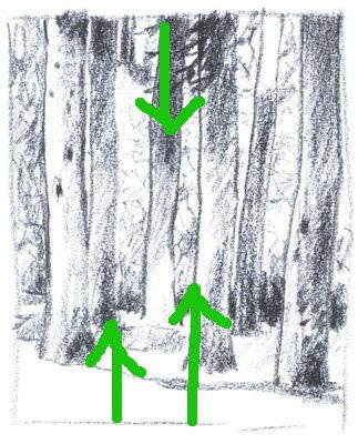
Forest Study, 6" x 5", Charcoal
Casey Klahn


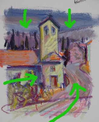
Bell Tower, 4.75" x 4.5", Original Pastel
Casey Klahn


Behind the Garage, 7" x 8.5", Graphite on Sketch Paper
Casey Klahn


After Wolf Kahn#1, @ 8" x 6, Pastel on Sketch Paper
Casey Klahn


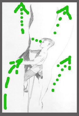
Lead Climber, 11" x 6.75", Graphite on Paper
Casey Klahn
The Portal, 4.75" x 4.5", Graphite
Casey Klahn

Now, look at my analysis of how sometimes linear, and sometimes values or colors push the viewer's eye around the picture plane.


Dark foliage pushes down; light foreground pushes up.


Dark value sky colors push down; light foreground pushes up and various lines lead in.
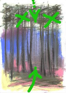
Blue (cool) recedes; pinks, yellows, oranges and violets are warm and proceed to the front.


It was tempting to make the winter sky dark, and the shingle roof dark as well. Instead, I remebered the push-pull theory and helped the eye heavenward with lines, mass weights and open, light values in the sky. Part of the roof was left light. Diagonal lines lead in from the left, and various vertical and spiraling lines disrupt and stop you inside the picture plane. They help to lead your eye upward. Notice that the interval of sky need not be large, because so much help is offered by the push-pull methods - this allowed me to keep the garage big and prominent.


This was directly copied from Wolf Kahn when I did a study of the contemporary master. Interestingly, the light foreground, with open lines lead in, and the hatched tangle in the upper area serve to catch the eye - partly stopping and only pushing down gently.


The environment of vertical rock is hard for the flat lander to visually process, so understand that here we have a lead climber on a vertical cliff that begins to overhang above him. He is intently focused on the rock before him, scrutinizing his next options. Don't get dizzy!
Our climber has more interval overhead than below, and yet he still gives the impression of being high off the ground. The lines opening up, and the simplicity and lack of detail help this effect.


Here is the most complex drawing shown as far as perspective is concerned. Obvious lines lead one into the picture and downhill along the path, then through the portal in the tangle, and then across the void, or canyon, and up the rock cliff. Important roof lines also bring the eye in from the left.
The "bending" viewpoint is a curvilinear perspective. In this drawing, I have offered a type of curvilinear perspective. My brain hurts, now. Reference here.
There is an interesting story that goes with this image, referenced here.