Showing posts with label Huechroval. Show all posts

Saturday, February 28, 2009

Which Pastels?

Bright Trees Through
@ 8" x 5.5"
Pastel
Casey Klahn


Occasionally I get questions from my readers, and I answer all of them. The questions that I received from a Canadian reader this week were specific enough that I think it worth sharing my answers.

From Patricia Vesely:
Hi Casey

I am an avid fan of your website - each painting posted is more awesome than the last! I am also impressed by the professionalism and the organization of your blog.
The information I have noted there is very valuable to me, being a relative newcomer to pastels and having not done anything artsy for years.
Now I must purchase new pastel colors - I wonder if you could post the names of some of the Experimental Colors?
I like the way you are able to switch, for instance, from a somber palette one painting (Tree on a rock Bed) to a more intense/vibrant palette like WK's pinks and greens.
Do you select a palette before beginning then stick to those particular colors, or do you select them as you go along?
Thanks for all you share.
pv

Thanks for the kind comments, Patricia, and also for the questions.

hard pastels to begin with...


I would say that one should not overlook getting a set of hard pastels to begin with. They can and do contain vibrant, intense colors, and also the muted earth tones you'll want for some paintings. Not to mention that they are easier to work with.

That being said, we all desire the luscious soft pastels and could blow $10,000 on them and still not have all the available ones on the market!
To solve that problem, get hold of the Multi-Brand Color Chart, from the publisher Huechroval.

...then buy open stock


Using this book will help prevent expensive redundant buying, which can happen when you buy pastel sets and find that some sticks are repeats. I would say to target wisely the set that you want to get started with, and then buy open stock, using a color chart for a guide. I also keep a file of each brand of pastel that I use, with either a printed proprietary color chart, or a hand made one which I get from Dakota Pastels.

Now, to the specifics of which pastels I use. Here is the image, again.
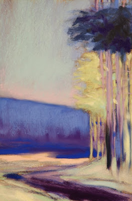


I recall using hard pastels to indicate the tree trunks, the muted ultramarine of the sky, and the muted yellows in the tree canopy that is behind. The brand I favor is Sakura, which isn't available anymore in the US. Lucky you, Patricia, because I think all of the Commonwealth nations do have these yummy hard pastels available. They are Japanese made, and I particularly like the way they are embossed with numbers for easy reference.

the grand champions of intense pinks


While on the sky, the pink is by Sennelier, who are the grand champions of intense pinks.

All of the darks are from my favorite maker, Diane Townsend. I would say most of the other colors, including the intense blue of the mid ground, are DTs.

The pale greens in the tree foliage remind me of the buttery soft Schmincke brand. Probably if I were to repeat this image, that's what I would reach for here.

There I was...


As for the process and selecting my palette, I recall that this painting was formulated during one of those wakeful nights where I was thinking of art at bedtime. The picture of bright trees behind was invented this way, and I recall wanting them to be high key yellow-greens. The perfect compliment (in my opinion) to the greens is pink, and the compliment that speaks to me for yellow is ultramarine blue. Of course, the theoretical compliment to yellow is violet, but my eye wanted blue.

There I was, with a violet background set of hills, and it wasn't right. Did I reach for a hue for resolution? No - that's not my method. I prefer the color attribute of intensity above all else. And, when addressing my palette, I keep a mental checklist of which sticks present which intensity. The blue that I chose for this job is a jumbo Sennelier - the only stick that would make this mark and the first one that I think of for intense blues.

selection, then resolution


I am afraid to say that for that stick, you would need a time machine, for the French proprietors, in their infinite wisdom, have discontinued that size. They do offer the "La Grande" size, but the experience isn't the same and neither are the marks.

In review, the palette selection is an idea for one, then two and often three colors in a composition, but then resolution always becomes a major factor in completing a work. The decisions are responses and they are often based on criteria that is surprising, such as the brand and the behavior of a particular stick.

For more posts on pastel brands, see my label, Pastel Brands Review.

Tuesday, July 8, 2008

Purple Pastel Secrets

Diane Townsend 12 Purples&Violets; Unison Open Stock and the Uber Chart for Colors.


The new book, Multi-Brand Color Chart, from the publisher Huechroval, has certainly been a fun and fascinating tool for me to use in my search for more purples. My last post described my need for the blue side of purple, and concluded with my purchase of a set of Diane Townsends.

There is a secret reason
for my choices.


What about open stock, or individual sticks purchased separately? The search for these, using Marie Meyer's new book, was a delight and I was able to establish which purple pastels I wanted. There is a secret reason for my choices. More on that later.

The demo of the book was a great success. I didn't need to labor long in my search, and the answers were quick and efficient. It helps to have a particular brand in mind if you want to fast-track your solution, as I was able to do by selecting Diane Townsends for the set, and Unisons for Open Stock.

My local art store is currently selling Unisons in OS at a discount, and so I went with my shopping list, and the color chart under my arm, and efficiently found my purples.

In the future, I may wish to select from another brand using the
Huechroval charts. But then, I think the choice will rely on my knowledge of the feel and texture of the brand's sticks. Do I want a block-in pastel that tends to be harder? Perhaps I'll choose Windsor & Newton.

...found my purples.

About that secret reason for my hue choices. I had such a blanket need for the blue-purples that I was essentially starting from scratch. That drove me to start with the highest intensity sticks of my particular choices, and if you look for those in the MBCC book, you find a swatch with a nomenclature and a black frame, but no color illustrated - blank space! The reason is that these spaces represent a color populated by pigments, or pastels, but unavailable via the CMYK color space. Now, you know I had to buy those!

File this under "trivia". The color purple has its own domain name.

Wednesday, July 2, 2008

Hue, Chroma & Value Chart

Huechroval, Publisher.
"Build Your Collection by Design, Not Accident."

Marie Meyer's new book
,
Multi-Brand Color Chart for Pastels, is the tool-of-choice for serious pastelists looking to fill out their palette in the smartest possible way.

Because my recent works have featured a green and purple composition, I found myself short on the cooler purples. Maybe I have been raiding the studio palette for my outdoor kits. Also, I have a very large assortment of handmade purples that I got at a Kitty Wallis workshop. They tend towards the red field of the purple hue, and many of these have pearlescence in them.

Here was my opportunity to put the new Huechroval pastel book through a practical test.

So, the need for a goodly number of purples was identified. As you may know, my palette tray is a large, self made shallow wooden box that holds my main collection of colors. See this post about it's design. Here was my opportunity to put the new Huechroval pastel book through a practical test.

The Test:

To begin with, I decided to stock up with my favorite brand, Diane Townsends. And, I have been leaning towards the Soft Forms rather than the Terrages, which I already have a big collection of. I pulled my file of Diane Townsend information to see what my color chart records said. Uh oh! It turned out that I only had the color chart for
Terrages, but not for the regular-sized Soft Forms.

Well, the first thing to do was to order the hand made color chart for Soft Forms from Dakota. While there, I made an order of paper and found out that the DT pastels I wanted were on sale.


But, which colors to buy? Lacking the chart, I went to the shopping page at Dakota for Soft Forms and printed the list. Then, I consulted the Diane Townsend site and found some sets pictured. I printed out a few that had the purples I liked. Those will look nice in my file folder, too. Still at a loss, I realized that I had in my possession the most
comprehensive color chart of pastel stock available in the USA, Multi-Brand Color Chart for Pastels.

The book utilizes a 100 hue color wheel, and each hue is given a number rather than a name...I wanted blue dominant purples.

The book utilizes a 100 hue color wheel, and each hue is given a number rather than a name. The purple field I want is numbered around 75-80. Now you turn to the pages that cover these hues and eye-ball the ones you want. I wanted blue dominant purples.


The book will have a swatch, which is a little square, usually with the color represented and a numeric identity. The thing to do, then, is to see the facing page of data that lists the color and also which pastel sticks inhabit that color square. The brand name is abbreviated, and identified by the nomenclature that the brand uses.

While each page in the chart represents a hue, each square is perceptually a uniform distance from its neighbor and therefore a new hue. Then, the horizontal axis represents intensity and the vertical represents value.

Guess what I did? After I identified the colors I wanted, instead of open stock I ordered the set of violets and purples that was on the sale. I can use that as the nucleus of my new collection of purples, and fill in from open stock next time!


Next Post:

See the scrumptious new set of DT purples and Violets, and my open stock pursuit of purples!


Thursday, June 26, 2008

Dominant Yellow


Yellow Gesture
18" x 11"
Pastel
Casey Klahn
CTA


The image above, Yellow Gesture, was made using a DianeTownsend Thin Lines yellow that Diane handed to me at her workshop. Her creator's pride in this particular yellow is well founded. Marie Meyer at Huechroval has made a fascinating yellow on black test which gives a great illustration of color strength comparison (coverage). Guess whose yellow pastel came out the strongest?


24 Yellows


My review of using the new book, Multi-Brand Color Chart for Pastels, will follow in the next couple of posts.