Showing posts with label Tips. Show all posts

Sunday, August 11, 2013

Ocean Shores 1 Day


There were 9 artists in attendance.  I taught technique, and had an interesting closing question from Roy.  He wanted me to state 5 key tips for the beginner pastellist.  Here is what I said:

1. Peel the paper off most of your sticks, and put them all in a tray.  In other words, get them out of the foam box and into a studio palette system.

2. Find a paper you like and stay with it a while. 

3. Use artist's grade tools.

4. Find out what your ideas are and develop those in your work.  The truth is available for an artist of any skill level to tell.

5. Line up several of your artworks and write down 25 observations about them.  This will help you understand what it is you have been doing, what your ideas are, and what makes your work unique.

I couldn't help going to process solutions because I like to focus on what makes fine art fine.  

But, I want to have a technique-focused answer that's less esoteric.  With more thought, I might replace 4 and 5 with the following:

4. Learn how to handle your values and to blend colors.  We spent a good deal of out time on this in the 1 day workshop.

5. Work from good drawings that you have done.  

Sunday, July 1, 2012

DIY Trug


The pastels shown in this homemade trug are the medium (read: oversize) Unisons, and some big "homemades."  It is crudely made, but still working fine after several years!

Homemade trug:  utility knife, Elmer's glue and Foam Board are all you need.  Mine does duty as a carrier for odd-size pastels.  Hmmn.  I think I'll make a couple more for my charcoal and drawing tools.

Friday, December 23, 2011

Subjects - A "How To"

This is the second installment on subjects.  Originally published a year ago.


Hoquiam River Bright 
10" x 14.75"
Pastel & Charcoal
Casey Klahn


Cindy Michaud asked me to follow up on the previous post about what to leave in, and what to leave out.  In that post, I wrote about finding your subjects, and gave my examples of the river and the prairie.  But, how to find them is the core question.


Would it be obtuse of me to say that your subjects may find you?  Here's what I mean.  Decide what your best recent works are.  Perhaps you have 6 or 10 of them framed that you really feel represent your best work.  What are the subjects?  You find when painting these given things, such as botanicals or wildlife or city streets, that you do your best work.  These are the subjects that sing for you.


Concentrate on these few things that you've identified.  Spend your next several studio sessions just painting these things.  Right now, for me, it is a river in the forest.  Specifically, the Little Hoquiam River, on the coast in Washington state.


Studio Hoquiam River Scenes


Thursday, December 22, 2011

Your Subjects

This post was first published a year ago.  It is in two parts, starting with What To Leave In, What To Leave Out.


[Waning+Light+72.jpg]


[somtimesweather+72.jpg]


It was interesting to see a great pastel artist list his focus on a narrow range of subjects in a book I read recently. The book is a dated one by Albert Handell: Pastel Painting Workshop. He likes the Southwestern landscape with arroyos and pueblo-style structures. He does trees, rock boulders and waterways. In his figurative work, he likes vignettes and portraits.

Why be narrow in subject matter?


It is good to be aware of what your subject matter is before you go off to the field to paint on site. Why be narrow in subject matter? My own feelings are that you may delve into a subject as deeply as you wish, and may never run out of inspiration. If your goal is to "draw things", then you may wish to pursue every possible subject one after the other. But, if you are wanting to produce paintings with depth and with good technique, then limiting yourself to a handful of subjects will provide you a greater opportunity for depth.

Limiting your subject matter will put you in good company.

Limiting your subject matter will put you in good company. Van Gogh stayed with agricultural landscapes in France that revolved around trees, waterways, fields, buildings and bridges. He did portraits and still lifes, but he stayed with common themes. Degas stayed with interior and theatrical figures, such as orchestras, singers and ballerinas. He did nudes at the bath. He also liked the horse track, and some industrial interiors. Daniel Greene stays with the portrait, but in his figurative work he focuses on painting his wife, artist Wende Caporale, in the New York subway with tile mosaic backgrounds. Of course, he does other works, but his series work is a method of staying focused. Harvey Dinnerstein does self portraits where he is painting bare chested, and Andrew Wyeth stayed on the Helga series for a number of years. His Helga series kept true to his own ouevre of rural interiors and moods.

Limiting my subject matter helps tremendously in finding compositions.

My own oeuvre features trees, forests, rivers and the prairie.  Sometimes rural buildings are featured, and rarely do I bring in the sky, horizons or light.  It's interesting to think of what I purposefully omit.  The horizon is too much landscape - too boilerplate.  Light is not much of a part of my environment, especially where I grew up on the Washington coast.  The sky is better left alone, unless to add a pushing or pulling event, or to set the color concord. 


Some of the content of this post was brought forward from a previous tips post, and updated with new material.

Tuesday, December 6, 2011

The Winter Studio

 Sort through old supplies...

 Winter backlight, or, It looks like my head is Photoshopped on...

Gray days ahead, but that's what I like!

I was motivated by Maggie Latham's post, Ten Clutter Busting Ideas, to clean up my own act in the studio.  First:  my desks!  They are the worst clutter keepers offending me right now.


If I have any tips for you, I will pass them along next time.

Wednesday, December 22, 2010

How To Find The Subjects

Hoquiam River Bright 
10" x 14.75"
Pastel & Charcoal
Casey Klahn


Cindy Michaud asked me to follow up on the previous post about what to leave in, and what to leave out.  In that post, I wrote about finding your subjects, and gave my examples of the river and the prairie.  But, how to find them is the core question.


Would it be obtuse of me to say that your subjects may find you?  Here's what I mean.  Decide what your best recent works are.  Perhaps you have 6 or 10 of them framed that you really feel represent your best work.  What are the subjects?  You find when painting these given things, such as botanicals or wildlife or city streets, that you do your best work.  These are the subjects that sing for you.


Concentrate on these few things that you've identified.  Spend your next several studio sessions just painting these things.  Right now, for me, it is a river in the forest.  Specifically, the Little Hoquiam River, on the coast in Washington state.


Studio Hoquiam River Scenes


Monday, December 20, 2010

What To Leave In, What To Leave Out.

[Waning+Light+72.jpg]


[somtimesweather+72.jpg]


It was interesting to see a great pastel artist list his focus on a narrow range of subjects in a book I read recently. The book is a dated one by Albert Handell: Pastel Painting Workshop. He likes the Southwestern landscape with arroyos and pueblo-style structures. He does trees, rock boulders and waterways. In his figurative work, he likes vignettes and portraits.

Why be narrow in subject matter?


It is good to be aware of what your subject matter is before you go off to the field to paint on site. Why be narrow in subject matter? My own feelings are that you may delve into a subject as deeply as you wish, and may never run out of inspiration. If your goal is to "draw things", then you may wish to pursue every possible subject one after the other. But, if you are wanting to produce paintings with depth and with good technique, then limiting yourself to a handful of subjects will provide you a greater opportunity for depth.

Limiting your subject matter will put you in good company.

Limiting your subject matter will put you in good company. Van Gogh stayed with agricultural landscapes in France that revolved around trees, waterways, fields, buildings and bridges. He did portraits and still lifes, but he stayed with common themes. Degas stayed with interior and theatrical figures, such as orchestras, singers and ballerinas. He did nudes at the bath. He also liked the horse track, and some industrial interiors. Daniel Greene stays with the portrait, but in his figurative work he focuses on painting his wife, artist Wende Caporale, in the New York subway with tile mosaic backgrounds. Of course, he does other works, but his series work is a method of staying focused. Harvey Dinnerstein does self portraits where he is painting bare chested, and Andrew Wyeth stayed on the Helga series for a number of years. His Helga series kept true to his own ouevre of rural interiors and moods.

Limiting my subject matter helps tremendously in finding compositions.

My own oeuvre features trees, forests, rivers and the prairie.  Sometimes rural buildings are featured, and rarely do I bring in the sky, horizons or light.  It's interesting to think of what I purposefully omit.  The horizon is too much landscape - too boilerplate.  Light is not much of a part of my environment, especially where I grew up on the Washington coast.  The sky is better left alone, unless to add a pushing or pulling event, or to set the color concord. 


Some of the content of this post was brought forward from a previous tips post, and updated with new material.

Tuesday, June 1, 2010

New Grays


 Homemade New Grays

I have been making new pastel sticks. These are mostly from easel tailings that I collect over time and reconstitute with water.  I make tints by adding white, and I also stretch the recipe with whiting. What results are grays made just to my own liking. Next, I will be manufacturing pure hues from fresh pigments.

Saturday, May 22, 2010

Crazy Things I Do; Evil Laugh

Here is a series of photos of using Turpenoid on La Carte.  For some reason, there was a crease along the long edge of my La Carte that only showed up when I applied pastel over it.  One method I tried to fill this crease was a Turpenoid wash.  Observe the crease in photo one, the application of the solvent which leaves a dark area initially, and then I continue to work while it dries. Turns out the method never did resolve the crease, but I may be happier with cropping out that 1 inch of edge anyway.


Sketch and block in.


Problem crease.


Uh oh.  Here comes the Turpenoid!


"Mwahh Hahhh Haaaa - Mwooh Har!"


Let it dry and continue to work.


Finished work.


When I do crazy things in my studio, like putting liquid on La Carte, I have to let out an evil laugh.  Enjoy these evil laugh videos with this post!


Friday, April 30, 2010

Reclaiming La Carte

 Not yet named; reclaimed La Carte and a new prairie image.

Save money and have fun by re-working your Sennelier La Carte paper.  Some papers can be reclaimed by pastel artists; new artwork can be made on top of failed images.  But, many artists don't consider Sennelier La Carte durable enough to reclaim.  To worsen this impression, La Carte is water hating, and so washing off an image isn't considered.

This artwork was done on re-claimed Sennelier La Carte paper.
Sometimes Weather
9" x 7"
Pastel
Casey Klahn
 

I want to introduce you to the many ways you can re-purpose your valuable Sennelier La Carte paper, as I have been doing successfully for the past few months.  Additionally, I have achieved new techniques from these methods - rewarding me with fresh ideas and images.


With the Great Recession in full pace, I have been searching for ways to save on material costs in the studio.  I have been turning to my stock of Rives BFK, Legion and other papers. 


I have always enjoyed Wallis, which is hands down the most durable sanded paper available.  You can wipe, wash and re-use it to your heart's delight.  Not so much the sensitive French sanded ground, La Carte.  La Carte is a professional, acid-free and colorfast board that has a sanded texture created with vegetable matter.  I prefer it for my own methods - it is the surface most suitable for my style of both heavy handed application of color, and also gentle scumbling and overlaying.  Nothing beats whispering a Diane Townsend Terrage pastel over it's grainy surface, mixing optically with the under layers.  Now add the rich pinks and blues from your Sennelier à l'écu sticks and you have advanced to the seventh heaven of artistry. 


 Erratic Boulder
6.25" x 8.5"
Pastel & Charcoal, re-claimed La Carte Paper
Casey Klahn


The following methods have proven successful for reclaiming Sennelier La Carte: 


Identify abandoned works that you are going to reclaim.  I look for lighter pastel coverage, although I have reused heavily worked surfaces, too.  It is just harder to find enough tooth available, but it helps if there is an image there that you can imagine as an under painting - it may become a brilliant foundation for your new art.  Read on to learn my tricks for finding more tooth in your used Sennie paper.


Brush away the existing pastel dust with a flat brush.  A smooth, cheap paint brush works great - I work the surface one direction at a time, and tap the paper to release stuck dust.  Repeat this process to see how much you can remove, and you'll soon get an idea of how exciting this method can be.

Wipe the old pastel off gently with tissue, a paper towel or a chamois cloth.  My favored method is with the tissue, after I have already removed as much as possible with a brush.  There will be bits of tissue remaining, and that can easily be brushed away - especially if you were gentle. 

Wash the old image away, as another option.  The proper solvent is Turpenoid, which is low odor, and works fine for under painting and blending your pastel on La Carte.  I have had some success with this method, but I do find that it fills the tooth more than the brushing or wiping methods.


Still having trouble getting your pastel to take?  I have found two more methods to reclaim my cleaned-up old La Carte.

Spray the surface with fixative.  Right now, my favorite spray is No-Odor Blair, which I can use in the studio with minimum discomfort.  I also like Spectrafix, but at the point where I am starting to add pastel to a reclaimed surface, I want the most coverage I can get from my spray.  Another method would be to apply several layers of the Spectrafix.  For subsequent layers, after my colors have been established, I use Lascaux spray, which changes my colors the least.  I don't want to add spray at the end of my work, though, since the highlights need to pop.

Sand the surface to bring back just enough texture to accept more pastel.  I tried a sandpaper block made of foam, and it actually worked great!  The finer side of a two-sided block works, and I have found that it is only needed on small areas and not the whole painting.  The conditions will be that you have developed your painting, and will have a nicely resolved artwork, except that a limited area will be dull and resist new marks.  Like with the brush, sand in one direction only, to avoid tearing the paper.


Now consider some new techniques brought out by reclaiming old La Carte. In many cases, I have created new works that allow old colors to bleed or to show through.  Some become vardøgr images, and some provide rich under paintings (red under green in a tree).  I have taken to imagining my new image around an old composition, often turning the old painting upside down or sideways.


A crowded build-up of art in my studio.  I may be handy with supports, but can't get around to putting up that 1 piece of drywall!  Any guesses on who I was trying to draw on that big one?


Did you sneeze on your La Carte pastel painting?  Then you may have run up against the dreaded white hole of melted-off surface that has plagued many Sennelier users.  See this post with repair solutions for damaged works (h/t Sheila M. Evans).


My images at Sennelier: here.


Saturday, February 28, 2009

Which Pastels?

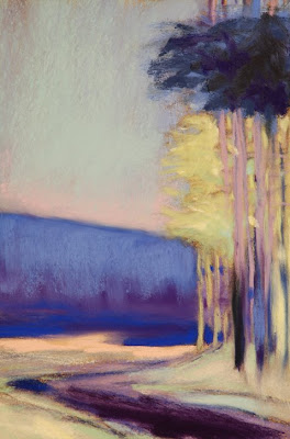
Bright Trees Through
@ 8" x 5.5"
Pastel
Casey Klahn


Occasionally I get questions from my readers, and I answer all of them. The questions that I received from a Canadian reader this week were specific enough that I think it worth sharing my answers.

From Patricia Vesely:
Hi Casey

I am an avid fan of your website - each painting posted is more awesome than the last! I am also impressed by the professionalism and the organization of your blog.
The information I have noted there is very valuable to me, being a relative newcomer to pastels and having not done anything artsy for years.
Now I must purchase new pastel colors - I wonder if you could post the names of some of the Experimental Colors?
I like the way you are able to switch, for instance, from a somber palette one painting (Tree on a rock Bed) to a more intense/vibrant palette like WK's pinks and greens.
Do you select a palette before beginning then stick to those particular colors, or do you select them as you go along?
Thanks for all you share.
pv

Thanks for the kind comments, Patricia, and also for the questions.

hard pastels to begin with...


I would say that one should not overlook getting a set of hard pastels to begin with. They can and do contain vibrant, intense colors, and also the muted earth tones you'll want for some paintings. Not to mention that they are easier to work with.

That being said, we all desire the luscious soft pastels and could blow $10,000 on them and still not have all the available ones on the market!
To solve that problem, get hold of the Multi-Brand Color Chart, from the publisher Huechroval.

...then buy open stock


Using this book will help prevent expensive redundant buying, which can happen when you buy pastel sets and find that some sticks are repeats. I would say to target wisely the set that you want to get started with, and then buy open stock, using a color chart for a guide. I also keep a file of each brand of pastel that I use, with either a printed proprietary color chart, or a hand made one which I get from Dakota Pastels.

Now, to the specifics of which pastels I use. Here is the image, again.


I recall using hard pastels to indicate the tree trunks, the muted ultramarine of the sky, and the muted yellows in the tree canopy that is behind. The brand I favor is Sakura, which isn't available anymore in the US. Lucky you, Patricia, because I think all of the Commonwealth nations do have these yummy hard pastels available. They are Japanese made, and I particularly like the way they are embossed with numbers for easy reference.

the grand champions of intense pinks


While on the sky, the pink is by Sennelier, who are the grand champions of intense pinks.

All of the darks are from my favorite maker, Diane Townsend. I would say most of the other colors, including the intense blue of the mid ground, are DTs.

The pale greens in the tree foliage remind me of the buttery soft Schmincke brand. Probably if I were to repeat this image, that's what I would reach for here.

There I was...


As for the process and selecting my palette, I recall that this painting was formulated during one of those wakeful nights where I was thinking of art at bedtime. The picture of bright trees behind was invented this way, and I recall wanting them to be high key yellow-greens. The perfect compliment (in my opinion) to the greens is pink, and the compliment that speaks to me for yellow is ultramarine blue. Of course, the theoretical compliment to yellow is violet, but my eye wanted blue.

There I was, with a violet background set of hills, and it wasn't right. Did I reach for a hue for resolution? No - that's not my method. I prefer the color attribute of intensity above all else. And, when addressing my palette, I keep a mental checklist of which sticks present which intensity. The blue that I chose for this job is a jumbo Sennelier - the only stick that would make this mark and the first one that I think of for intense blues.

selection, then resolution


I am afraid to say that for that stick, you would need a time machine, for the French proprietors, in their infinite wisdom, have discontinued that size. They do offer the "La Grande" size, but the experience isn't the same and neither are the marks.

In review, the palette selection is an idea for one, then two and often three colors in a composition, but then resolution always becomes a major factor in completing a work. The decisions are responses and they are often based on criteria that is surprising, such as the brand and the behavior of a particular stick.

For more posts on pastel brands, see my label, Pastel Brands Review.

Monday, January 19, 2009

Abstract Organic Shapes

Blue Trees in the Middle Distance
7 - 3/8ths" x 5.75"
Pastel
Casey Klahn


Consider the words of this blog title, "abstract organic shapes." For a sound and enjoyable study of shape, see Diane Mize's post, And Then There is Shape. An organic shape is one with a random pattern or irregular edges - just the opposite of geometric shapes. Abstract means non-specific or simplified. A non-tree tree, if you will. More of a shape than a technical study of leaves, foliage, branches and trunks.

Think twice before you include trunks, branches or leaves


If you want foliage, then make your tree as formless as possible.Irregular, and abstract. Think twice before you include trunks, branches or leaves. A better direction to go instead is to ask yourself how this shape will effect your overall composition. Back all of the way out of the picture plane, and make a value and shape sketch. How big will the tree or trees be? Will they form a unified mass? What will the relationship of these trees be to the other elements in my painting?

Consider the image posted today, Blue Trees in the Middle Distance.

Since we are building a landscape here, albeit an abstracted one, we have chosen to model the form of our trees. Keep it simple, with roughly three values only. As with strict realism, we have opted to not go very broad with our value range. An almost black violet, a dark middle ultramarine and a middle violet do everything we need them to do to represent two trees on a slope. We keep the diagonal strokes all parallel, which heightens the gestural effect of our marks.

An unrelenting melancholy


Anchor the trees to the ground with well placed shadows, and a dark line where we interface with the ground. Higher key colors in front of and behind our trees help with modeling. Atmospheric effects of the ridge, sky and clouds push them back, and limiting the palette help with unity. Again, we keep our gestural effect with our marks - they don't conflict.

An almost unrelenting
melancholy pours down the picture plane, brought about by the blue and the clouds. A critique was written about this painting, here.


Thursday, January 15, 2009

Tree School

Tree Study in Turquoise
@ 6" x 5"
Pastel
Casey Klahn


The title "Tree School" sounds like it belongs at an arborist's convention, or maybe a logging camp. But, I want to offer my artist's take on rendering trees with pastel.


Trees can be an awful distraction in a painting. Especially if they are present but not the subject, and if they take up too much of your effort.

We all enjoy graphite drawings in detail of a beautiful tree. Great texture, perfect modeling, and wonderful presence are what please us. But, that is the tree drawing where the tree is center stage; the star of the show. What about when the landscape is about things other than how the trees look? What do you do then?

Additionally, you can face a problem when the trees are the main content, but not the subject. I mean by that the painting where a color composition is the subject of the painting, or maybe something like the motion of one's eye through the woods. Trees have a built-in drama to them, and I propose that too much detail can distract from the message.

Return here to attend my short course on trees in pastel, and I leave you with this hint: don't begin with green.

Friday, September 12, 2008

The Last Cow Discovered?


My ignorance of the beautiful French language is on display in this post. To me, "Lascaux" sounds like "Last Cow". And, indeed the Caves at Lascaux do feature some cows - among the first known cow paintings. Perhaps the French should have called the place "First Cow".

Be that as it may, today is the anniversary of the discovery of the caves, on September 12th, 1940, by a dog and his entourage of four boys.
Pre-historic art, so called, is an endless source of fascination to the artist. Was the early artist a "magician" or "shaman", because of his inexplicable ability to represent the natural world by drawing? There are early man paintings in my own area, and what little kid wouldn't wish to be the first to discover a rock wall covered with something like that?

As I prepare to teach an upcoming class on drawing, I am asking myself many questions about the activity of drawing. Is it "magic", or in other words, reserved for a special person, or type of person? Or is drawing available to anyone?

Matisse, who is the subject of my current studies at The Colorist, has said that a drawing must "be decisive!" Does he mean decisive like in the use of the double envelopment (also first displayed on this day at the Battle of Marathon, in 490 B.C.) ? Or, does he mean to make marks with authority, and not tentatively or weakly?

So, today instead of Five answers for Friday, I have put these questions to my kind readers. What are your feelings about drawing, and how it should be taught?


Note: I want to give credit where credit is due. The earliest evidences of art, although muddled in with functional and craft objects, are actually ceramics, and not drawings or paintings. This could be due to archival reasons, but there you have it. Of some comfort to the pride of the painter, the earliest known art object may be a Venus figurine painted with Red Ochre.

Friday, September 5, 2008

What Are Your Subjects?

My Subjects -
Trees in the Field


Rural Buildings


Conifers and Color Fields


It was interesting to see a great pastel artist list his focus on a narrow range of subjects in a book I read recently. The book is a dated one by Albert Handell, Pastel Painting Workshop. He likes the Southwestern landscape with arroyos and pueblo-style structures. He does trees, rock boulders and waterways. In his figurative work, he likes vignettes and portraits.

Why be narrow in subject matter?

It is good to be aware of what your subject matter is before you go off to the field to paint on site. Why be narrow in subject matter? My own feelings are that you may delve into a subject as deeply as you wish, and may never run out of inspiration. If your goal is to "draw things", then you may wish to pursue every possible subject one after the other. But, if you are wanting to produce paintings with depth and with good technique, then limiting yourself to a handful of subjects will provide you a greater opportunity for depth.

Limiting your subject matter will put you in good company.


Limiting your subject matter will put you in good company. Van Gogh stayed with agricultural landscapes in France that revolved around trees, waterways, fields, buildings and bridges. He did portraits and still lifes, but he stayed with common themes. Degas stayed with interior and theatrical figures, such as orchestras, singers and ballerinas. He did nudes at the bath. He also liked the horse track, and some industrial interiors. Daniel Greene stays with the portrait, but in his figurative work he focuses on painting his wife, artist Wende Caporale, in the New York subway with tile mosaic backgrounds. Of course, he does other works, but his series work is a method of staying focused. Harvey Dinnerstein does self portraits where he is painting bare chested, and Andrew Wyeth stayed on the Helga series for a number of years. His Helga series kept true to his own ouevre of rural interiors and moods.

Limiting my subject matter helps tremendously in finding compositions


My own oeuvre features conifers in a forest setting with color bands, trees in the field, and farm buildings. I recently have added deciduous trees and the figure to my interests. Making brief appearances in my art are clouds, skies and waterways. Limiting my subject matter helps tremendously in finding compositions when I go outdoors to paint. My next target is a neighbors farm outbuilding that one looks up to , and it has a stunning backdrop where the draw bends away and down in the background.

Friday, August 29, 2008

Draw Five

Olive Trees & Paint
May 2008
Pigment Wash, Charcoal & Pastel
On Diane Townsend Paper
21.5" x 14"
Casey Klahn


Drawing has absorbed much of my attention lately. Many of my recent artworks are drawing-based, as opposed to images that I begin with pastel sticks in large masses of color. I'm using charcoal and pencils again.

At The Colorist, my drawings are gathered under one label here. See the My Drawings label here at Pastel.

Let's explore drawing theories in this Five for Friday post.
  1. I don't seek so much to draw things as I do to make a drawing.
  2. Gather a collection of your own drawings that are framed or cropped somehow. How much negative space did you use?
  3. My best advice for laying out a drawing is to just begin it, and work outward. For this, you need a big sheet of paper.
  4. Don't erase anything, unless it's to add to the drawing.
  5. Proportions are for draftsmen. You are an artist. Think: "will following the rules of proportion enhance my drawing, or sidetrack me instead?"

Friday, August 22, 2008

Compositions Advanced


The Abandoned Barn Study has been a goldmine for me in the analysis of composition. I thank Brian McGurgan for giving me that opportunity. The study has led us to look at things like lines that lead us around, into and out of our picture plane, the weight of masses, and the plastic element called "push-pull" by Modernists. See Hans Hoffman.

Hoffman declared the reign of "one point" perspective (linear composition) to be over. He proposed color, light and shape as elements that not only lead into a picture, but also push back out of the plane. Ready for some interactive fun? Go here for a color puzzle illustrating Hoffman's Push-Pull Spatial Theories.

Add Hoffman's theory to your linear perspective rules. Now, understand the application of lines, intervals, colors, values and other elements in the picture plane to lead the viewer's eye where you want it to go. If the sky is "heavy" with darker values, the eye will feel it's "weight" pushing the picture elements down.

Let's have a look at some examples from my own drawings. Do you think in color when you draw with pencil or charcoal? If you are a painter, you should. It will effect the outcome of your gray scale drawing. Maybe this will become evident as you look at this combination of both colored and black & white drawings. Again, we're using a definition of a drawing as a picture leaving some ground/paper showing.


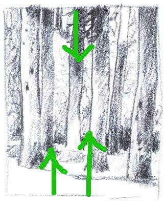
Forest Study, 6" x 5", Charcoal
Casey Klahn


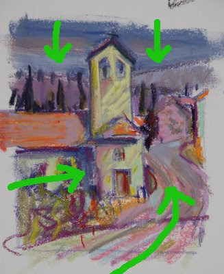
Bell Tower, 4.75" x 4.5", Original Pastel
Casey Klahn


Behind the Garage, 7" x 8.5", Graphite on Sketch Paper
Casey Klahn


After Wolf Kahn#1, @ 8" x 6, Pastel on Sketch Paper
Casey Klahn


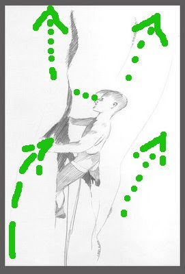
Lead Climber, 11" x 6.75", Graphite on Paper
Casey Klahn
The Portal, 4.75" x 4.5", Graphite
Casey Klahn

Now, look at my analysis of how sometimes linear, and sometimes values or colors push the viewer's eye around the picture plane.


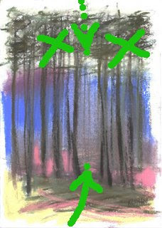
Dark foliage pushes down; light foreground pushes up.


Dark value sky colors push down; light foreground pushes up and various lines lead in.
Blue (cool) recedes; pinks, yellows, oranges and violets are warm and proceed to the front.


It was tempting to make the winter sky dark, and the shingle roof dark as well. Instead, I remebered the push-pull theory and helped the eye heavenward with lines, mass weights and open, light values in the sky. Part of the roof was left light. Diagonal lines lead in from the left, and various vertical and spiraling lines disrupt and stop you inside the picture plane. They help to lead your eye upward. Notice that the interval of sky need not be large, because so much help is offered by the push-pull methods - this allowed me to keep the garage big and prominent.


This was directly copied from Wolf Kahn when I did a study of the contemporary master. Interestingly, the light foreground, with open lines lead in, and the hatched tangle in the upper area serve to catch the eye - partly stopping and only pushing down gently.


The environment of vertical rock is hard for the flat lander to visually process, so understand that here we have a lead climber on a vertical cliff that begins to overhang above him. He is intently focused on the rock before him, scrutinizing his next options. Don't get dizzy!
Our climber has more interval overhead than below, and yet he still gives the impression of being high off the ground. The lines opening up, and the simplicity and lack of detail help this effect.


Here is the most complex drawing shown as far as perspective is concerned. Obvious lines lead one into the picture and downhill along the path, then through the portal in the tangle, and then across the void, or canyon, and up the rock cliff. Important roof lines also bring the eye in from the left.
The "bending" viewpoint is a curvilinear perspective. In this drawing, I have offered a type of curvilinear perspective. My brain hurts, now. Reference here.
There is an interesting story that goes with this image, referenced here.