Sunday, December 30, 2012

Fall Foliage Better Late Than Never

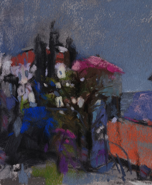
Autumn Slope 
@ 10" x 9" 
Pastel on Black Canson
Casey Klahn 
iPh photo

It is an unusual thing for me to work on black and also on Canson.  I had a very talented friend explain to me her method of getting good results on Canson, and with some extra effort I resolved this one to my liking.  It is a scene from my studio north window from about 2 months ago.

By the way, if you saw this video of Sheila M. Evans working in pastel, and you enjoy her work, you have an opportunity to vote for her in the Best of 2012 contest at Making a Mark.  Polls close about 2.5 hours from now!

Monday, December 10, 2012

Sheila M. Evans Video Illumination


Sheila M. Evans is very talented, and her illuminated flora have no peer.    

Wednesday, December 5, 2012

Pastel Brands and Materials

Pastel Brands and Materials  


See the new page here at Pastel Workshop: Pastel Supplies.  It provides a resource when you are researching or reviewing pastel materials, to include major brand soft pastels, paper, and miscellaneous materials.  I will be updating this page as needed, and plan to list major catalog retailers next.

Thursday, November 29, 2012

When Artists Unify

Diptych
Forest Deep 1 and 2
12" x 7" each
Pastel
Casey Klahn


Unity is the spirit of the elements in your art working together. 
When you choose to unify the elements, you are providing greater power, impact and emotional strength in your work.  Unity is achieved when every part of the picture agrees with every other part of the picture.  In a perfectly unified picture, nothing would be out of place, and everything would make sense of everything else.  A well unified image reveals a clear concept and all the parts testify to this.

Unity can be defined in negative terms, which is to say that when a picture lacks unity, some part or parts seem out of place.  This can happen when the colors do not agree or make sense together.  Also disunity exists where the marks are of such different character that they clash.  Further, your picture will appear as if it ought to be reduced by being split into parts.

A common pitfall is to divide the picture plane, either horizontally or vertically, with two completely disparate ideas, such as a very light blue sky and dark, dull brown land form.  I was working on an image this week in the studio which portrays a darkish boulder field tumbling down on the right hand, and a watercourse splitting the image by dividing off the left side. I decided to kill the waterfall idea altogether, as the boulders were rendered with a fine, shadowy mood, and I felt that the narrative of a waterfall was in opposition to the moody image already there on the rocks.

What to do

Using colored ground is a fine start if you want to unify the middle values and supporting hue in a painting.  A neutral value and hue, such as Sienna brown, is a warm and fairly unobtrusive beginning from which to build upon.  It helps by establishing a singularity of color "all-over" the image.  Using pure hues as a supporting underpainting is a strong start, and provides some of the same advantages as neutral undertones, but will also limit your responses.

If you wish to begin on white or black ground, then you will have to establish a pattern of hues and values that carry the image and do not contradict one another.  

Here is a pastel on white paper which is unified by keeping the main hues analogous, or close to one another on the color wheel: blues, violets and pinks.  A few yellows keep it active, and grays used judiciously adopt their neighboring colors and extend the illusion of local sameness.  Open marks, paper texture and the white color showing through, and the use of counterchange to harmonize, help to keep this composition together.

Here I have used almost the same colors on both brown and white supports. The brown piece is easy to keep unified as respects color, but on the white I have to use the pink-violet throughout the whole image, and it helps that these warm hues  are close on the color wheel.  The supporting neutral hue, which is a gold ochre, stays in the warm temperature range, and yet creates a conversation with the violets that makes sense: it is pushing the foreground forward, and feels complimentary to the violet, since it has a slight yellow bias.

Consider this image which uses pink and green on white laid paper.  There is a violet-pink hue under everything.  That touch of green at the place where the midground meets the sky, together with the same green in, behind, and under the tree makes the color story of "pink compliments green" work throughout the picture.  Imagine this image with the green only in the tree, and nowhere else, and the resulting picture would lack unity.


Establish unity by telling a coherent story with all of your lines and also the marks or brush strokes. Repeating shapes and establishing a pattern, as well as textural continuity and rhythm provide threads of unity throughout your picture.

More Thoughts on Unity

Now I have a question for you.  Is harmony a requirement of unity in a painting?  If so, what about the very successful image, The Scream, by Edvard Munch?  I look at The Scream and feel panic, not harmonious and good thoughts! Also, don't you feel a little off balance when you view At the Moulin Rouge, by French artist Henri de Toulouse-Lautrec?  These iconic images do evoke the fundamental unity of the ideas held within them, as a result of elemental (formal) unity.  They are masterpieces of the power of art to express emotional disquiet and therefore they reveal some of the deeper things of humanity.  Unity in the use of the elements of art is one of the tools used in creating these strong works.

We accept that disharmony is an aspect of some paintings, just as asymmetry is the opposite of harmony within the element of balance. Unity is something different than harmony; harmony being consonant parts and unity a gathering of the whole.  

Unity is having great elemental bones in your painting, and portraying your idea with clarity.  


Giorgio Morandi
Still Life
Morandi was a master of the concise still life.  Here he shows one near-black or dark cobalt bottle next to an essentially white bottle, setting up a very severe formal insult to an otherwise sedate grouping.  But, imagine what it would look like without that indigo box behind and near the left side of the assemblage.  The box harmonizes with the black bottle, and establishes a dialogue of the parts.  They are saying: l'unità di qualità formali e l'unità delle idee.


Wednesday, November 28, 2012

Friday, November 23, 2012

Listen To Zuzu


It has been said that every time an artist picks up a pastel, somewhere a little bell is heard ringing, and an angel gets his wings.

Saturday, November 17, 2012

Saturday, November 10, 2012

Getting the Word Out About the November-Christmas Sale


This post is jumping the gun a little, as I don't have the price lists published yet.  People are already buying new artworks from me at Facebook, and so I am formalizing the process and announcing the  
SKY, FIELD, AND DEEP WOODS SALE.

You can find my new works at The Colorist and Facebook.  I should have the list completed by tonight, and it will feature both framed and unframed pieces.


Monday, November 5, 2012

Fence Din

Fence Remnant, Springtime
7.5" x 7.5"
Pastel
Casey Klahn


This is a better photo record of this image.


Thursday, October 11, 2012

All The Colors


Click on the image to see it whole
All The Colors Field
small/ @ 3.5" x 7"
Pastel
Casey Klahn

Because I value my readers at Pastel Workshop, I sometimes premier artwork here before I post the same at The Colorist.

Saturday, October 6, 2012

Flat File Sale Over Soon


This sale of small and unframed works from my flat files will end next weekend. Interested patrons are e-mailing me, or messaging me on Facebook.  Thanks!

How to purchase.
Facebook.
New Web Site!

Villa Through the Trees
8.8" x 7.2," Pastel, Casey Klahn
$325/unframed


Thursday, September 27, 2012

Bronze Figurine, A Drawing


Figurine Drawing #1
18" x 12"
Charcoal, Chalk & Pastel
Casey Klahn


This time I drew the figure from photos I took of one of Degas' bronze ballerinas.  More to come.

Tuesday, September 25, 2012

New Website & News

New Website:


Look for my report on the incredibly talented Cameron Hampton, coming soon at The Colorist.


Also, see and shop my Flat File Sale, ongoing at The Colorist.

Saturday, September 22, 2012

Saturday, September 15, 2012

Tuesday, September 11, 2012

Monday, August 27, 2012

Jackie Simmonds


Jackie Simmonds, from the UK, is someone you ought to be looking at as you develop your pastel skills.  She has every accolade you can think of, and well deserved they are.  One of her skills is as an instructor, and today's post from her was so great I wanted to share it with you.  It is titled, Simplifying The Image, and I want you to note what she says about the importance of working the whole image and not just the subject.

Jackie Simmonds Artyfacts.
Jackie Simmonds Paintings and Sketches.
At Artists In Pastel.

Saturday, August 18, 2012

Wednesday, August 15, 2012

Tree Trunks

Tree Trunks
@10" x 8"
Pastel
Casey Klahn

Here is an older image, by maybe 5 or 6 years, that is a rendering of my front yard.   I took this informal photo to support my current exhibit, and so here it is for your viewing, too.  We hang this one in the dining room.

Do you collect your own works?  I recently identified a work that has sold twice this year, and then at the last minute the patron changed their mind.  It is an image of my back yard (or field, as it were) and I decided that its boomerang story means it is now in my collection.  I love it, too.  I'll have to post it next time.

Friday, August 10, 2012

Tuesday, July 24, 2012

Tuesday, July 17, 2012

Making Pastels Resource


Making Professional Pastels.  Resource at Daniel Smith, by Paul de Marrias.


I made these.

Pigment Pen


The Daniel Smith stores are here in Washington state.  I especially enjoy going into the Seattle store and picking out big, white bags of pigment - French Ultramarine is my favorite.


Here are some stores around the US that supply pigments and other materials:


Daniel Smith, founded in Seattle.
Utrecht Art Supplies, founded in NYC.
Rochester Art Supply, Rochester, NY.
Artisan, Santa Fe.  Find Gamblin pigments there.


I guess I borrowed some pigments from a pastel stick in this instance, but pictured is a bag of Daniel Smith Whiting.  The jar holds blue easel tailings.


Saturday, July 14, 2012

Sunday, July 1, 2012

DIY Trug


The pastels shown in this homemade trug are the medium (read: oversize) Unisons, and some big "homemades."  It is crudely made, but still working fine after several years!

Homemade trug:  utility knife, Elmer's glue and Foam Board are all you need.  Mine does duty as a carrier for odd-size pastels.  Hmmn.  I think I'll make a couple more for my charcoal and drawing tools.

Wednesday, June 20, 2012

Swatch Study

Swatches From My Artwork

This exercise is an analysis of the colors that occur in a few of my pastel works.  I took them with an eyedropper, in Photoshop, and made these digital swatches using a brush tool.  The goal is to have about 26-36 colors when I'm done. 


Thursday, June 14, 2012

The Colorist: All Water is Abstract


The Colorist: All Water is Abstract: Forest Pond Bloedel Reserve, Washington 8" x 12" Pastel Casey Klahn Click on image to see the full crop.

Tuesday, June 5, 2012

Wednesday, May 30, 2012

The Colorist: Pastel Studio, Canada


The Colorist: Pastel Studio, Canada: Pastel Studio Art Supplies I'll be at the Pastel Studio  shop in Ontario, Canada,  this weekend.  The See Differently workshop par...