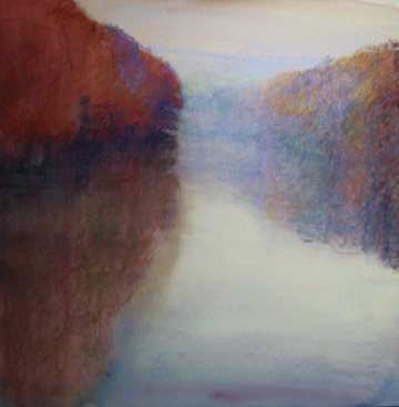
Color is the starting point that I choose for my tree renderings. If you are ever to arrive at a coherent color scheme, you must resist making those trees green! Typically the local color of trees, green will key the color composition for you. If you wish green as a major element in your image, then use it. If not, then do a color study of your composition first to determine what color you will be making your trees.
The local color of trees is usually green, but if you think about it, there are other local colors of trees. Brown, orange, silver, gray and black are present. Trace or hints of red and blue are very evident to me in trees. Cast colors include violet and blue. When we view our trees in this manner, any color becomes part of the natural palette associated with trees.
Remember that color has much more value than associations with objects. Some assign emotional value to color, but I also think of it's plastic qualities. The red trees in this winter scene counter-pose the cool trend of a winter scene, and push them forward and cause vibration when compared to the ultramarine background.
Don't become a victim of the tyranny of green.
Monday, January 26, 2009
Wednesday, January 21, 2009
Tree Admiration
Learn from other artists whose renderings of trees you love
Learn from other artists whose renderings of trees you love. Mark me down as a Wolf Kahn follower. His forests of trees are gesture rich, and pure blocks of color are woven into the whole. I did the drawing posted here directly from a WK as a study to try to "get" more of what his methods are.

Evening Pines, by Deborah Paris, gives a similar treatment of trees at a forest's edge. Atmosphere prevails, and I have a feeling that I am standing among the liquid air of 100 degree Georgia humidity at dusk. Her Tonalist style involves a limited palette and a narrow range of values. I can't help but feel completely present in these woods when I am looking at Evening Pines.
Albert Handell's Woods Interior expresses the abstract qualities of just tree trunks. His tree trunks have more texture with less apparent effort than almost any artist I know of.
All of the artists I've mentioned here take a very different approach to trees, and your tree style will become a signature of your own work.
See also:
Michael Chelsey Johnson
Jennifer Phillips
Tracy Helgeson
Susan Ogilvie
Marla Baggetta
Marla's new blog.
Monday, January 19, 2009
Abstract Organic Shapes
Consider the words of this blog title, "abstract organic shapes." For a sound and enjoyable study of shape, see Diane Mize's post, And Then There is Shape. An organic shape is one with a random pattern or irregular edges - just the opposite of geometric shapes. Abstract means non-specific or simplified. A non-tree tree, if you will. More of a shape than a technical study of leaves, foliage, branches and trunks.
Think twice before you include trunks, branches or leaves
If you want foliage, then make your tree as formless as possible.Irregular, and abstract. Think twice before you include trunks, branches or leaves. A better direction to go instead is to ask yourself how this shape will effect your overall composition. Back all of the way out of the picture plane, and make a value and shape sketch. How big will the tree or trees be? Will they form a unified mass? What will the relationship of these trees be to the other elements in my painting?
Consider the image posted today, Blue Trees in the Middle Distance.
Since we are building a landscape here, albeit an abstracted one, we have chosen to model the form of our trees. Keep it simple, with roughly three values only. As with strict realism, we have opted to not go very broad with our value range. An almost black violet, a dark middle ultramarine and a middle violet do everything we need them to do to represent two trees on a slope. We keep the diagonal strokes all parallel, which heightens the gestural effect of our marks.
An unrelenting melancholy
Anchor the trees to the ground with well placed shadows, and a dark line where we interface with the ground. Higher key colors in front of and behind our trees help with modeling. Atmospheric effects of the ridge, sky and clouds push them back, and limiting the palette help with unity. Again, we keep our gestural effect with our marks - they don't conflict.
An almost unrelenting melancholy pours down the picture plane, brought about by the blue and the clouds. A critique was written about this painting, here.
Thursday, January 15, 2009
Tree School
The title "Tree School" sounds like it belongs at an arborist's convention, or maybe a logging camp. But, I want to offer my artist's take on rendering trees with pastel.

Trees can be an awful distraction in a painting. Especially if they are present but not the subject, and if they take up too much of your effort.
We all enjoy graphite drawings in detail of a beautiful tree. Great texture, perfect modeling, and wonderful presence are what please us. But, that is the tree drawing where the tree is center stage; the star of the show. What about when the landscape is about things other than how the trees look? What do you do then?
Additionally, you can face a problem when the trees are the main content, but not the subject. I mean by that the painting where a color composition is the subject of the painting, or maybe something like the motion of one's eye through the woods. Trees have a built-in drama to them, and I propose that too much detail can distract from the message.
Return here to attend my short course on trees in pastel, and I leave you with this hint: don't begin with green.
Saturday, January 10, 2009
Preview: Loriann Signori
 Loriann Signori
Silver Spring, Maryland
Coming soon: My interview with Loriann Signori. Loriann is a plein airist whose colorist work defines freedom.
 Topaz Serenity
Loriann Signori
Subscribe to:
Comments (Atom)


