Wednesday, September 23, 2009
Sunflowers and Stephanie Smith
Artist Stephanie Smith is bursting onto the scene with free-form florals that make most flower paintings pale in comparison. Perhaps they even work better than the real thing, in the visual sense. Open, loose, color-forward and engaging as only full throated pastel works can be.
Her blog, A Roker Artist, delivers her images and her process for your enjoyment. Stephanie is from Tyne & Wear, England.
I wanted to interview her about what she is thinking and feeling when she renders these florals.
The interview.
Pastelsblog: Tell us something about your Sunflower series.
The flowers I painted from were weeks old and well past their best, but I loved the curious shapes made by the live and dead petals around the solid centre.
These weird, asymmetrical arrangements of petals were what grabbed my attention.
PB: What is your common theme from one image to the next?
I was driven by the need to capture the last days fo these flowers; when they were in full bloom they were quite uniform and bland. But as they died the colours developed, like the oncoming of autumn and change in the foliage of trees and bushes.
The saucer shapes became contorted and oranges and reds appeared alongside the lemon yellows. There was such a variety which hadn't existed when they were newly bought. Each head was individual and changing almost from hour to hour, until all the petals were shed.
PB: What is the role of gesture in your Sunflowers?
I apply pastels in a number of ways, and I've used a range of techniques in this sunflower series; intial drawing in conte stick, smudging in the local colour, building up structure in thin layers similar to drybrushing so that the colour underneath shows through, then getting heavier with impasto pastel as I strengthten certain areas and details.
The excitement was in the contorted petals, so once I'd lain down the structure of each flower head, the pastel marks became freer and more expressive.
PB: What about color?
I was painting the sunflowers in gloomy corner, and I wanted to show the way the yellows shone out, as though emitting a light of their own.
Choosing a coloured paper gound which was very close to the sunflower centres was effective. It meant that the petals made an almost abstract arrangement on the paper, with the flower heart and leaves disappearing into the background. And I used a restricted colour palette throughout the series, as pastels, when laid over each other, start to meld and smear and create new shades. It's one of the characteristics of painting with pastels which I enjoy.
PB: Also, I notice the bones of drawings in these images. Tell us something about the role of drawing in your process.
I have always been a drawer and I've only recently learnt to paint I suppose. Pastels were one of the earliest mediums I worked with, and I've been trying to find new ways of working with them. So I'm not surprised that drawing is evident in these pieces. And pastels make such great marks, depending on how you hold them and how little or how much pressure you apply. I suppose I've drawn on top of the painting in these sunflowers.
PB: Give me the what, when and wheres of the venues where you are showing right now.
Some of the sunflower series are currently being shown in the Time For Tea, a little Cafe-Gallery in Poynton, Cheshire where one of my sister Melanie lives. Melanie also has some of her acrylic still lifes on show there too. The cafe owner is an artist herself and displays and sells her own work in the cafe.
Four more paintings from the series are being sold in Warm Earth Gifts on Park Lane, Poynton, Cheshire. UK.
Note: Melanie Rimmer blogs at Chickpea.
Saturday, August 29, 2009
Diversions
Still Life is a diversion for me. It can be good practice in modeling form, but I always get caught up in the color play.
Thursday, August 27, 2009
Booth Mock Up
Here are some booth mock-ups for the upcoming Sausalito Art Festival. The actual booth will be flush with art, instead of thin as shown here, but this is a good preview of how my art is framed and how it will be hung. C U There!


Friday, August 7, 2009
The Lighthouse Keeper
This was posted previously, but only as a scan. It is a studio finish from a plein air painting made on the Oregon coast.
Did you know that lighthouses, back in the day, would burn whale oil or kerosene? And, what's more, they were as popular for tourists in the nineteenth century as they are now. Except, of course, the travel there was harder.
The gift store by this lighthouse had paper models of the lighthouses. I imagined using these, well lit, as studies for more paintings. Some day you'll see those here.
Yaquina Head Lighthouse.
Thursday, July 30, 2009
Wonderful Washington Workshop
I can tell that the Richard McKinley workshop just concluded in Mt. Vernon, WA was a success by the results that show in Loriann Signori's work. Her recent works are still very much Loriann's signature style, but they are her work at its best - great clarity, superb color and authentic. Her heart is in it, and she's creating lovely pastels that you should take a look at. These are my favorites: The Field 1 & 2.
If you've ever taken an art workshop of any type, let alone one of the length and intensity of McKinley's La Conner one, you know how it can turn you inside-out with the issues of self-direction versus a strong and influential teacher's style. You are there to adopt and apply the teacher's ideas, and yet you have your own statement to continue. I have lost sleep over these things!
My interview of Signori is here: Plein Air On Purpose.
She suggests that Washington State is an inspirational locale. I agree, of course! Skagit County, where McKinley's workshop takes place, is the art rich home of the Northwest School (Tobey, Callahan, et al.) and is noted for the strange diffuse light that permeates the marine air. Some day you really ought to make the trip to see for yourself.
Richard McKinley
La Conner Art Workshops
Loriann Signori's Painting-a-Day
Museum of Northwest Art (MoNA)
Friday, July 24, 2009
Materialkunde

Pastels are an endless source of wonder as a medium. The dust on butterflies' wings, it has been called.
Astrid Volquardsen is blogging about the pastel medium in detail. She is comparing paper, stick softness, pencils and has a particularly fun post on manufacturing pastels.
My interview of Astrid Volquardsen is here.
Tuesday, July 14, 2009
Friday, July 10, 2009
Plein Air Cedar Shed
 Cedar Shed with Stool
5" x 7"
Pastel
Casey Klahn
On site painting this month has been ticking along. A number of scenes around the garden ("cedar") shed have been done, featuring cast light and various surfaces. The surface is the light grey La Carte, but the results still are very warm.
I am bringing this post "over" from The Colorist because I want to follow my plein air project here, and keep the River Series going at that blog. Think: pastel paintings here, concepts and ideas there.
I am bringing this post "over" from The Colorist because I want to follow my plein air project here, and keep the River Series going at that blog. Think: pastel paintings here, concepts and ideas there.
Wednesday, July 8, 2009
Red River Sketch
In organizing photos the past few days, I came across this sketch, and realized it hadn't been posted before. This one started a whole series, in some ways. The elements that went into it were a trip to see the Hoquiam River, early pinks in the trees (spring or late winter deciduous trees lining the river bank), an Indian Red pastel stick, and an idealized conception of American rivers.
The river series is a fun group of strongly colored riverscapes seen here.
Monday, July 6, 2009
Saturday, May 16, 2009
The River Series
Music score present, here. Turn it up, some!
All of the images for my new River Series have not been posted, yet. But, I got the idea for a slide show when I saw Karen Jurick's outstanding one with big band musical score. Thanks for the motivation, Karen - your post is off-the-hook awesome. It was challenging to put this together, since a few technical glitches kept bugging me, but here is my first effort at this type of thing. Enjoy!
All of the images for my new River Series have not been posted, yet. But, I got the idea for a slide show when I saw Karen Jurick's outstanding one with big band musical score. Thanks for the motivation, Karen - your post is off-the-hook awesome. It was challenging to put this together, since a few technical glitches kept bugging me, but here is my first effort at this type of thing. Enjoy!
Sunday, April 26, 2009
Street Pastels
Photobucket.
Ever get bored with the run-of-the-mill artist's routine? Clock into the studio, crank up the easel, and take out your muse bat. Ho Hum. Another day of seeking brilliance.
I'll bet my bottom lira that Kelly Borsheim lives an anything but boring artist's life. Try this lifestyle on for instance: ex-pat sculptor and street painter in Florence, Italy. I know - your jaw just hit the floor. If you've ever been to Florence, you know the layout. All pedestrian and pavement. Beautiful statuary and architecture everywhere. I can't imagine a better canvas than the pavement of Florence - abundant and inspirational.
Now, I feel all inspired to hit my studio, again...whither goest thou, Brilliance?
Monday, April 13, 2009
Stormy Art - Accepting Bids
5"" x 7"
Pastel
Casey Klahn
Bidding begins at $100 - unframed
Since I don't often produce small works that fit in standard frame sizes, I can offer this rare image as an unframed original. Any takers? Bidding begins at $100. Postage and tax extra; bidding by comment or via e-mail at caseyklahn@g [no spam or spaces here] mail.com.
Thursday, March 12, 2009
Gesa Helms: Exploring The Meadow - Colors and Responses
Gesa Helms' discovery of pastels has been a colorist romp through nature's basket. Want loose handling? If so, I offer Gesa's art as an example of open and honest exploration of marks, colors and responses to the scene.
Gesa Helms:
My main work is as an academic - I trained as a human geographer and now work in an urban studies department. And while drawing and painting begun rather innocently as diversion, I can see how much the work process of an artist allows me to explore questions and problems in a different and rather intriguing manner. Increasingly, I am trying to bring these two ways towards creativity, knowledge and process together.
35x25cm
Soft pastel on board
Gesa Helms
Soft pastel on board
Gesa Helms
The countryside of where I grew provides a lot of inspiration for experiments from plein air sketches into more abstract paintings.
I discovered soft pastels four years ago when I began drawing. Adding hues to the monochromatic worlds of sketches and studies was a revelation. The vibrancy and high pigment load of soft pastels has kept me fascinated since, and yet I am increasingly employing pastels as one medium among others - including acrylics, gouache, a bit of collage and more recently printmaking. Casey's Colorist, and its younger sibling Pastel Blog, was one of the first blogs I stumbled upon and I fell wholeheartedly for Casey's approach to New School Color. I feel very honoured to be able to show some of my work here. - Thank you, Casey!
Most of my subject matter is taken from nature observations. Here, a small pastel kit has served me well for plein air sketches, alongside graphite or an ink pen. These sketches provide the source for numerous explorations around subject matter, composition, medium and markmaking.
Next Post:
Gesa's work exploring Wolf Kahn's palette and marks in monotype and pastel.
Tuesday, March 10, 2009
My Guest, Gesa Helms
Gesa Helms, of Glasgow, Scotland, is my guest artist for a few posts starting this week. Her work has been recognized in The Pastel Journal 100, and she has been delighting us at her blog with her artwork focused on both Scottish landscapes and those of her German home.
Gesa has found that small bodies of water capture her interest, and she has been exploring this on paper through both pastel and printmaking. She is adopting the palette and other elements of Wolf Kahn's art in these impressively loose and expressive works.
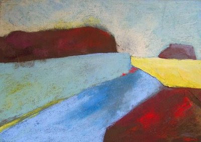 One One Three
 2008
47 cm x 32 cm
Pastel and Acrylic on Board
Gesa Helms
Selected in The Pastel Journal 100
Return here for her article on this journey to interpret the landscape of her home area of rural Northwest Germany. She blogs at Paint and Pastel blogspot.
Saturday, February 28, 2009
Which Pastels?
Occasionally I get questions from my readers, and I answer all of them. The questions that I received from a Canadian reader this week were specific enough that I think it worth sharing my answers.
From Patricia Vesely:
Hi CaseyI am an avid fan of your website - each painting posted is more awesome than the last! I am also impressed by the professionalism and the organization of your blog.The information I have noted there is very valuable to me, being a relative newcomer to pastels and having not done anything artsy for years. Now I must purchase new pastel colors - I wonder if you could post the names of some of the Experimental Colors?I like the way you are able to switch, for instance, from a somber palette one painting (Tree on a rock Bed) to a more intense/vibrant palette like WK's pinks and greens.Do you select a palette before beginning then stick to those particular colors, or do you select them as you go along?Thanks for all you share.pv
Thanks for the kind comments, Patricia, and also for the questions.
hard pastels to begin with...
I would say that one should not overlook getting a set of hard pastels to begin with. They can and do contain vibrant, intense colors, and also the muted earth tones you'll want for some paintings. Not to mention that they are easier to work with.
That being said, we all desire the luscious soft pastels and could blow $10,000 on them and still not have all the available ones on the market! To solve that problem, get hold of the Multi-Brand Color Chart, from the publisher Huechroval.
...then buy open stock
Using this book will help prevent expensive redundant buying, which can happen when you buy pastel sets and find that some sticks are repeats. I would say to target wisely the set that you want to get started with, and then buy open stock, using a color chart for a guide. I also keep a file of each brand of pastel that I use, with either a printed proprietary color chart, or a hand made one which I get from Dakota Pastels.
Now, to the specifics of which pastels I use. Here is the image, again.
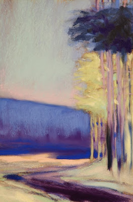
I recall using hard pastels to indicate the tree trunks, the muted ultramarine of the sky, and the muted yellows in the tree canopy that is behind. The brand I favor is Sakura, which isn't available anymore in the US. Lucky you, Patricia, because I think all of the Commonwealth nations do have these yummy hard pastels available. They are Japanese made, and I particularly like the way they are embossed with numbers for easy reference.
the grand champions of intense pinks
While on the sky, the pink is by Sennelier, who are the grand champions of intense pinks.
All of the darks are from my favorite maker, Diane Townsend. I would say most of the other colors, including the intense blue of the mid ground, are DTs.
The pale greens in the tree foliage remind me of the buttery soft Schmincke brand. Probably if I were to repeat this image, that's what I would reach for here.
There I was...
As for the process and selecting my palette, I recall that this painting was formulated during one of those wakeful nights where I was thinking of art at bedtime. The picture of bright trees behind was invented this way, and I recall wanting them to be high key yellow-greens. The perfect compliment (in my opinion) to the greens is pink, and the compliment that speaks to me for yellow is ultramarine blue. Of course, the theoretical compliment to yellow is violet, but my eye wanted blue.
There I was, with a violet background set of hills, and it wasn't right. Did I reach for a hue for resolution? No - that's not my method. I prefer the color attribute of intensity above all else. And, when addressing my palette, I keep a mental checklist of which sticks present which intensity. The blue that I chose for this job is a jumbo Sennelier - the only stick that would make this mark and the first one that I think of for intense blues.
selection, then resolution
I am afraid to say that for that stick, you would need a time machine, for the French proprietors, in their infinite wisdom, have discontinued that size. They do offer the "La Grande" size, but the experience isn't the same and neither are the marks.
In review, the palette selection is an idea for one, then two and often three colors in a composition, but then resolution always becomes a major factor in completing a work. The decisions are responses and they are often based on criteria that is surprising, such as the brand and the behavior of a particular stick.
For more posts on pastel brands, see my label, Pastel Brands Review.
Monday, February 23, 2009
Plein Air On Purpose- Loriann Signori
Artist and blogger Loriann Signori, of Silver Springs, Maryland, is committed to plein air practice in her painting. The one thing that strikes me first about her landscapes is the freshness of her vision. I asked her about her art direction and methods.
Daybreak at Hawksbill Peak
26" x 32"
Pastel and Oil on Marble Dust Board
Loriann Signori
26" x 32"
Pastel and Oil on Marble Dust Board
Loriann Signori
Pastel: What is your motivation for plein air painting?
For me, plein air painting is a passion. There is no place that I feel better, more at home, than being outdoors. To live I need to be connected to the earth, air, and water to feel solid. I have been painting outdoors since I was in my teens… I’d say that is a long time. Like the enduring postman, I am outside in any weather, working. Happy.
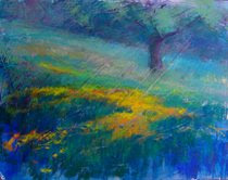
Buttercups in May
Pastel
Loriann Signori
Loriann Signori
Pastel: Say a few words about the Towpath. What excites you artistically about this subject?
In my life I have found that I resonate to the idea of making a series of paintings. At many different points I have found a series to be pivotal. For the past 3 years it has been the river and nearby reservoir that is my muse. Long ago, when studying for my MFA it was mums. Then I painted only a pot of yellow mums every day for 2 years. Back when I was in my teens, it was a laundry basket full of multi-colored clothes. One might think it would get tiring. But no, in fact, for me, it is what sets me free.
I find I can easily become a victim of painting “things.” But when I am in a series I get beyond whatever is my subject matter. Instead it is about the feeling, the color and my passion for making art. Each day when I go outside to paint I search for a way to describe the intangible ideas of atmosphere, emotion and poetry. It is a search I will have my whole life.
Pastel: Do you have a particular palette right now?
As for the more pragmatic – I must own a million pastels. The workhorses are Unisons and Girault. I also add selected sticks from Schminke, Terry Ludwig, Diane Townsend, Mount Vision and even a couple NuPastels. I make a yearly pilgrimage to Dakota Pastels in Washington to try and buy. It’s a great place for a pastel artist.
They have it all there to see and touch…like a kingdom of the gods. You are so lucky to live in driving distance. My watercolor palette contains the usual suspects: ultramarine, cobalt and peacock blues, lemon and cad yellow, alizarin crimson and opera (love this one – great grays and vibrant oranges can be made), Payne’s gray, all in Holbein and Windsor Newton. Oils are similar and made by Gamblin and Holbein.
Pastel: Who are your inspirations?
For the last 3 years I have been studying and dreaming of the great masters of space: the Hudson River painters, Sanford Gifford, Frederic Church, George Inness (who later branched away from that school) and the Romantic landscape painter, J.M.W.Turner. As a discipline for learning I started my blog and have created one painting each day. I call them my vitamins. They help me to grow stronger each day.
The living artists I admire most are Richard McKinley (I can’t say enough good about him), Elizabeth Mowry, Mary Sipp Green, Joseph McGurl and Jane Bloodgood- Abrams. While I am a pastel painter I look to all mediums. It is the feeling that I seek no matter the vehicle. One reviewer has described me as a “poetic realist.” I like that description.
Pastel: What paper do you like to use?
For a surface I use two different ones, depending on the need. I have developed a love of Uart paper (400) and I make my own gator board /marble dust supports for work in the studio and sometimes on location.
Pastel: Anything more you'd like to tell us?
As to my “style,” my plein air goal is to use a paucity of marks. How few strokes can I make and say what I need to say? It helps that I use a watercolor underpainting which creates the underlying skeleton of color. I find it harder to have the same goal in the studio. There I get wrapped up in the richness of pigment, layered and vibrating.
On another note, I feel very fortunate to live where I do. Washington, DC (a few miles from my house) has a plethora of unbeatable, free museums. When I feel stuck, I head downtown to visit a friend (painting) for inspiration. And even though this is a metropolitan area we have (most importantly) the Potomac River and 185 miles of undeniable access through our wonderful towpath. It is such a gift to have such a treasure chest of painting sights right at my door. I feel I never have to go anywhere. Ever time I go it looks different.
Lorian Signori's Painting-a-Day
Loriannsignori.com
Saturday, February 21, 2009
Tree School - Freely Working from Photos
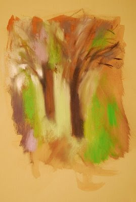 Olive Trees & Paint
May 2008
Pigment Wash, Charcoal & Pastel
On Diane Townsend Paper
21.5" x 14"
Casey Klahn

I hope you are aware of the troubles of working from photos. They include getting permissions from the photographer, incorrect perspectives that are inherent to photos and color and value issues. A good rule of thumb is to work from photos of places that you have been, yourself. This olive tree image originates from Italy, and I have a deep connection with the landscape there. I am currently working from some photos that I took of coastal Washington State, where I had recent plein air sessions and where I grew up.
I used reductive treatments where I rubbed away the pigment in the trunks with a kneaded eraser.
All this being said, the response that you have to your photos may be a great point of departure for your masterpiece. When I began this olive tree series, I had a picture in my mind of how the master, Wolf Kahn, treated olive groves in Italy. I had a feeling for the oldness and the primary nature of these much-painted trees. I wanted my treatment to be new, but still somehow related to the classic look of olive trees. I wanted the emotion.
Olive Trees and Paint is as much about the tools I used in the painting as it is about back light and ragged branches. The Townsend sanded paper; the under wash of pigment and water; the over-sized electric green Sennelier pastel stick and gestural elements are forces that I brought to bear. Composing on-the-fly, with intuitive placement of the elements, was a focus of mine in this image. The use of black charcoal established a strong and gestural pattern to the branches and trunks. I used reductive treatments where I rubbed away the pigment in the trunks with a kneaded eraser. The triad of violet against green and reddish umber provides life to the color composition.
Remember how you freely re-arrange the elements in front of you when you are painting from nature? The same applies to using photos for reference material in composing new works.
Tuesday, February 17, 2009
High Tide at the Jetty
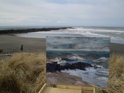 The painting was begun at high tide, but as you can see the tide was going out by the time I took this photo. Interesting how the camera compresses reality - my painting is accurate for relief, showing more ocean above the jetty, but the photo makes the ocean appear flattened.
I had to drive to my home town area this past weekend for a funeral. The art kit went with me, since I have had a desire to do some images from there for some time. Specifically, I want to do a series on the Hoquiam river.
This painting of the wild Pacific Ocean hitting the rock jetty in Ocean Shores, WA has some things I like. The technique of pastel strokes is pleasing. The colors are accurate, it seems. But, an interesting thing happened with this rare plein air session. I had my new large box of pastels, which is organized by hue first, and value second. My smaller boxes are purely organized by value. So, wouldn't you know it? The painting I rendered in this method suffered a little for having incorrect values! I'll keep this in mind for my next efforts, and I'll see if I wish to correct this one in the studio. Live and learn.
As things turned out, the drive was too hard for me this close after my surgery. I know - I should be well by now, but such is the case. I did get some good family and college buddy visits in, but after one morning session at the beach, I was wiped out. I tried a second session at the mouth of the Copalis River, but circumstances and wind got the better of me.
Not to despair, though. I did take my camera with me. More importantly, I had my eyes, too. Paintings will follow.
Tuesday, February 10, 2009
Environment of the Artist
There are some superlative things about my peculiar environment here in Washington State. I'll be posting about that in the next installment of the tree school.
Friday, February 6, 2009
Loriann's New Pastels
I found it interesting that Loriann Signori is buying up these new pastels to flesh-out her plein air box. See her reorganized box here. I found it so because I am refilling my studio palette, too. It seems that my pure tones in every hue have all been used up or migrated into my three or four plein air boxes! I have a big order in for many pure tones, and I look forward to re-organizing my studio palette.
Thanks to all of those who have "hit" my how to make pastels posts. I did those early in my blogging career, and they were way harder than I thought they'd be. Dirty hands, camera - you get the idea. I much admire the well done blog posts on this subject. I feel a re-do of that post coming on. And, I feel the pastel making station calling my name, too. Especially with a new bunch of pure tones from which to key off! I want to see if I can make my own statement with hand made pastels in these colors, and I want to get my tints and tones of value expressed, as well.
Upcoming: my interview with Loriann Signori.
Wednesday, February 4, 2009
Three Things - Tree School
One thing I glean from this image is the necessity to compose the whole picture when featuring trees. Direction, the rule of threes, and (believe it or not) a controlled palette are three important lessons.

Direction.
Dianne Mize wrote about this recently, and I want to use this image as an example of directional strokes. The big, scumbled strokes are unified. In other words, there aren't a bunch of big marks, plus small, finicky lines, plus whatever. This image uses the same types of strokes. The directionality is strong, with a diagonal steeply rising to the right. A strong violet horizontal provides a counter pose, and electric greens give an entrance for the eye at a shallower diagonal in the foreground.
The Rule of Threes.
New blogger (and my High School classmate) Garth, wrote a post about the power of three. Maybe there is a mystic numerological reason for favoring threes, who knows? I employ a "rule of threes" in composition as a means of simplicity and yet there is still a depth of idea to three spaces.
This image is composed with sky, trees and ground. How basic can you get? Also, notice three basic colors, ultramarine or violet, green and yellow.
Controlled Palette
Two primaries and their intervening secondary limit this palette to, essentially, one side of the color wheel. That limitation provides power and unity to the color composition. The viewer is less apt to be confused looking for the whys and wherefores of a broad palette.
As a colorist, I choose to present full intensity colors as much as possible, and yet I want to keep nature recognizable. This image keeps the viewer grounded by utilizing local colors, yet they are "amped" to maximum intensity and contrasted against the olive green trunks. The value scale is spread from darks to middling values to not-too-lights.
The venerable maple tree is as evocative an image in America as any of nature's offerings. I tried to keep that in mind when I executed this green maple. I wrote more about this image in Deciduous Trees Expanded.
Monday, January 26, 2009
Tree School - Why Green?
Color is the starting point that I choose for my tree renderings. If you are ever to arrive at a coherent color scheme, you must resist making those trees green! Typically the local color of trees, green will key the color composition for you. If you wish green as a major element in your image, then use it. If not, then do a color study of your composition first to determine what color you will be making your trees.
The local color of trees is usually green, but if you think about it, there are other local colors of trees. Brown, orange, silver, gray and black are present. Trace or hints of red and blue are very evident to me in trees. Cast colors include violet and blue. When we view our trees in this manner, any color becomes part of the natural palette associated with trees.
Remember that color has much more value than associations with objects. Some assign emotional value to color, but I also think of it's plastic qualities. The red trees in this winter scene counter-pose the cool trend of a winter scene, and push them forward and cause vibration when compared to the ultramarine background.
Don't become a victim of the tyranny of green.
Wednesday, January 21, 2009
Tree Admiration
Learn from other artists whose renderings of trees you love
Learn from other artists whose renderings of trees you love. Mark me down as a Wolf Kahn follower. His forests of trees are gesture rich, and pure blocks of color are woven into the whole. I did the drawing posted here directly from a WK as a study to try to "get" more of what his methods are.

Evening Pines, by Deborah Paris, gives a similar treatment of trees at a forest's edge. Atmosphere prevails, and I have a feeling that I am standing among the liquid air of 100 degree Georgia humidity at dusk. Her Tonalist style involves a limited palette and a narrow range of values. I can't help but feel completely present in these woods when I am looking at Evening Pines.
Albert Handell's Woods Interior expresses the abstract qualities of just tree trunks. His tree trunks have more texture with less apparent effort than almost any artist I know of.
All of the artists I've mentioned here take a very different approach to trees, and your tree style will become a signature of your own work.
See also:
Michael Chelsey Johnson
Jennifer Phillips
Tracy Helgeson
Susan Ogilvie
Marla Baggetta
Marla's new blog.
Monday, January 19, 2009
Abstract Organic Shapes
Consider the words of this blog title, "abstract organic shapes." For a sound and enjoyable study of shape, see Diane Mize's post, And Then There is Shape. An organic shape is one with a random pattern or irregular edges - just the opposite of geometric shapes. Abstract means non-specific or simplified. A non-tree tree, if you will. More of a shape than a technical study of leaves, foliage, branches and trunks.
Think twice before you include trunks, branches or leaves
If you want foliage, then make your tree as formless as possible.Irregular, and abstract. Think twice before you include trunks, branches or leaves. A better direction to go instead is to ask yourself how this shape will effect your overall composition. Back all of the way out of the picture plane, and make a value and shape sketch. How big will the tree or trees be? Will they form a unified mass? What will the relationship of these trees be to the other elements in my painting?
Consider the image posted today, Blue Trees in the Middle Distance.
Since we are building a landscape here, albeit an abstracted one, we have chosen to model the form of our trees. Keep it simple, with roughly three values only. As with strict realism, we have opted to not go very broad with our value range. An almost black violet, a dark middle ultramarine and a middle violet do everything we need them to do to represent two trees on a slope. We keep the diagonal strokes all parallel, which heightens the gestural effect of our marks.
An unrelenting melancholy
Anchor the trees to the ground with well placed shadows, and a dark line where we interface with the ground. Higher key colors in front of and behind our trees help with modeling. Atmospheric effects of the ridge, sky and clouds push them back, and limiting the palette help with unity. Again, we keep our gestural effect with our marks - they don't conflict.
An almost unrelenting melancholy pours down the picture plane, brought about by the blue and the clouds. A critique was written about this painting, here.
Thursday, January 15, 2009
Tree School
The title "Tree School" sounds like it belongs at an arborist's convention, or maybe a logging camp. But, I want to offer my artist's take on rendering trees with pastel.

Trees can be an awful distraction in a painting. Especially if they are present but not the subject, and if they take up too much of your effort.
We all enjoy graphite drawings in detail of a beautiful tree. Great texture, perfect modeling, and wonderful presence are what please us. But, that is the tree drawing where the tree is center stage; the star of the show. What about when the landscape is about things other than how the trees look? What do you do then?
Additionally, you can face a problem when the trees are the main content, but not the subject. I mean by that the painting where a color composition is the subject of the painting, or maybe something like the motion of one's eye through the woods. Trees have a built-in drama to them, and I propose that too much detail can distract from the message.
Return here to attend my short course on trees in pastel, and I leave you with this hint: don't begin with green.
Saturday, January 10, 2009
Preview: Loriann Signori
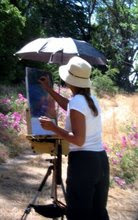 Loriann Signori
Silver Spring, Maryland
Coming soon: My interview with Loriann Signori. Loriann is a plein airist whose colorist work defines freedom.
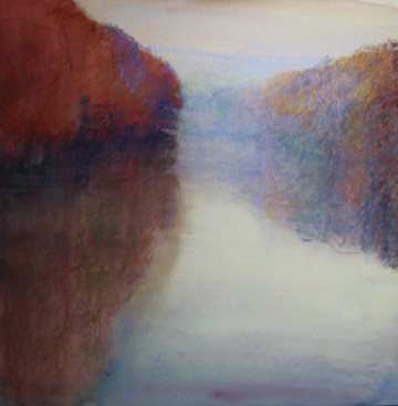 Topaz Serenity
Loriann Signori
Subscribe to:
Comments (Atom)


