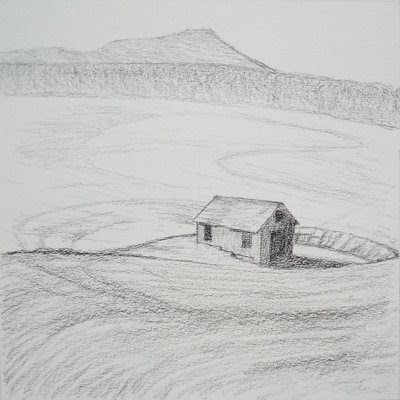
Conté pierre noire pencil on Cartiera Magnani Velata paper (cream tone, 8″ x 8″ ), August 2008.
Here is the second crit of Brian's thumbnail sketches, and after this we'll move on to color compositions. I have to say that I really admire Brian's enthusiasm in all of his pastel work. For this particular project, he has even gone so far as to buy a couple of new books to support this study. Way to go!
Brian's post, More Abandoned Barn Sketches, follows my Thumbnail Critique of his first sketches, and this project is referenced here in a past post at Pastel (pastelsblog.blogspot).
My Comments:
I like the square format, and your complete elliptical circle around the barn is a good tool for attaching the building to the terrain. Don't make it too perfect, though. In our minds, we want our landscapes to be irregular .
Pay serious attention to the intervals of space given to each element in the overall image. Try this experiment. Put away the photos, and also your prior sketches. Now, draw the scene from memory. Weight the elements for compositional reasons, not descriptive reasons.
You said, "With Casey’s comments on Wolf Kahn and Hans Hoffman I’ve gone back and done some more reading and will continue to explore the “push-pull” aspects of this piece - the visual weight of the sky versus the land masses and also the dynamic that warmer and cooler colors will have within the piece once I get that far along."
You have four bands of terrain, which I like. Several ways to handle that. One is to keep the four, but camouflage two by making them analogous colors and the same value. An important one will be to not make the bottom two bands be equal height (or depth, if you will).
Kahn does a lot with sky colors to either push the eye down upon his buildings, or conversely to allow them to breath and float up. But, what do we do with linear composition to accomplish this?
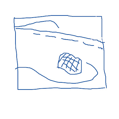
Here is a sketch I did in Photoshop to arrange the same elements you are using, but giving different weights to each element. The major lines refer to one another, which unifies the scene, and keeps the eye inside the picture plane, and on the barn. A cunning aspect is that the fore and mid (behind or above the barn) ground are roughly the same size like in your sketch, but the balance has shifted to the fore and barn elements because these two elements are drawn a little larger, and the angles are now offset rather than being parallel.

When I used to get crits from the Famous Artist School, the artist would offer these re-drawn sketches. I hope that's O.K. for you, Brian. Sometimes a drawing speaks better than words, huh?

Casey and Brian,
ReplyDeleteI enjoy following your little sketch and crit conversation... I've got a little field project myself (though no barn) - but it'll probably will have to wait until I'm back home in 10 days time. I will write up something - it's not often that I'm so explicit/constructive about composition but it's a good and useful exercise to unpack it at points. I like how Casey proposes to change the weight of the different bands. Very interestig... thank you!
This feedback is very helpful, Casey. As we begin work on color sketches, I'll continue to experiment with the composition further, putting aside the reference photos and previous sketches, as you've suggested in an effort to further strengthen the composition.
ReplyDeleteThe Photoshop sketch was informative and clearly illustrates the suggestions you've made. This is a nice approach to quickly communicating ideas and I certainly welcome it.
You talk about Wolf Kahn's use of color to suggest a feeling of pushing downward or to allow forms to breath and float upward. I understand this conceptually (I think) but need to keep studying his landscapes to better understand how he does this - through color choices, size of compositional elements, texture, etc. He writes often of contrasting solids (buildings, rocks) with more open spaces (sky, tangled trees and scrub, etc.). Our abandoned barn seems a good case study in this contrast and I'm trying to incorporate this understanding into my thinking as well.
For all of this talk of Wolf Kahn maybe I should be trying to emulate his work in my barn landscape. I had been thinking of focusing on Richard McKinley - especially with underpainting and color selection - but maybe continuing to learn from Kahn is a better approach for me right now since it seems to be happening naturally already at this early stage in the work.
Thanks again, Casey - I'm looking forward to our next steps on the project!
Gesa, I'm glad you're reading. I have been following your field sketches, too. Maybe we can incorporate something, at least a cross posting? Your style is remarkably free and loose.
ReplyDeleteI wouldn't recommend driving around drunk on a tractor, though...just sayin'. (see Gesa's blog for this story)
Brian, I just did a trip where I made some breakthroughs in my plein air work. I can't even get to my studio to scan or photograph the works, though!
The moral of the story is I was "channeling" Albert Handell - thinking about how he does his rocks and trees, which were my subjects. I recently acquired a pastel book of his from the Seventies, and it's full of his classic tree scenes, as well as these crazy portraits of hippies. And I have his new book on the landscape in plein air.
Far be it from me to teach "Wolf Kahn," but maybe trying to channel the master is a good direction. See my posts on Wolf Kahn and on the Wolf Kahn Project that I did at The Colorist.
Good idea to keep one artist in mind when working hard on a project.