Thursday, June 26, 2008

Dominant Yellow


Yellow Gesture
18" x 11"
Pastel
Casey Klahn
CTA


The image above, Yellow Gesture, was made using a DianeTownsend Thin Lines yellow that Diane handed to me at her workshop. Her creator's pride in this particular yellow is well founded. Marie Meyer at Huechroval has made a fascinating yellow on black test which gives a great illustration of color strength comparison (coverage). Guess whose yellow pastel came out the strongest?


24 Yellows


My review of using the new book, Multi-Brand Color Chart for Pastels, will follow in the next couple of posts.

Tuesday, June 24, 2008

Kanji Writing

Kanji Writing
15.5" x 9"
Pastel
Casey Klahn

The White Writing of Mark Tobey is an influence on me. I'm still trying to figure out how to express it, though.

Saturday, June 21, 2008

Oldest Pastel?

Isabella d'Este
1499
Charcoal, Chalks and Yellow Pastel
Leonardo da Vinci
The Louvre


This may be considered the oldest pastel artwork extant. Go get 'em Leonardo da Vinci. An interesting backstory is given that Isabella may have been one of Leonardo's few female friends. He began his Mona Lisa (another subject) a handful of years later, circa 1503. That puts this work in the same vicinity of time, at the height of da Vinci's artistic powers.

Friday, June 20, 2008

What To Paint Today?


The words subject and content have different meanings to me in regards to painting. The content will be the elemental things depicted, such as trees, hills, sky, persons, etc. The subject, for me, is often never about the content. The tree's will be about "cool against dark warm," or the subject may be the color composition "analogous blues." Get it?

Artists will frequent the same content again and again, partly because the elements are less important than the subjects, or the "oeuvre." The trees and figures become tools to work another formal aspect of the art. Narrow content is another way to become identified by your work.

Eden Compton and Harry Bell are two blogger artists that I read regularly who exhibit narrow content choices. Albert Handell identifies his usual fare in his book,
Pastel Painting Workshop. The limits of his ouvre include portrait vignettes, closely cropped trees, rocks and streams, and architectural elements. Handell says that patient study is required, and that limiting content is the key to this.


Bunkhouse Thumbnail Sketch
(Scanned Image)

I am carefully selecting my next plein air site, based on a sketch I did a year or two ago. The bunkhouse at my In-Laws' farm has a lot of the elements that Wolf Kahn uses repeatedly in his narrow content set: looking uphill towards a small rural building, with the elements of sky, vegetation and tree masses.

Tuesday, June 17, 2008

Friday, June 13, 2008

Friday the Thirteenth - Artist's Tips for Accidents


Ever wonder if your artwork is just an accident waiting to happen? Lucky you!

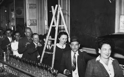
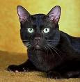
Much of what sparkles in a successful piece is what artist's consider "happy accidents". I am certain that I don't know how to teach the making of happy accidents. Walk under a ladder? Cross paths with a black cat?

Let's approach this in an experiential way. A "just let it happen" sort of methodology.
  1. When you are rendering your next work, try choosing that next color randomly. Choose a specific value, but let the hue be an accident. Forget about "local color" completely. The way it works for me is that my values are part of my palette's structure. Look at my header at the top of the page - the mid values are those in the middle of the tray as one looks from left to right, jumping the dividers as you go.
  2. If that is too scary (you scardy cat) then try this: make an abstract thumbnail with randomly chosen hues. Use this as your palette for your next work. You may change values, but these are your limited hues.
  3. Stand at your easel and use your whole body when making your marks. The extra pizazz in your marks should become evident. You are loose at the waist, and your work is at shoulder level. Give it a try!
  4. An oldie but a goodie: make an underwash on white paper by using the side of a hard pastel to indicate the color, and then wash that with turpenoid and a brush. Let the underlayer show through.
  5. Counter-intuitive one here. Tape your paper on your big drawing board all around and secure. Make sure it is squared, and justified to the edge of the board. Your senses will be less distracted by the sloppy or uneven paper that sometimes gets mounted.

Now, go forth and be uncareful.

Thursday, June 12, 2008

Spokane Lobby

Spokane Lobby
Charcoal & Conte Stick
in Moleskine
Casey Klahn


Getting out hasn't been easy, but I have accomplished a few plein air sketches this past week. This morning, I was downtown in Spokane enjoying a coffee and roll, wondering if this location was going to offer me another coffee shop sketch. Not wanting to be in a rut, I found the old lobby of the building facing outwards towards the street. Here was a dated lobby with a new (ugly) facade - glass double doors set in a plain metal framed surround.

A challenge to draw!

At the bookstore, I found an out-of-print and used copy of Albert Handell's
Pastel Painting Workshop, 1981. Replete with hippy chicks and other awesome Handell illustrations, I couldn't resist buying it.

Monday, June 9, 2008

Deciduous Trees Expanded

Maples with Blue
8.1" x 6.5"
Pastel
Casey Klahn

The challenge with these deciduous trees is partly to reduce detail, but just as with the rest of my landscape metaphor, to eliminate or obscure the horizon. Also, the top of the space on the picture plane is a spacial challenge, because the deciduous tree picture, unless it is going to be "about" the trunk, often involves showing the top of the tree.

I have to ask myself, "how would Wolf Kahn handle this space?" His whole tenure under Hofmann was much about arranging the space of the painting. See this wonderful interview that I posted at The Colorist on this and other art lessons from Kahn.

Friday, June 6, 2008

Thoughts on a Series

Spring Trees
4" x 4.5"
Pastel
Casey Klahn


Somewhere I read, recently, about tips for doing a series of paintings. Let's explore the practice of creating a group of works.

The economics of doing art in a series is perhaps the obvious reason that comes to mind. But, there is much more to the art series than that. As a matter of fact, without the underlying artistic rationale for painting a series, the results can often fall flat.

Do a series of similar works to get down on paper (or canvas) the fuller extent of your ideas. Are your pictures more than the representation of some objects? Do they have anything to say to the viewer of deeper meaning? Explore the nuances of a color composition, or of a particular place in all of it's complex facets.

Hang a series of ten paintings that share a coherent and well developed idea. You will be going past the technique and the handling of pastels; beyond the aesthetics of pleasant images. You will be expressing the depth of your artistic development, and revealing more clearly what your ideas are.

I would rather see your room of ten signature works hanging than a solitary Pollock at the MoMA, any day!

With these things in mind, what are some methods for creating a series of works?

  1. Try to see a One Man Show at a local gallery or an artist focused Exhibition at the Museum. Notice what creates the continuity in this hanging. Likely the framing will be the same, and maybe even the sizes and aspects of the paintings will be uniform.
  2. Either decide what you are trying to say with your artistic growth, or look very intently at what has been coming off of your easel. Is it trending in a certain direction? Is it new in some way for you?
  3. I try to get my subjects or objects the same. Now, I am doing a series of deciduous trees which are drawn in the Eastern Washington setting. This is a departure from my typical conifers, and the change or growth is an important element of a successful series. Nicole Caulfield is doing still lifes in boxes, in the style of the Tromp L'oeil. Harry Bell did a series on water taxis in Venice (very unique). Joan DaGradi is doing post-Hurricane Katrina condemned houses in New Orleans.
  4. One method to provide continuity is to not only follow an idea, but to repeat, limit or at least narrow your palette. The effect on your exhibition will be noticeable.
  5. Especially for the pastelist, make a decision about what paper you will be doing your series on. Will the images be more coherent on the same paper brand and color? Maybe yes and maybe no - you'll need to decide, and possibly stock up on one particular paper.
Ready to take that next step in your artistic development? Hang a grouping of ten coherent pastel works, and remember to get someone to take your picture there!

Tuesday, June 3, 2008

Germany!


It gives me great pleasure to post about German pastel art. With the world's softest (and one of my favorite) pastel brand, Schmincke, manufactured there, and as the historic bed of the pastel medium, Germany is an important art hub. German painter Johann Alexander Thiele (1685-1752) is credited with the essential invention of modern pastels.

Expressionism is a key art movement originating from Germany.

Wall Panel, 1914
o/c
Kandinsky

Wassily Kandinsky (1866-1944) was a Russian artist whose growth and style was solidified during his long residencies in Germany. He was the first abstractionist.

Astrid Volquardsen is a contemporary pastelist in Germany. Link.


German information center, US German Embassy.
Some of my favorite pastellists either originate from or frequent German soil:
Wolf Kahn, born in Stuttgart.
Gesa Helms, frequents Germany and posts landscapes from there.
Casey Klahn, second generation German-American.

Petra Voegtle
Not a pastel artist, but very prolific and an indispensable gateway for English language blogging from Germany.